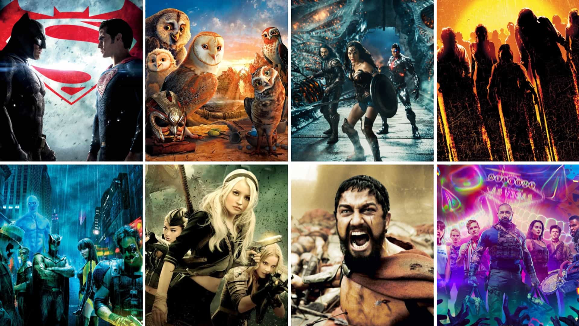
Any great director has fans and detractors, lovers and haters. But few filmmakers inspire division as extreme as comic book, movie maestro, Zack Snyder. Frivolous hack, or pop art genius? Stylist without substance, or masterful cinematic storyteller?
Even Snyder’s critics admit that what he does well, he does better than anyone. Snyder’s kinetic action sequences can pull viewers into a heightened, tone-rich fray. This guide to Zack Snyder’s directing style focuses on his on-screen wins and how he achieves them. We’ll examine Snyder’s techniques and see how he creates his undeniable visual mood and energy. Let’s dive in.
The Zack Snyder Style
1. Comics become storyboards
Long before shooting the first frame of any movie, directors establish their visual direction with mood boards, storyboards, and shot lists.
To date, Zack Snyder has written, produced, or directed a relatively small number of feature films, mostly based on comic books or graphic novels. Many of Zack Snyder's best movies originated with what are essentially built-in, source material storyboards: comic book and graphic novel image panels.
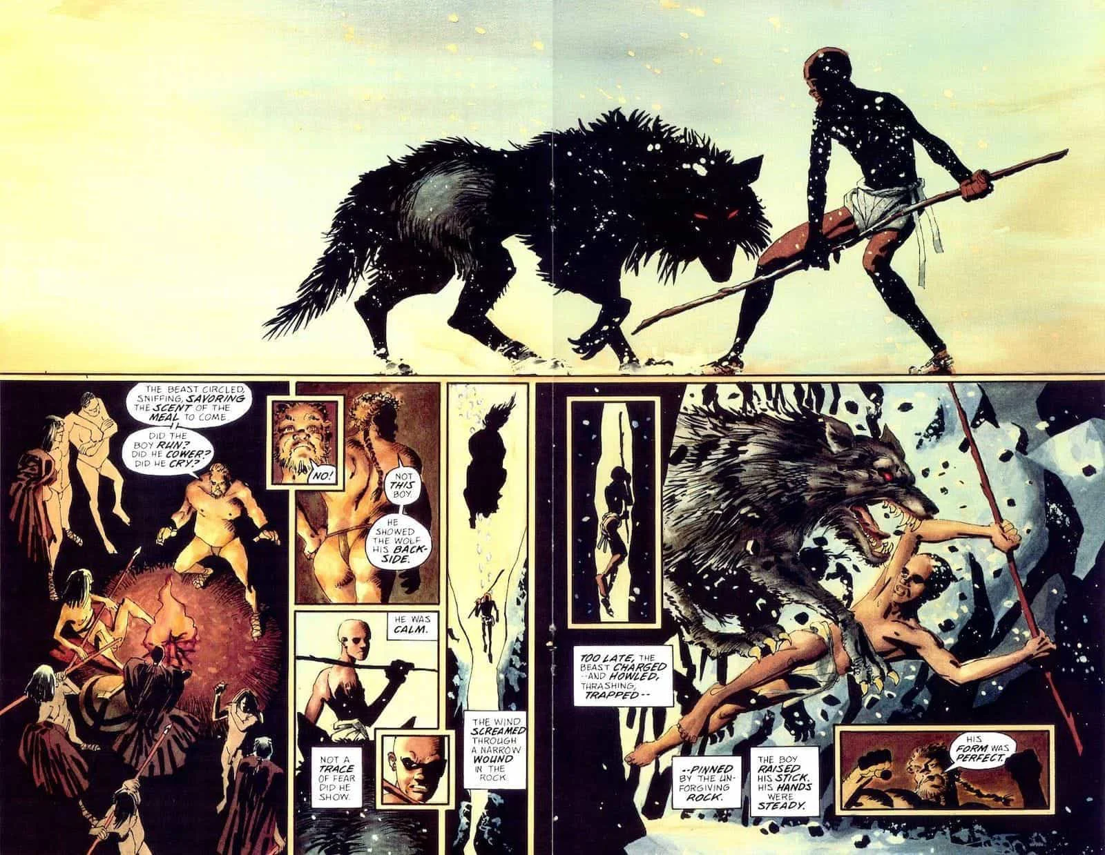
Snyder sticks almost religiously to the original image panels
Comic book movies are nothing new, but nobody exercises fidelity to the original form quite like Snyder. His movies really do look and feel like comic books invigorated for the big screen, like highly stylized epic tentpole operas.
How does he do it? He orchestrates his iconic Snyder color palettes, shoots action in specific ways, plays with frame rates, and moves the camera — or, more accurately, moves lenses — with purpose. This post discusses color, frame rate, editing, and camera concerns in subsequent sections.
First, a peek at Snyder’s pre-production process.
As a director, Zack Snyder doesn’t simply read the comic or graphic novel he’s adapting and goes off to make his movie. He chains the publications to his wrist. He studies every nuance of the original artwork and uses panels straight from the source to construct storyboards and shot lists for his films.
This translates to on-screen visuals that look at times almost identical to their printed-page inspiration.
Watch this scene from Zack Snyder’s 300 :
Zack Snyder movies replicate their source material
The narration, take it or leave it: when young Leonidas turns his head at the 58-second mark, it looks like he wants to tell the narrator to shut up already. But visually, the scene drips with mood, darkness, and thrill.
Now here’s Snyder’s “cheat sheet” — an original panel from the Frank Miller 300 comic book. See how it compares to a still from the Zack Snyder's movie:
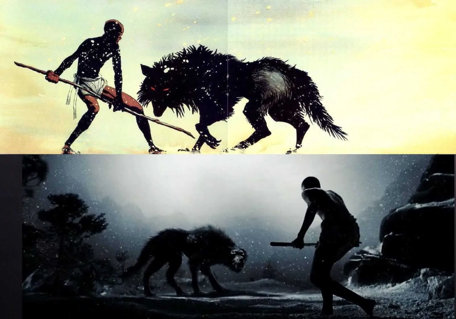
From Frank Miller comic to Zack Snyder Movie
Snyder faithfully translates comic to screen, with slight adjustment to suit his film’s color palette.
When combined with Snyder’s directing techniques discussed in subsequent sections, this does more than just copy source material. Snyder effectively converts the feeling of reading a comic book to a visceral, action-packed filmgoing experience — and it all starts with the artwork on the page.
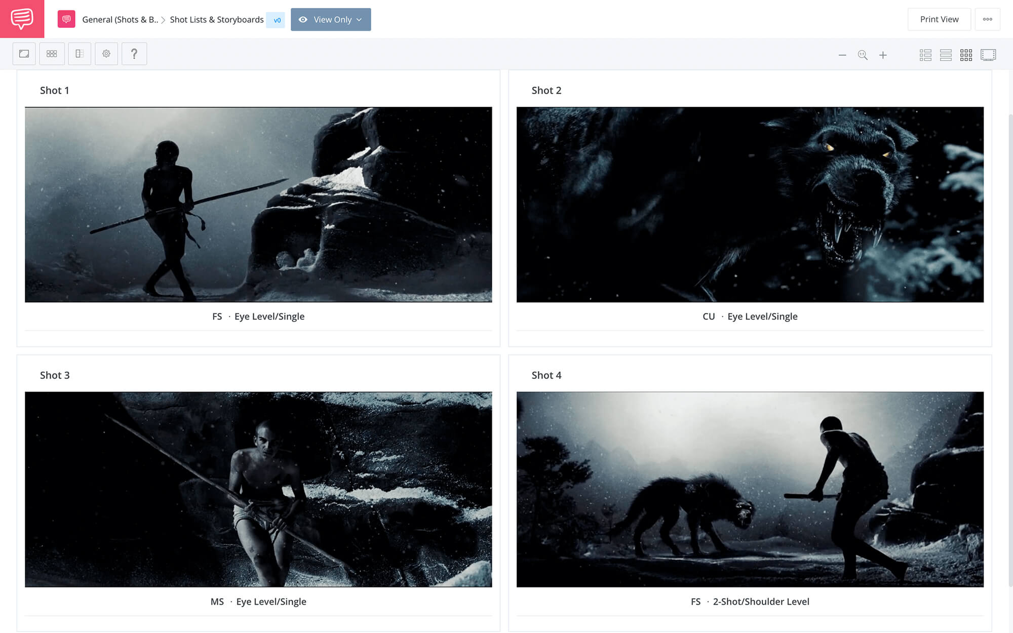
You can import your scripts and break down the shots like Snyder would. Check out how this is done with StudioBinder's storyboard software:
To see how Snyder turns Frank Miller’s illustrations into a compelling scene in 300, click on the shot list below. Check out how Snyder’s detailed shot specs sprout from the comic book to steer the drama:
Adhering closely to original artwork accomplishes two things for Snyder: it makes his job easier, since a sizable amount of the heavy lifting is done. Why change a good thing? Better to take what works and run with it.
Also, basing his own filmmaking style on source material delivers on the promise of the development process. Snyder makes big-budget studio movies, so it’s understandable that multiple executives, producers, and stakeholders hitch their wagon to the project throughout its lifespan.
When a comic book or graphic novel gets people excited, that’s what collaborators expect to see on screen: the material that got them excited in the first place. Hewing to the prototype, not diverging too much in cinematic execution, gives the studio the movie it wants.
What’s the takeaway for directors? Whether a project starts with existing source material or a fresh concept, going into production with a solid visual game plan is crucial. That means devoting time to shot listing and storyboarding before the cameras roll.
Snyder Flies off the Ramp
2. Snyder uses speed ramping
Comic books present a lot of variation from one panel to the next. A wide landscape might be followed by an extreme close-up; a piece of action in one panel might lead to a microscopic detail of that same piece of action in the next. Also, the sizes of panels themselves fluctuate. One frame might take up a sliver of a page, the next give readers a two-page spread.
Snyder employs cinematic techniques to amplify this printed moment-to-moment modulation for his movies.
The first technique is speed ramping.
SPEED RAMPING DEFINITION
WHAT IS SPEED RAMPING?
Speed ramping or time remapping, is the art of slowing down and speeding up footage during a particular shot to produce dramatic effects.
Zack Snyder often uses both slow-motion and fast-motion in a single shot or sequence.
Watch this fight scene from Zack Snyder’s Watchmen, based on the DC comic book series of the same name:
Zack Snyder Directing Style: Speed Ramping
The effect of Snyder’s speed ramping is twofold. It gives viewers a strong sense that someone — a storyteller — is guiding the narrative. It’s evidence of a director telling audiences, “Hey, I’m going to slow down right here, so pay close attention to this. And now I’m going to speed up so you really feel the velocity of the action in this part.”
Yes, it’s heavy-handed, though that’s not necessarily a bad thing when evoking comics and graphic novels that were indeed drawn by hand.
Snyder’s speed ramping also mimics the effect of reading a comic book, in movie form. It’s a way to present the varying imagery in comic book panels with a cinematic equivalent — all within a single shot or sequence.
Speed ramping controls information, paces the audience’s attention, and guides viewers’ eyes in much the same way comic book panels do.
Character motivates speed ramping in this scene from Snyder’s Justice League — the power of Superman, the speed of the Flash. Here, the speed ramping technique deepens a connection to superheroes by letting viewers experience the powers that make them super:
Zack Snyder Directing Style: Frame Rate Manipulation with Purpose
Find out how to manipulate speed using slow-motion, fast-motion, and speed ramping in this ultimate guide to frame rates.
For more about speed ramping explore our quick guide to speed ramping in Premiere Pro for seamless and impactful video editing
The next section examines another filmmaking technique Snyder favors.
Zooming in on Zack Snyder Movies
3. Snyder and snap zooms
A snap zoom is a quick zoom in or zoom out.
The snap zoom holds favor in documentary filmmaking as a utilitarian technique for capturing action as it unfolds. For example, when the director and camera crew don’t have the luxury of calling “cut” to set up another shot, or to change lenses.
When making documentaries, action needs to be captured in real-time. The snap zoom allows for this. If something noteworthy occurs in the frame during filming, zoom in. Want to step back and look at the full scope of action taking place? Zoom out. But whatever happens, by all means do it quickly — make it snappy — because the moment is fleeting.
In Snyder’s films, snap zooms convey similar urgency, even as every shot and setup stands as a monument to planning and scheduling. Snyder’s on-the-fly effect is precision-engineered.
Snap zooms in this sequence from Snyder’s Man of Steel give a sense that the action is moving too fast for the filmmakers to keep up. Snyder, it would seem, has no choice but to use snap zooms so viewers can see everything they need to see, and everything Snyder wants to share.
Snap zooms kick in around 17 seconds in.
Zack Snyder Directing Style Trademark: Snap Zooms
This is Snyder’s stylistic choice.
Unlike documentaries, there’s no need to use snap zooms to show audiences Jor-El riding winged beasts, the villains on his tail, the vehicles ablaze up ahead — but it is an effectively forceful and lively technique.
Also, for a director whose stories come from comic books and graphic novels, who so frequently combines fantasy with versions of the real world, snap zooms serve to ground that fantasy to reality.
Sure, an intergalactic battle of made-up super-beings might be raging on a distant planet that doesn’t exist in the first place, but the camerawork tells viewers, and makes them feel, that this is really happening.
Auteur Theory Made Practical
Explore directing techniques used by the greats
Create works like these iconic auteur directors. Explore practical directing tips you can immediately put into action on your next project.
Explore More Auteur Directors
Zack Snyder Action Directing Style
4. Avoid unnecessary cuts
The previous two sections consider Snyder’s use of speed ramping and snap zooms. These techniques often replace Snyder’s need to cut from one angle to another in complex fight scenes to keep viewers oriented.
Instead of a rapid-fire editing onslaught, Snyder propels action in one long take, or at least the illusion of one long take, by pushing in to show detail, pulling back to communicate scope, accelerating for sensory jolts, and relaxing the pace to take a breath or reorient.
Film critic Amy Nicholson praises Snyder’s disinclination to cut as an “exercise in patience,” and adds, “I'll always be confused by why directors spend so much energy staging a fight only to turn it into a chopped salad.”
By modulating action in other ways (zooms and ramps), Snyder renders edits unnecessary. A fight scene from 300 puts the full gory glory of this trademark Snyder style on display. Keep an eye out for Snyder’s trademark snap zooms, speed ramps, and no cuts — not one:
Another directing style trademark: edit-free action scenes • Subscribe on YouTube
Even if directors refrain from using Snyder-style snap zooms and speed ramps for creative or budget reasons, shooting an action-packed fight scene in one long, cut-free take remains a bold option.
Here’s a no-edit fight scene from Oldboy. This is not a Zack Snyder film — it’s directed by Cannes Grand Prix winner Chan-wook Park — but it serves as an engrossing example of a stripped-down, proto-Snyder approach:
Long-take action in non-Snyder film Oldboy.
So for filmmakers who can’t afford an elaborate blue screen set and dozens of costume-clad extras, like the 300 fight scene required, choices do exist to emulate Snyder’s directing style.
The following section surveys another component of Zack Snyder’s directing style: his color palettes.
Color in Zack Snyder Movies
5. Snyder engineers color
Director Zack Snyder’s films use color to create not-quite-real worlds filled with zombies, superheroes, and warriors. This stylistic color design is most pronounced in his comic book movies.
Whereas Marvel films generally play it straight and bring superheroes into a plain-old regular planet Earth (Iron Man lives in Malibu, Spider-Man in New York, Ant-Man in San Francisco), the DC cinematic universe, as spearheaded by Snyder, pulls viewers into a grayer, grittier, weirder world of superheroes.
Painting a picture of fictitious alternate-world cities like Metropolis and Gotham, however — where DC’s Superman and Batman respectively reside — allows for much greater freedom. Myth can overtake reality. This is a major difference between the Marvel and DC superhero universes.
Check out this video on how Director, Zack Snyder uses color:
Zack Snyder's color palette orchestration • Subscribe on YouTube
He colors his films with muted tones and monochromatic color schemes to convey a cold, desolate fantasy version of feudal Japan in Sucker Punch.
He identifies characters with popping, recurrent motifs, such as red and tan for Leonidas in 300.
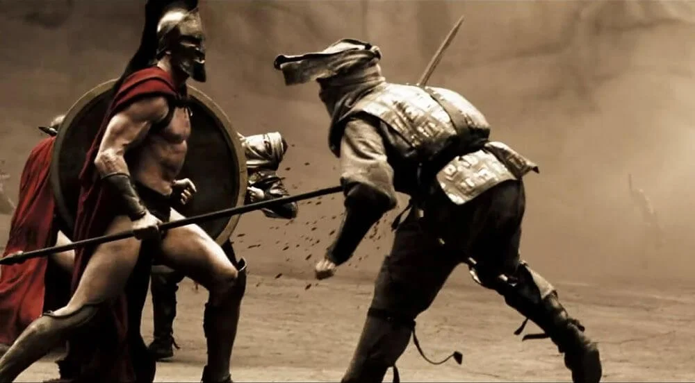
Recurring color scheme
And blue and orange for Dr. Manhattan in Watchmen.
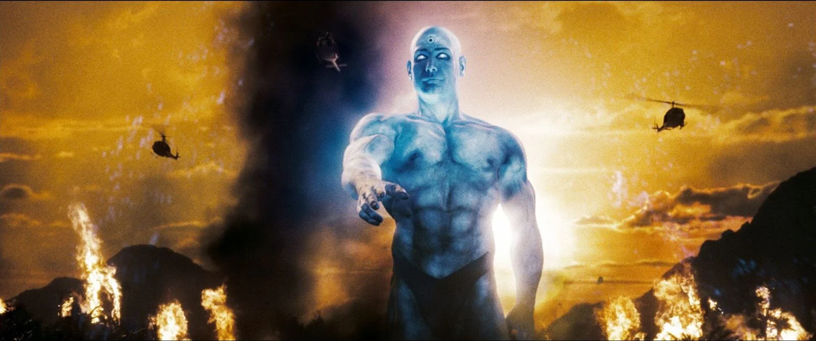
Snyder uses color for visual mood
And he uses contrasting colors to create irony, like a rich red spatter of blood on the yellow smiley face on the Comedian’s badge in Watchmen.

Creepy coloring in Snyder movies
The action point for directors: think about color. Make it part of the pre-production process.
Plan a color palette and create a mood board. And definitely check out this video on film color psychology:
Zack Snyder storyboards, mood boards, and mindfully chooses colors before filming. His style is heavily influenced by filmmaking techniques like...
snap zooms...
speed ramps...
and long-take action scenes.
If you're a fan of the Zack Snyder style, try using these techniques in your next project. Specify the details the next time you spec out a shot list so you go in with a clear vision for the shoot.
Related Posts
Auteur Theory Made Practical
Explore directing techniques used by the greats
Create works like these iconic auteur directors. Explore practical directing tips you can immediately put into action on your next project.
Explore More Auteur Directors
Up Next
How Christopher Nolan Designs Shots
Zack Snyder creates a distinctive cinematic style that highlights action and conflict in his movies, even movies he doesn’t direct. Patty Jenkins has called out Snyder’s influence on her Wonder Woman film. Christopher Nolan is another world-building director with a unique style. While both Snyder and Nolan have directed their own takes on Batman, the similarities more or less end there. Find out how Nolan approaches filmmaking, and grasp his perspective, in the next post.
Up Next: Shoot Like Christopher Nolan →
Share your vision with elegant shot lists and storyboards.
Create robust and customizable shot lists. Upload images to make storyboards and slideshows.
