Composition is all about how you arrange the elements within your work of art. These visual elements either fall under positive or negative space. What is positive and negative space and how do they work together to create a better competition? In this article, we’ll take a look at how the two work together through proportions and positioning. And how the choices you make in composing positive and negative space ultimately determine your composition.
What is Positive and Negative Space in Art?
Defining positive and negative space
Negative and positive space are two sides of the same coin. The two work in unison and one doesn't have as much impact without the other. Let’s take a look at the definition of positive and negative space to better understand how they work together.
POSITIVE AND NEGATIVE SPACE DEFINITION
What is positive and negative space?
Positive space is a term used to refer to the areas of interest and focus in a piece of artwork. Positive space is often the subject of a work of art such as a person, landscape, or object. Even in abstract art work where there may not be a singular subject, shapes and patterns can become positive space.
Negative space is a term used in art to describe the space surrounding a subject. Negative space, also called white space, is typically empty and lacks details as to simplify an image and keep the focus on the subject (positive space).
What is positive and negative space used for?
- Distributing the weight of an image
- Establishing symmetry or rhythm
- Creating balance
Divisions Between Negative & Positive Space
Proportions of space
Every work of art, whether it is a painting, photograph, cinematic shot, or sculpture works with space. An artist is tasked with portioning this space out to either positive space or negative space.
To explain the difference between these types of space we must understand what affect each type of space has on a composition.
How they portion out the space of their work will inherently change how a viewer perceives it. Here are a few different common proportions between these two types of space that can be used together.
Mostly Positive Space
Using mostly positive space in painting, photography, and cinematography is often achieved by filling the frame. Filling the frame is often used to draw immediate and direct attention toward a single subject.
In cinema, filling the frame with positive space is most commonly achieved with the extreme close up shot. Learn more about the extreme close up shot in our video breakdown of every type of camera shot.
Ultimate Guide to Camera Shots: Every Shot Size Explained • Subscribe on YouTube
Filling the frame can also be used to fill the frame with many different subjects, nonetheless, points of positive space that take up more area than negative space. This is often used to portray a chaotic, busy, or highly detailed scene.
Related Posts
Mostly Positive Space
On the other side of the spatial spectrum is the use of mostly negative space. Artists use mostly negative space in their frame for various effects.
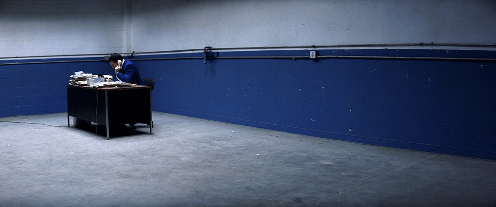
Small areas of positive space, commonly a person or subject, can be encompassed by negative space to reflect the internal state of the subject. This emotional state is often loneliness or isolation that is portrayed through the emptiness around them.
This is the first shot in Punch-Drunk Love and it tells us so much about this character with a simple decision to have Barry surrounded by negative space.

Punch-Drunk Love • Positive and negative space art
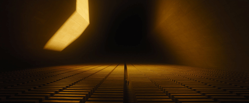
Allocating a majority of your frame for negative space can also be an effective way to capture scale. Scale is often determined by the relationship between the size of an object or environment and the human body.
Using extreme wide shots to capture more negative space surrounding a character or subject can really capture the scale of an environment or object. In this shot from Blade Runner 2049, one of Denis Villeneuve’s best films, the size of negative space compared to the size of the characters establishes the colossal scale of the environment.

Blade Runner 2049 & a massive amount of negative space
Balanced
While some artists use negative and positive space in unequal proportions, others use them equally to create balance. This can be done through symmetrical balance in a frame where weight is distributed equally on both sides of a centerline. However, a composition does not have to be symmetrical to balance both types of space.
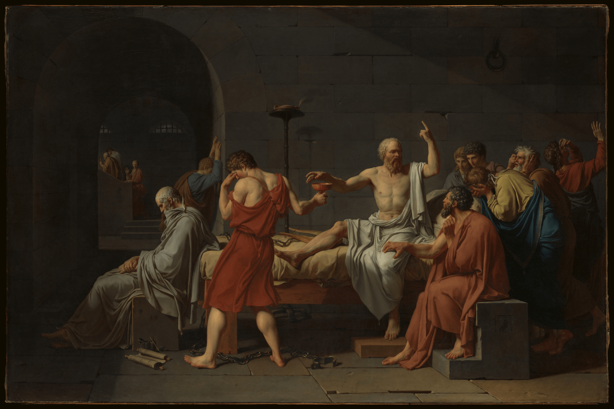
In the painting The Death of Socrates by French painter Jacques-Louis David in 1787, Socrates is sentenced to death by drinking hemlock.

The Death of Socrates • Positive and negative space art
Negative and positive space are used in roughly equal proportion. While the positive space boasts immense detail and various points of interest, the flat stone wall behind serves as negative space.
This negative space only draws further attention on the subjects, while simultaneously creating balance in the frame. Try to imagine if Jacques-Louis David decided to fill the frame with solely the positive space of the scene. The scene may feel more chaotic.
By using negative space to balance the positive space, the defiance and strength of Socrates on his deathbed shines through, rather than the chaos. This analysis by Nerdwriter1 dives deeper into the effects of composition in The Death of Socrates.
The Death of Socrates: How To Read A Painting
The proportions of space in a frame are not the only effect it has on composition. Where artists decide to position positive and negative space can also affect how a viewer perceives the work.
Related Posts
What is Positive and Negative Space Use For?
Positioning negative and positive space
The positioning of positive and negative space affects the weight of a work of art. Weight can be placed by creating positive space and weight can be removed through negative space. How weight is distributed not only affects how a work of art looks, but also how it feels for a viewer.
For instance, even in a painting where both types of space are of equal proportions, how that positive space is dispersed through the scene can change how the painting feels. Therefore, different patterns of space can be used for different effects.
Rhythm
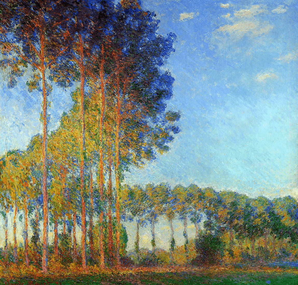
When these types of space are staggered in precise distances, they can create visual sense of rhythm. For example, in the painting Poplars on the Bank of the Epte (1892) by Claude Monet, the positive space of the trees are staggered by the negative space of the sky.

Poplars on the Bank of the Epte (1892) by Claude Monet • positive and negative space art
Although the distribution of space is equal in proportion, there is a sense of rhythm created in how they are positioned and staggered.
Symmetry
Equal proportions of both types of space can achieve visual balance. But only precise positioning of these on both sides of a centerline can achieve symmetrical balance.

Symmetrical balance
It is impossible to achieve symmetrical balance without being meticulous and precise with where you position negative and positive space within your composition.
Since all compositions are made up of these two types of space, it’s important to understand how they work together. Both the proportions and the positioning of positive and negative space determine the visual aesthetic of a frame as well as the impact it has on a viewer.
Up Next
What is Symmetrical Balance?
As we mentioned earlier, being precise with where you position positive and negative space is most important when creating symmetrical balance. Why would you want to incorporate symmetrical balance into your work? Check out our next article to learn more about the effects of symmetrical balance and how artists create it.
Up Next: Symmetrical Balance →
Showcase your vision with elegant shot lists and storyboards.
Create robust and customizable shot lists. Upload images to make storyboards and slideshows.
