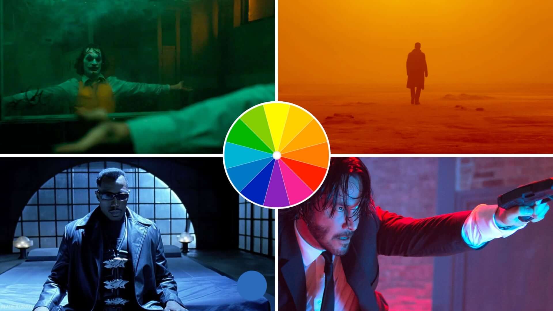
A color scheme is an important part of any creative project, from graphic design to fashion. Not only does it add visual interest, but it also helps to communicate a message and create the desired mood or atmosphere. Understanding how to select the right colors for your project will make all the difference in ensuring its success. What is a color scheme and why are the useful? In this article, we’ll explore what color schemes are and their benefits, as well as discuss different types of color schemes and how to choose the best one for your project.
What is a Color Scheme in Art?
First, let’s define color scheme
There are various types of color schemes that exist. Even choosing a single color is a choice that has an effect. The more you understand about how color works psychologically and theoretically, the more it can become a creative tool.
However, before we dive into these theories and options, let’s look at the color scheme definition.
COLOR SCHEME DEFINITION
What is a color scheme?
A color scheme is a combination of colors used for decoration, clothing, and other design purposes. It can be used to create visual interest, differentiate elements, and convey a certain mood or atmosphere. Generally speaking, color schemes consist of three or more colors that have been chosen for their aesthetic value as well as to harmonize with each other. The various color combinations in a given palette are known as harmonies.
What is a color scheme used for?
- Create an emotional impact
- Evoke a certain mood
- Communicate a desired message or theme
- Provide balance
What is a Color Scheme Used For?
Benefits of using a color scheme
The use of color schemes in design can be incredibly beneficial. By utilizing different shades and hues, a designer is able to create visual interest, while also easily conveying information such as hierarchies and instructions.
Color schemes can also be used to differentiate elements in a design, making them easier to read or understand. For example, graphic designers use color schemes to communicate a brand's message, attract attention, and create a visual interest.

Color Scheme Examples • Thistle and Pig Packaging
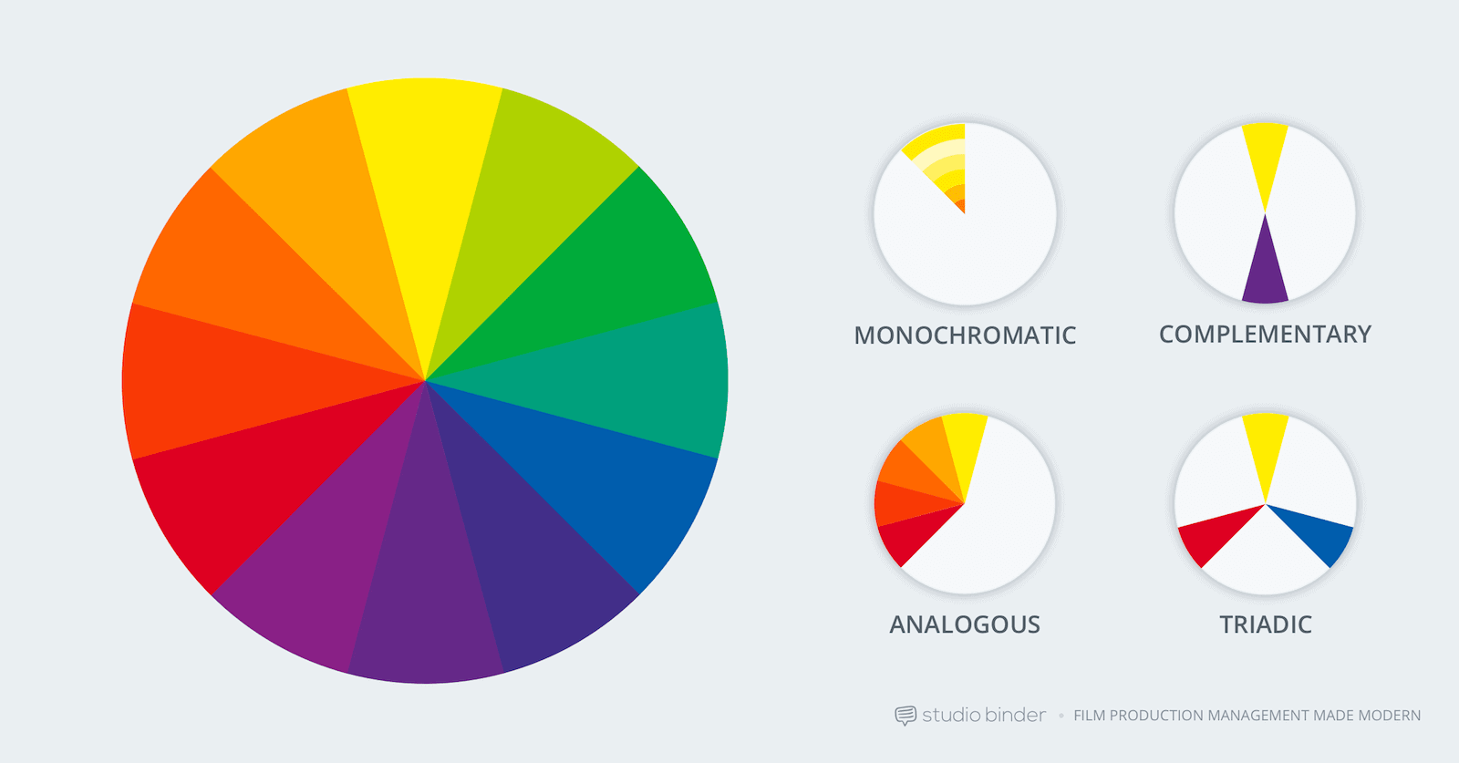
Color schemes are used to make a design visually appealing by using combinations of colors that complement each other and are aesthetically pleasing. Here's a quick diagram showing the most common schemes. We will dive into each of these individually below.
What is a Color Scheme in Art?
Furthermore, color schemes are fundamental for creating an emotional impact, helping to evoke certain feelings or set the mood for a project. Filmmakers use color schemes and film color theory to evoke certain feelings and create atmosphere in their films. Learning how to use color in film can allow you to set a certain mood or articulate a character's emotional state.
For the ultimate guide on using color, download our FREE E-book below:
Cinematography techniques pdf
FREE Download
How to Use Color in Film
Hue, saturation, brightness — the three elements of color that make all the difference. In this book, we'll explain the aesthetic qualities and psychology effects of using color in your images. Topics include color schemes like analogous and triadic colors and how color palettes can tell stories of their own.
It is common for filmmakers to use contrasting colors, such as warm and cool tones, to show the relationship between characters or objects on screen. A great example can be found in David Fincher’s best movies.
Color Schemes in Art and Film • Subscribe on YouTube
In fact, David Fincher is a director who uses color like no other. To go into further detail of how he uses color on a character and storytelling level, we made a second video.
David Fincher's Colors • Subscribe on YouTube
For more color in film videos, head over to our color palette YouTube playlist.
Using the right color scheme is essential for establishing a clear message or theme that viewers will easily interpret and remember. Let’s take a look at the color schemes that are at your disposal.
Related Posts
What is a Color Scheme in Art?
Monochromatic
Monochromatic color schemes are created using variations of a single color. This type of scheme is often used to create a sense of calm, harmonious energy. Monochromatic schemes are commonly found in nature and can be used to unify an image or element in design.
To create a monochromatic scheme, an artist can use tints, shades and tones of a single hue. For example, Zack Snyder uses this monochromatic color scheme in his film Watchmen.
Mastering the Movie Color Palette: Zack Snyder • Subscribe on YouTube
These variations provide contrast while still creating a consistent feel within the design. Monochromatic color schemes can also be enhanced by adding neutral colors such as black, white and gray to add depth and dimension.
Color Schemes in Art
Analogous
Analogous color schemes are created by selecting colors that are adjacent to each other on the color wheel. This type of scheme uses colors that have similar values and temperatures, creating a calming visual effect. Color temperature is a specific way to use color in lighting, one of the most common and visually striking ways to bring color into a medium like film.
To create an analogous scheme, a designer should select three to four colors that are next to each other on the color wheel. Using tints, tones and shades within these hues will help to provide subtle contrast and interest.
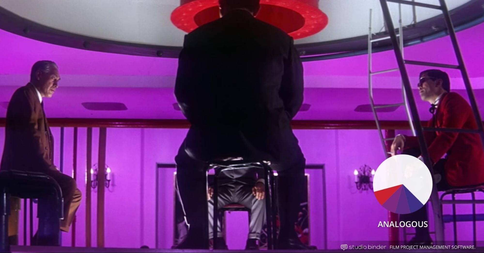
Tokyo Drifter • Color scheme examples
As with monochromatic color schemes, analogous ones can create a sense of harmony and unity in design. By adding one or two neutral colors such as black, white or gray, an artist can enhance the look and make the design more eye-catching.
Types of Color Schemes
Complementary
Complementary color schemes are created using two colors that are directly opposite each other on the color wheel. This type of scheme creates a bold look, as the two contrasting hues provide strong visual interest.
To create a complementary scheme, an artist should choose two primary or secondary colors from opposite sides of the color wheel.
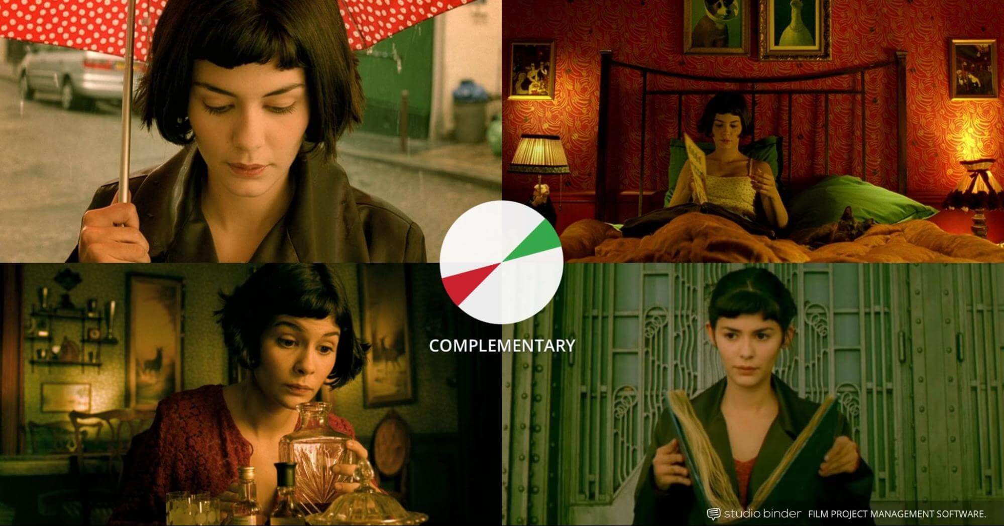
Amelie • Color Scheme Examples
Adding tints and shades of those hues will help to soften the contrast and create a more subtle, unified look. By balancing both hues throughout the design, an artist can create harmony while still showcasing bold visual accents.
Neutral colors such as black and white can also be added to enhance the design by providing extra depth and texture.
Related Posts
Types of Color Schemes
Triadic
Triadic color schemes are created by selecting colors that are evenly spaced around the color wheel. This type of scheme is an easy way to provide balance and contrast, as it combines three colors with equal visual weight.
To create a triadic scheme, an artist should start by choosing one primary or secondary color from the wheel, then select two other hues that are equally spaced away from it.
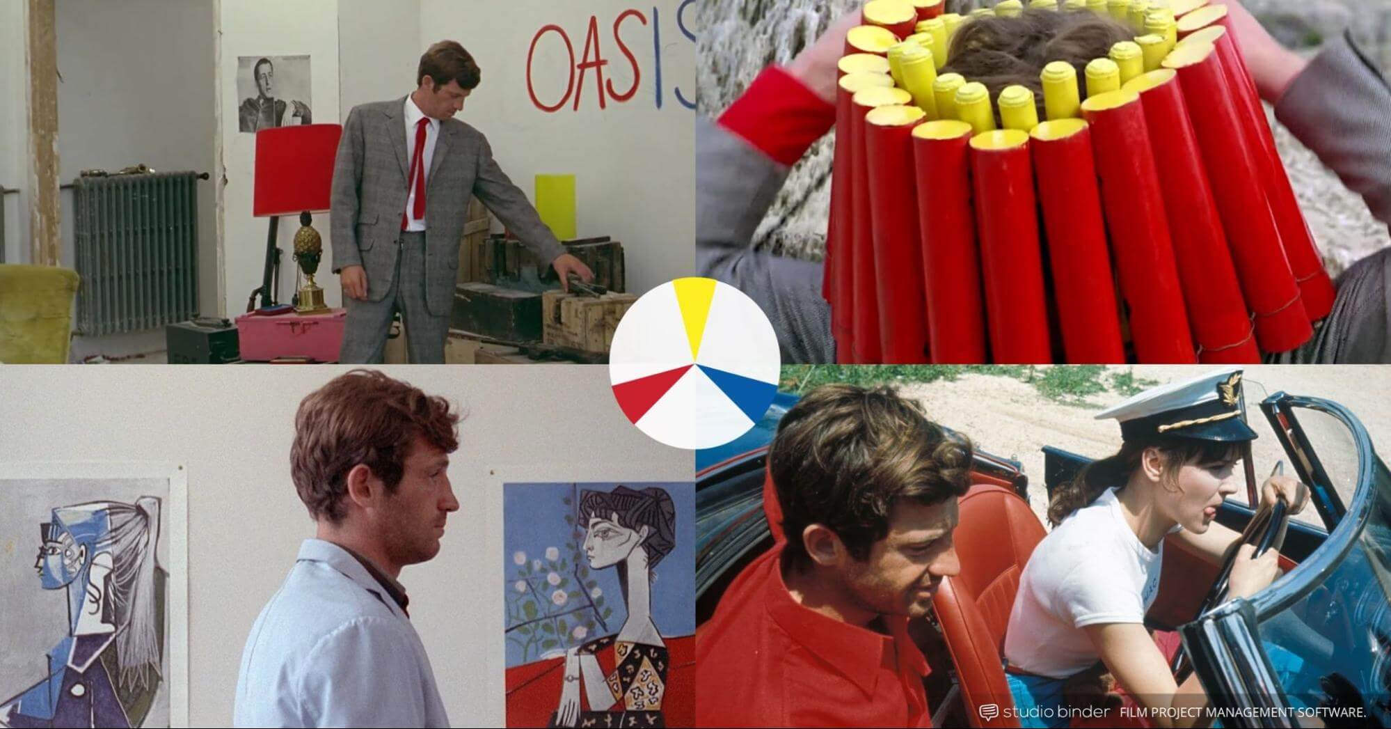
Pierrot le Fou • Color Schemes in Art
All three colors should be of equal visual weight and placement throughout the design for balanced contrast. The addition of neutral colors such as black and white can further enhance the design and provide more texture and depth
Split Complementary Color Scheme Defintion
Split Complementary
A Split Complementary color scheme is created by selecting a base hue, then combining the two hues on either side of its complementary color. This type of scheme pairs a base color with two contrasting, yet harmonious colors on either side.
To create a split complementary scheme, an artist should start by selecting one primary or secondary hue from the color wheel.
Next, select the two hues adjacent to its complementary hue for maximum contrast and maximum impact.
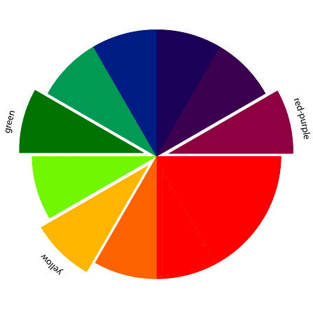
Split-Complementary Color Scheme Meaning
A Split Complementary color scheme offers an easy way to create contrast and balance in a design. By pairing a base hue with two hues on either side of its complementary color, this type of scheme brings out the best qualities of each color while providing maximum contrast. This type of scheme is great for creating eye-catching designs with maximum impact and visual interest.
Tetradic Color Scheme Definition
Tetradic/Double Complementary
A Tetradic color scheme is created by selecting four distinct hues from the color wheel: two sets of complementary colors. To create a Tetradic colors, an artist should start by selecting one primary or secondary hue from the color wheel then choose its complementary hue.
The remaining two colors should be chosen opposite each other on the same side of the complementary pair, creating a balanced yet vibrant palette.
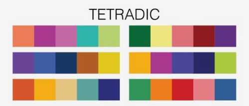
Tetradic Color Schemes in Art
A Tetradic color scheme is used to achieve maximum contrast and balance, which can be especially effective in creating visual interest in a design. By combining four distinct hues from the color wheel – two sets of complementary colors – this type of scheme creates tension and depth as well as a vibrant composition.
Neutral Color Scheme Defintion
Neutral
A neutral color scheme is one that consists of mostly white, black, and shades of gray. This type of color palette is often best suited for creating a calming and subtle atmosphere in a room or space since the colors do not create too much visual stimulation.
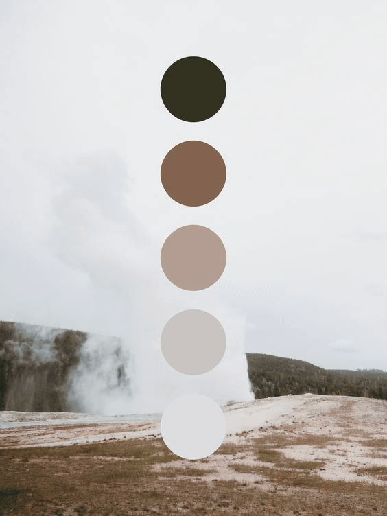
Neutral Color Scheme Meaning
Neutrals work well together as they are versatile and complement various other elements such as artwork, texture, and pattern.
In addition to providing a pleasing aesthetic, neutral colors can be used to create harmony within any design.
A neutral color scheme can be used to create a calming and subtle atmosphere in any room or space. These colors do not create too much visual stimulation, so they can be ideal for creating a peaceful environment.
What is a Color Scheme in Art?
Accented Neutral
An accented neutral color scheme is a way to add visual interest and depth to an otherwise neutral palette. This type of palette adds a pop of bold or bright colors, such as red, blue, yellow, orange, green and purple, to the mix while keeping the overall look subtle and muted.
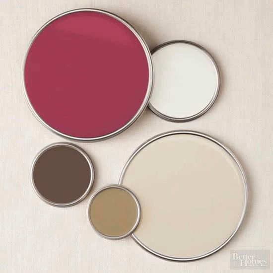
Types of Color Schemes • Accented Neutral
By incorporating accent colors you can create unexpected combinations that bring the room to life and give it a dynamic feel. Accents can be added through accents pieces like artwork, pillows or rugs.
What Does Color Scheme Mean?
Choosing the Right Color Scheme
Choosing the right colors for a creative project can be a daunting task. To get started, consider the mood or atmosphere you want to create.
Do you want something calming and tranquil, energetic and vibrant, or somewhere in between?

What is a color scheme in design?
Think about how the colors will interact with each other, as well as any accents that may be used. You can play around with variations to get an idea of what works best for your project.
Check out sources of inspiration such as photography mood boards, interior design mood boards, or fashion boards for various color ideas.
Color schemes are an important component in any creative project and can make the difference between a dull, uninspired design and one that stands out.
With so many options to choose from, consider your project’s purpose and decide on a scheme that captures its essence and emphasizes the desired emotion. By following these tips you can create beautiful color schemes for any project.
Up Next
How to Use Color Theory in Film
Color schemes are an incredible tool for any medium, but especially filmmaking. Cinema relies on emotion evoked through visuals and sound. A potent way to do this is through color theory. Learn more about color theory uses in filmmaking in our next article.
Up Next: Color Theory in Film →
Showcase your vision with elegant shot lists and storyboards.
Create robust and customizable shot lists. Upload images to make storyboards and slideshows.
