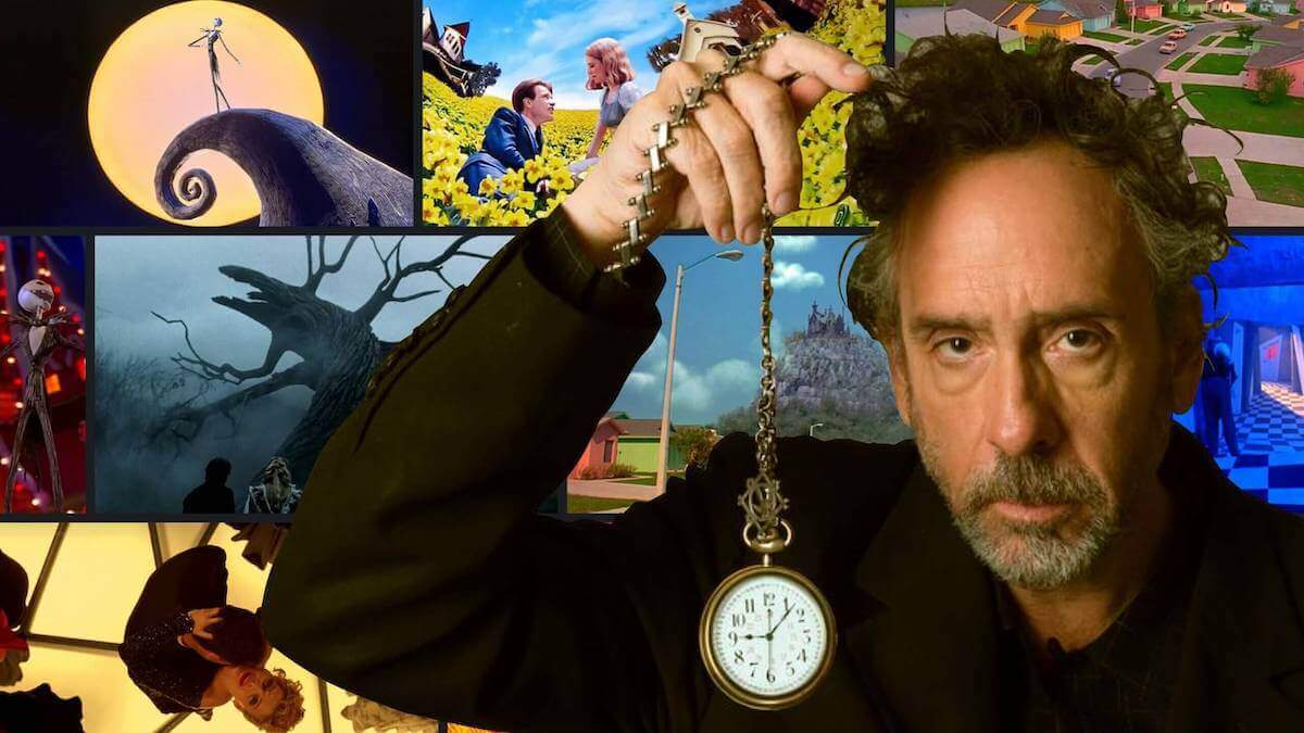
Tim Burton is a filmmaker with a style so unique that we’ve come to regard his works — and those who replicate them — as Burtonesque. And we see the Burtonesque in every facet of his films: writing, lighting, music, characters and of course, production design. We’re going to explore the Tim Burton style and his singular mise en scene with the purpose of better understanding expressive filmmaking. By the end, you might be inspired to create something equally audacious and bold.
Tim Burton Style Analysis
Elements of mise en scene
If you’re unfamiliar with the term mise en scene, don’t worry – it quite simply refers to all the elements that go into making a visual image. For more on mise en scene, here's breakdown of how directors like Stanley Kubrick have mastered the elements of film-language.
What is Mise en Scene? • Subscribe on YouTube
Perhaps no filmmaker knows how important mise en scene is more than Tim Burton. Mise en scene plays a huge role in creating mood (the feel of a story) and tone (the attitude of the artist). We can see the effects of expressive mise en scene everywhere in Burton’s best movies — and it’s largely responsible for how we feel about his film-worlds. Now let’s jump into Burton’s mise en scene by breaking down some of its most noteworthy elements.
Who is Tim Burton and How Does He Write?
How to write light and dark stories
Tim Burton isn’t so much of a screenwriter as he is an idea conceptualizer. In fact, nearly all of Burton’s writing credits are for story/character conceptualization, not screenwriting.
So, what can we learn from the Tim Burton aesthetic of dreaming up film worlds? Well to understand the Tim Burton style of filmmaking and story-conceptualizing, we have to go back to the beginning.
In the early 1980s, Burton began working at Walt Disney Studios as an animator. Two years later, he directed his first official short titled Vincent — which was a sort of autobiographical ode to Edgar Allan Poe and Vincent Price.
Vincent is a foundational piece in establishing the Tim Burton art style and one of the best short films of all time. Considering this, let’s review the short film by paying special attention to detail for story conceptualization.
Tim Burton Art Style Takes Off in Vincent
What do you think of the Tim Burton style of filmmaking here? Personally, I think Vincent is a perfect example of the best aspects of what you might call a “Tim Burton writing style.” Vincent is actually based on a poem by Burton in the style of a Vincent Price monologue.
The content of the poem is full of things we’ve come to expect from Burton’s works; such as a focus on existential dread, ghoulish monsters, and the macabre. Although it’s somewhat impossible to do, I suggest you try to imagine Burton’s works without any visuals at all. That’s the first step in understanding all the best characteristics of Tim Burton films.
Style Tim Burton’s World
The art of contrasting design
There are two sides to Tim Burton’s production design: the naturalistic side and the theatrical side. The naturalistic side tends to mimic Burton’s own exaggerated view of “American suburbia,” like it does here in Edward Scissorhands: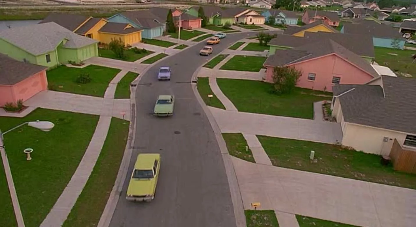
Naturalistic Tim Burton Set Design
The American suburbia Tim Burton aesthetic is defined by bright and bold colors, as well as 1960s architecture and cars. It stands in stark contrast to Burton’s theatrical side, which is defined by Gothic overtones and mechanical machinations and heavily inspired by German Expressionism.
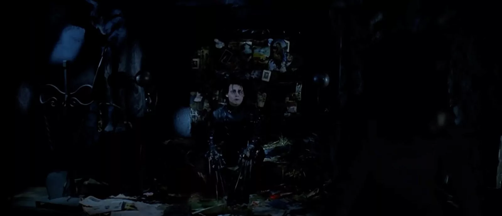
Theatrical Tim Burton Set Design in Edward Scissorhands
Both sides of the “Tim Burton design style” are exaggerated — but they’re diametric to each other. I suppose it’s true that contrast is king when highlighting differences between two sets; a point proven by Edward Scissorhands.
When thinking about ideas for designing your own sets, consider how Burton uses the naturalistic side in an ironic sense to suggest “this is where the true villainy lives.”
Tim Burton Style Analysis of Lighting
How to light a scene like Burton
Film lighting is a vitally important aspect in creating the atmosphere of a scene. Oftentimes, lighting is the difference between a visually enveloping scene and a hard-to-make-out scene.
Take a look at this shot from Tim Burton’s Batman for example:
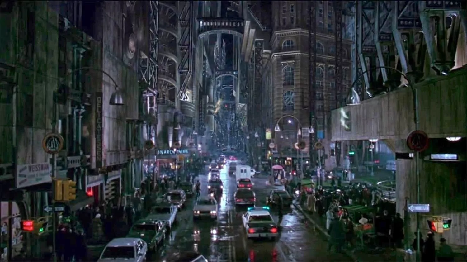
Burtonesque - The World of Tim Burton's Batman
To me, this shot says “this setting is alive.” It’s active — traffic signs emit red and green neon, lampshades illuminate rain-soaked streets, and Gotham citizens populate all the space in between. Now think about if this scene were lit differently — or if it were lit less. Would it feel kinetic? Or would it simply be dark and dreary? I think the answer is clear.
Now let’s take a look at a shot from Big Fish to see how it was lit very differently from the shot in Batman.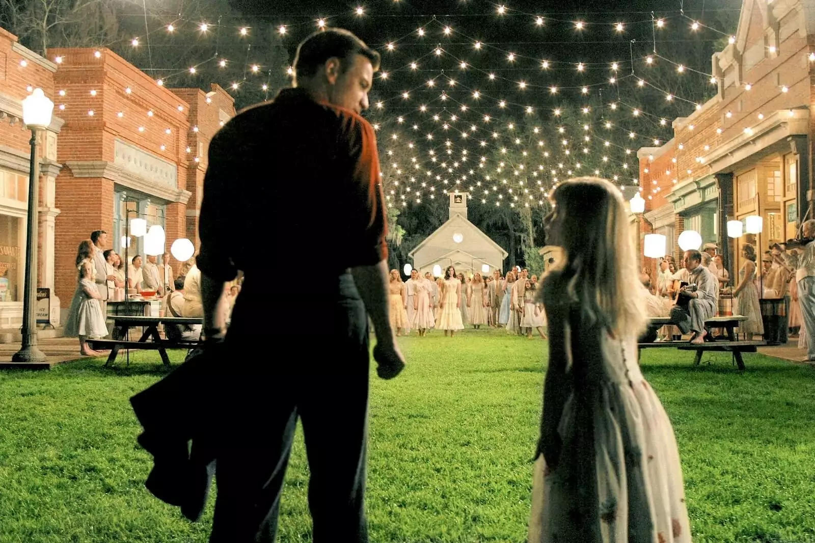
The World of Tim Burton’s Big Fish
What do you think of this shot? I think the bright lights communicate a dreamlike-feel and serve as a bridge between Burton’s naturalistic and theatrical perspectives. This is a set that’s grounded in reality but elevated by exaggerated lighting. All in all, it’s singularly Burton.
If you’re interested in exploring other lighting styles, check out our list on the best video lighting kits for filmmakers.
Tim Burton Style Analysis of Music
Burton and Elfman — A Musical Pair
Tim Burton and composer Danny Elfman have worked together on 16 films and counting. Their 30-year working career is one of the most prolific in modern cinema. Let’s take a look at the trailer for their documentary interview together and then we’ll explore how Elfman has helped to style Tim Burton and his movies with an equally specific aesthetic.
A Conversation With Danny Elfman & Tim Burton Trailer
Danny Elfman’s scores play a huge part in the success of nearly all of Tim Burton’s feature films — from the bizarro synth-sounds of Beetlejuice to the orchestral horns of Batman.
And the great thing about Elfman is that his scores are always exaggerated, and singularly unique that fits like a glove inside the Tim Burton style.
Their working relationship has proven to be a perfect match. You’ll find Elfman’s scores on many lists of the best movie scores of all time.
Tim Burton Style Analysis of Character Design
Tim Burton characters are unique
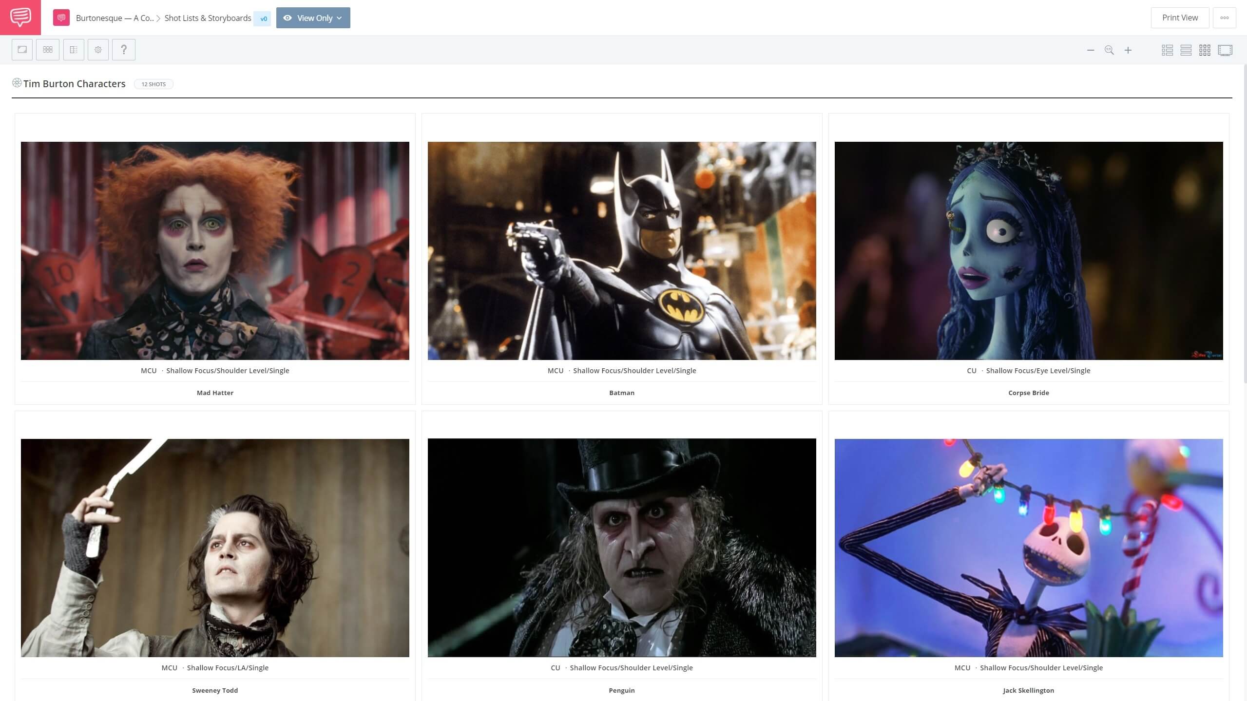
We know Tim Burton characters are unique — and not just for their own sake, they’re an essential aspect of the Tim Burton aesthetic. His characters are defined by their exaggerated features; long frizzled hair, baggy eyes, gangly limbs, etc. But the over-the-top features of these characters often serve the role of a smokescreen, hiding their innate human side.
We imported some of the best Tim Burton character designs into StudioBinder’s storyboarding software — you won’t want to miss our take on these iconic characters. Click below to download the entire collection.
Tim Burton Characters • Click to view the shot list
Tim Burton German Expressionism Roots
Tim Burton costumes have purpose
We also know that Tim Burton costumes are almost always showstoppers. Perhaps we should give credit to costume designer Colleen Atwood who’s worked on 12 films with Burton too. Their working relationship has produced some of the best costumes in recent cinema history, such as the costumes of Edward Scissorhands and Sweeney Todd.
Let’s go behind the scenes of Alice in Wonderland to see Johnny Depp get into character as the Mad Hatter — “Tim Burton style."
Tim Burton Costumes Johnny Depp in Alice in Wonderland
It’s amazing to hear that there’s a historical explanation for the Mad Hatter’s well… madness. Depp says that old hatters used to use glue with mercury to keep the hats together, which sometimes caused the wearer to go mad. This is just one example of a Tim Burton costume design serving more than just an aesthetic purpose.
Tim Burton Style Analysis of Drawing
Inside the Tim Burton drawing style
The “Tim Burton drawing style” is instantly recognizable. Here’s an exercise: take out a piece of paper and a pencil, close your eyes, think of a character Tim Burton would conceptualize and begin to draw it.
What does it look like? Big eyes? Crazy hair? Ghoulish features? Maybe it looks something like Burton’s concept art for Edward Scissorhands.
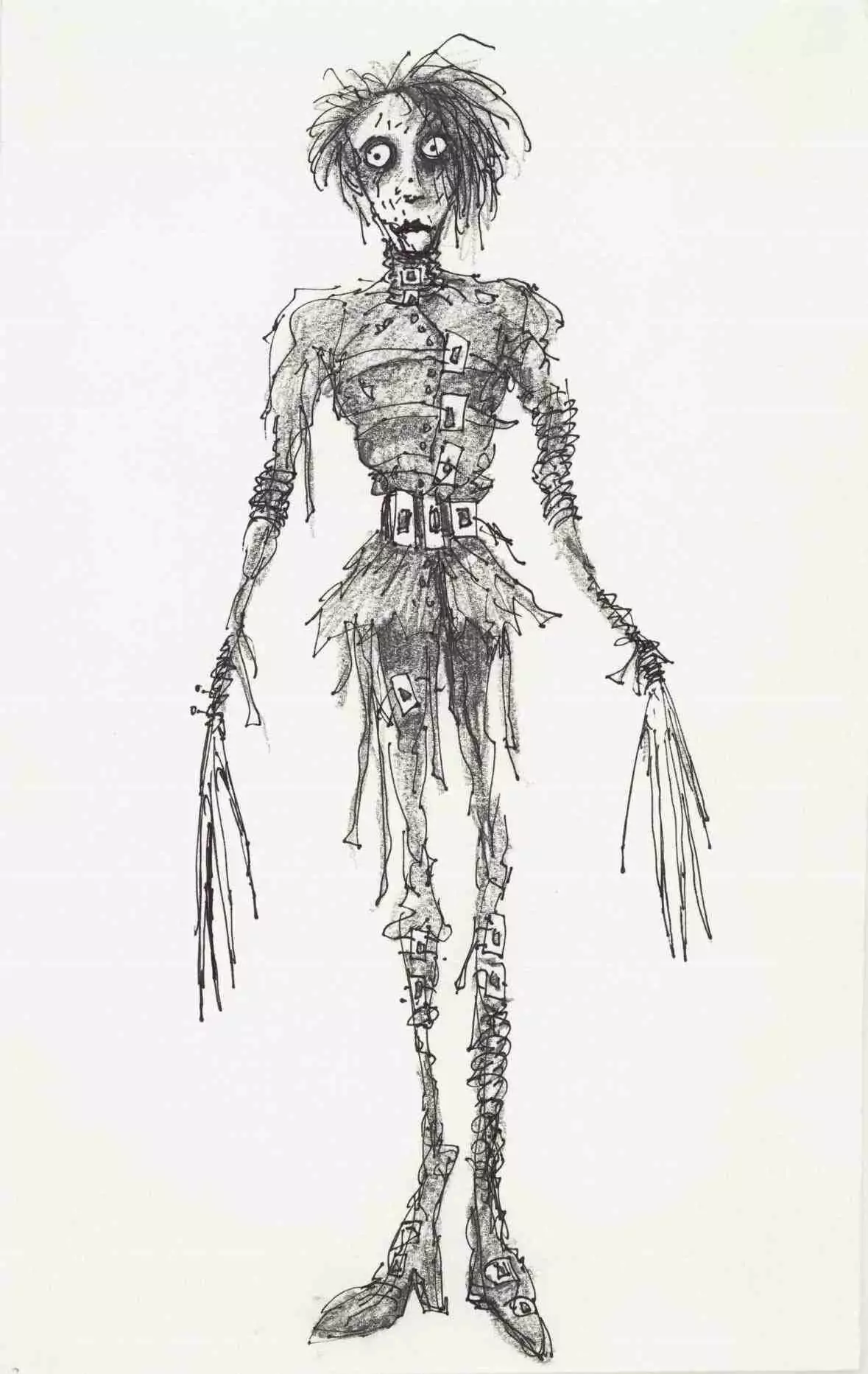
Tim Burton Drawing Style of Edward Scissorhands
We see this approach to detail everywhere in Burton’s works, from Frankenweenie to The Nightmare Before Christmas (which was directed by Henry Selick). Likewise, we even see some Tim Burton animation styles translate over to his live-action films, like they do here in Big Eyes.
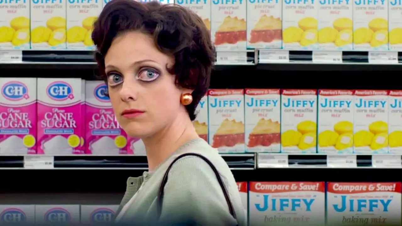
Tim Burton Animation Blends With Live Action in Big Eyes
If you want to create a drawing style as audaciously bold and instantly recognizable as Burton has, don’t do what he’s done, do the opposite; do something in between; do what you want to see. It’s not a bad idea to imitate Burton as a practice in design, but in the end it’s essential that you create your own aesthetic.
Related Posts
UP NEXT
Best Tim Burton Movies, Ranked
Now that we’ve run through a complete Tim Burton style analysis, you might be thinking “what are the best Tim Burton movies?” If that’s the case, check out our article where we rank every movie of Tim Burton’s legendary career. Can you guess which film took the top honor?
Up Next: Burton’s Films Ranked →
Showcase your vision with elegant shot lists and storyboards.
Create robust and customizable shot lists. Upload images to make storyboards and slideshows.
