The size and shape of your storyboards matters. And if you’re wondering if there is a single, standard size and shape of all storyboards, you’d be wrong. But that’s a good thing! There is flexibility in storyboard dimensions, which allows you to visualize your story how you see fit. No matter the scope of your intended project, this post will cover some of the basics of storyboard dimensions and the considerations to make when storyboarding.
Storyboard Frames
The importance of aspect ratio
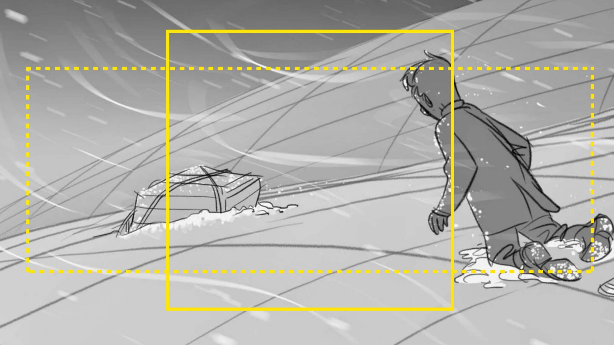
In short, storyboard dimensions should be directly tied to your intended aspect ratio. If your upcoming project will use a 4:3 aspect ratio, your storyboards should obviously match. For a quick reminder, here's how aspect ratio works and why making that decision during the pre-production storyboard creation process is key.

Aspect Ratio & Storyboard Dimensions • Subscribe on YouTube
With a grasp on the storytelling value of aspect ratio, let's discuss storyboard dimensions and the available options. In order to follow along, you should download our free storyboard templates as we'll be referencing them for the remainder of the post.
Free downloadable bonus
FREE Storyboard Template Downloads
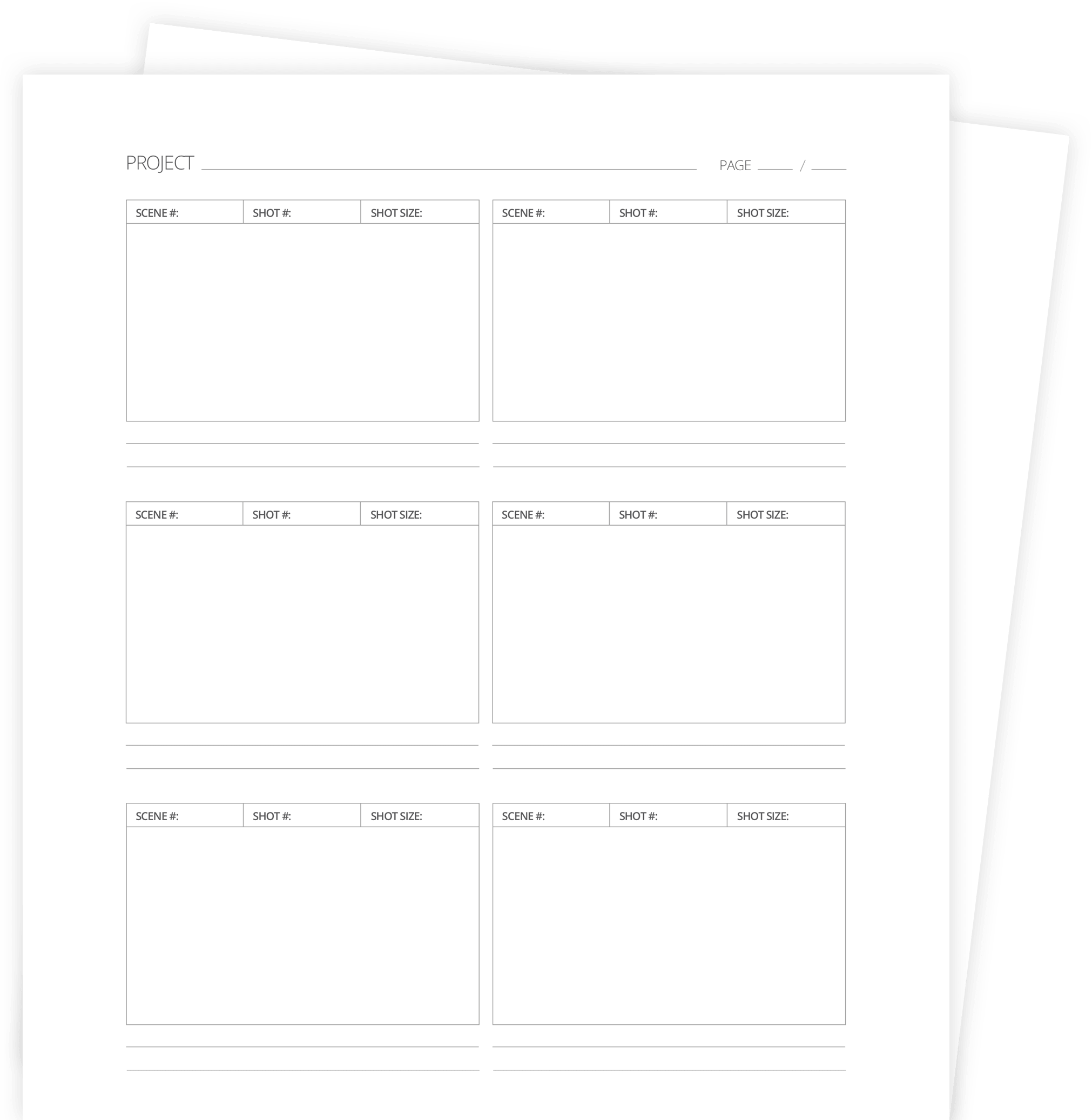
If you prefer the old-school, pen and paper method of storyboarding, download our FREE printable templates. Included are 60+ files for Word, Illustrator, Photoshop, and PDFs. You can also choose various layouts between 2- and 16-panel sheets in landscape or portrait.
Related Posts
Storyboard Dimensions
Basic storyboard dimensions
Storyboard dimensions should be dictated by the aspect ratio of your project. Typically, storyboard print sizes are either Letter (8.5x11 inches), Legal (8.5x11.75 inches), or A3 (11.75x16.5 inches). This means that if your panel dimensions are 4x3 inches, for example, you can fit three panels to one page.
Storyboard dimensions should be as close as possible to the most common aspect ratios:
Is it necessary to have your storyboard panels be the exact aspect ratio? The short answer is no. Granted, having the same aspect ratio would give you a clearer understanding of how to compose your frames. But the general rectangular shape is enough to get the job done.
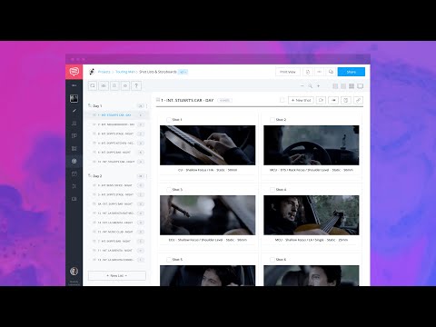
If you're using dedicated storyboard software like StudioBinder's storyboard creator, shifting between these storyboard dimensions is a cinch. You can change the both the aspect ratio and layout to best serve the purpose of your digital storyboard.
Here's an overview of everything you can do with the program.

StudioBinder's Storyboard Creator • Create Your Storyboard Now
Related Posts
Storyboard Layout
Most common storyboard layouts
Now that we know the basic storyboard dimensions for individual panels, we need to discuss how storyboard panels are displayed. This is where a lot of variety can be found and it all depends on how detailed you want to be.
Naturally, a three-panel storyboard would allow much more space for each panel than a 12-panel page. But there are pros and cons for each to consider.
A sheet with fewer panels allows for larger frames and more detailed images. But the tradeoff is that you can only view a limited amount of panels at once.
Conversely, a sheet with more panels allows the viewer to see more context and the general flow of how each shot leads to the next. The downside there is the limited detail your storyboard artist would be able to include.
There is also a consideration for where the text, storyboard notes and storyboard arrows fit into the layout. Obviously, the more space needed for these annotations and shot specs, the less room available for the storyboard panels.
Related Posts
UP NEXT
Create your own storyboard
Now that you've got some options on how to display storyboards, it's time to create your own. No matter which presentation mode you prefer, having dedicated storyboard software on your side will undoubtedly bring an element of efficiency and professionalism to your pitch.
Up Next: StudioBinder's Storyboard Creator →
Share your vision with elegant shot lists and storyboards.
Create robust and customizable shot lists. Upload images to make storyboards and slideshows.


