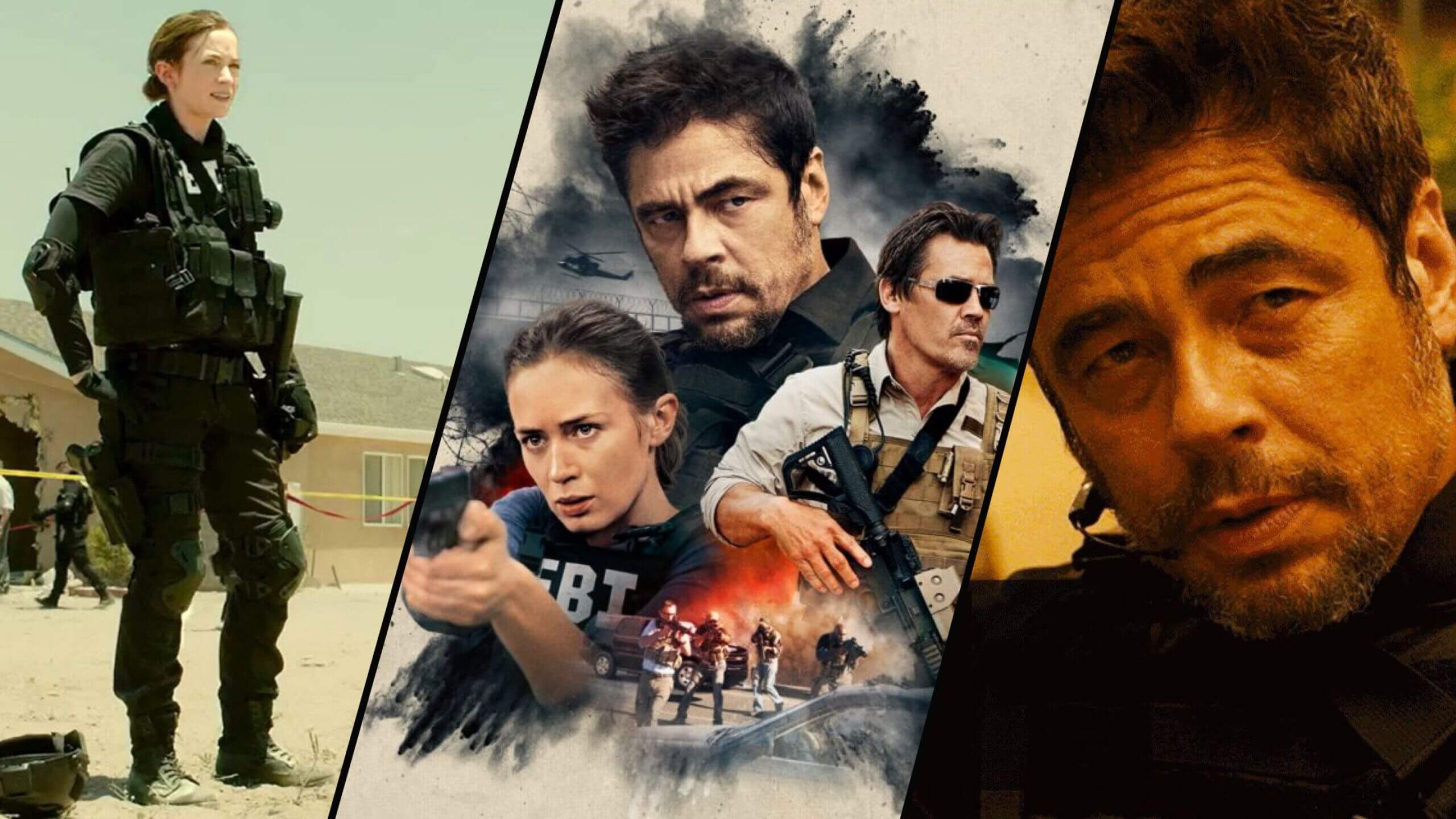
When a director has a formidable visual style, you need an equally formidable cinematographer. Perhaps that’s why Denis Villeneuve and Roger Deakins have had such a fruitful collaboration. In this post, we’re going to look at their work in Sicario and how elements like lighting and composition were used to support the themes at play. Watch the video below as the two filmmakers discuss their collaboration before we expand what makes the Sicario cinematography so noteworthy.
Sicario Cinematography — Composition
“Cutting the frame”
As explained in the video above, one of the go-to Roger Deakins cinematography techniques is to “cut the frame.” By this, he means to use architecture, objects, characters, or anything else to help focus the audience’s attention in a certain portion of the frame.
For example, if you’re shooting through a doorway, it gives the viewer a limited perspective and this has two main effects.
Firstly, this technique can also be used to generate a perceived threat, as if we’re occupying the point of view of somebody watching. Think of the best horror movies or thrillers where the killer peeks around a corner at their soon-to-be-victim.
Secondly, as Deakins says, it “simplifies the frame” meaning you eliminate extraneous visual information so that the audience only sees what you want them to see.
This functions similarly to cutting to a close-up shot from a wide shot to “point” to something specific. However, if you cut the frame, you can stay in a wide shot and the viewer will automatically focus where you want them to.
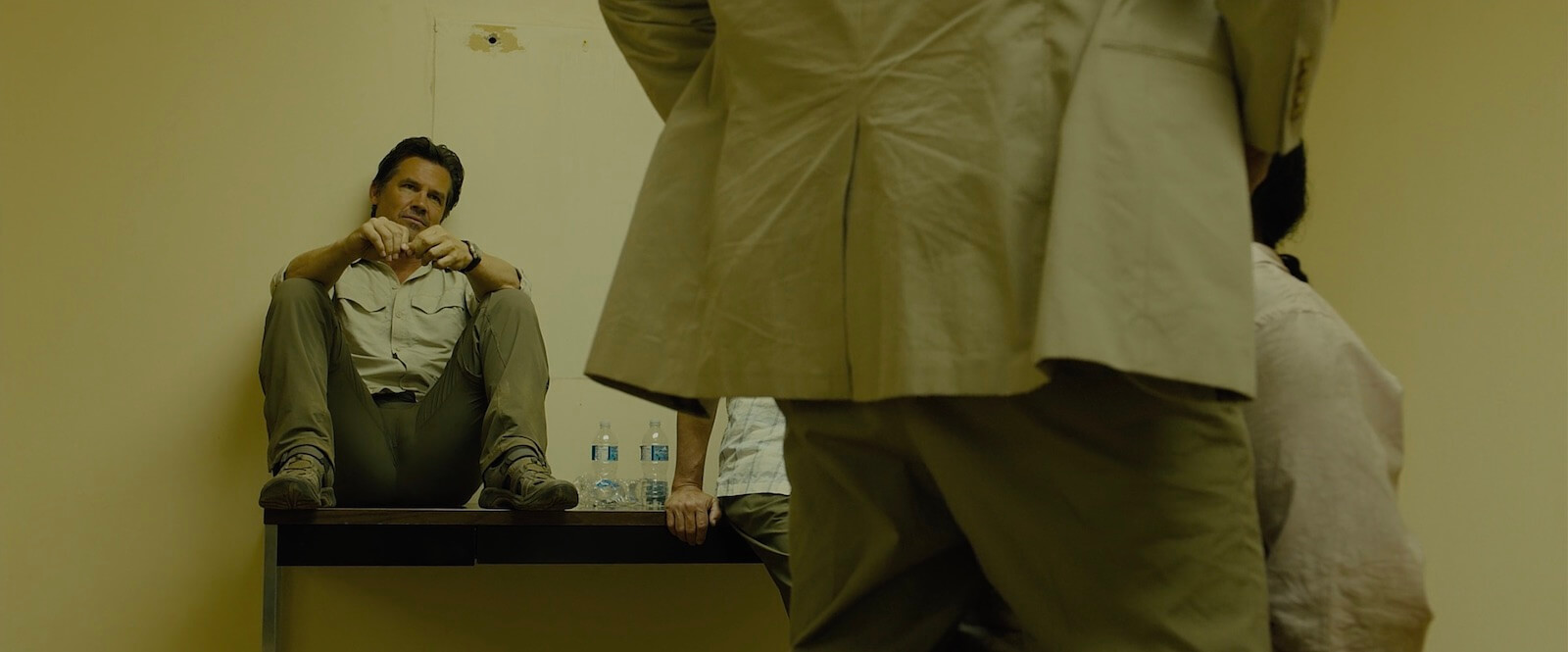
In this tense moment, Alejandro blocks half the frame, which allows us to pay attention to Matt in the background. This is really effective blocking and staging. It shows how Alejandro's power and Matt's indifference in one shot.

Roger Deakins Sicario Cinematography • “Cutting the frame”
Alejandro and his prisoner occupy the right half of the frame while Matt sits in the background on the left side. Essentially, this gives us two shots in one. There’s no need to cut to a close-up of Matt as he delivers his lines because he’s the only face we can see.
Also, this camera framing accentuates Matt’s indifference to what’s about to happen to the prisoner. He sits casually on the table, almost bored. Which aligns with what little we know about Matt’s personality and perspective on this entire operation.
For more on composing frames with different camera lenses, make sure to download our ebook: The Ultimate Guide to Camera Lenses.
Free downloadable bonus
FREE Download
Camera Lenses Explained
Every type of camera lens has distinct qualities and visual characteristics that every image-maker should understand. Download our FREE e-book to get in-depth explanations on prime vs. zoom lenses, anamorphic vs. spherical lenses, wide angle, standard, telephoto and even specialty lenses that all tell a slightly different story.
Sicario Cinematography — Lighting
Sicario lighting & good vs. evil
In Sicario, lighting techniques are often used thematically. This means that themes like good vs. evil can be echoed in how a scene is lit. Conceptually, this is nothing new — shadows are bad, light is good. But just because something is simple or well-known doesn’t mean it can’t still be used effectively.
Watch this breakdown on how using fill light is the actually most important light when navigating the amount of shadows in a scene.
Fill Lighting Techniques • Subscribe on YouTube
For the final scene between Alejandro and Kate, this is the exact technique we’re describing. It’s a very straightforward scene in which Alejandro threatens Kate’s life if she doesn’t sign a document. She is more evenly lit in front of a white wall while Alejandro is backlit in front of a dark counter and cabinet.
Watch the scene and then we’ll talk specifically about the lighting.
Roger Deakins Sicario Cinematography • Alejandro vs. Kate
All we see of Alejandro is the edge of his face and a single point of catchlight in one eye. He blends into the darkness eerily well and that’s the point. Alejandro is a mysterious and dangerous force. He is someone Kate has never been able to fully understand.
Kate, on the other hand, is an open book. She holds no secrets and she is vulnerable. And, so, having her exposed while Alejandro is obscured is a visual way to illustrate the internal and external conflict between them and their opposing ideologies.
Download and read the Sicario screenplay to see just how different this scene was written. It focuses on the same power dynamic between these two characters but the actions taken to illustrate it are markedly different.
Sicario Cinematography Scene Study
Sicario border scene breakdown
If you’ve seen the film, you know that the Sicario border scene shootout is pure tension. In the middle of stopped traffic, the extraction team finds themselves in a standoff and firefight. What’s notable about the Sicario border scene is that despite the severe and tense situation, the camera is calm and clinical — just like Alejandro and his team.
Let’s watch the scene one more time — it’s just that good.
Sicario Border Scene
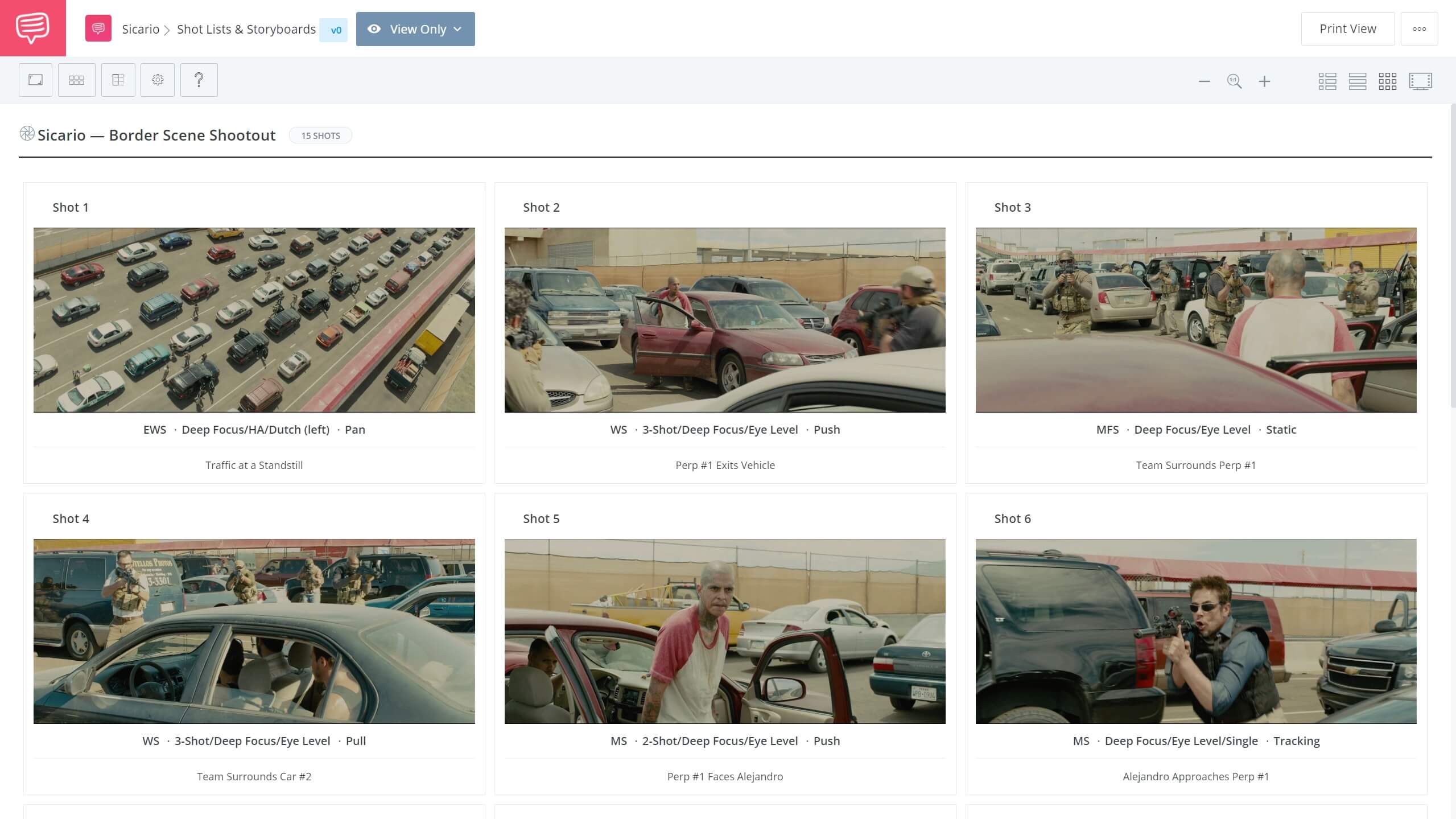
So, how does a scene like this get constructed? Naturally, a lot of work is done in editing to find the right rhythm but the plan starts with the shot choices. Let’s look at the individual shots from a portion of the standoff in a storyboard we put together using StudioBinder’s storyboard creator.
This way, when we look at the pieces of the puzzle individually, we can fully appreciate the big picture. Click the image to explore the entire storyboard.
Sicario Border Scene Breakdown • Open the storyboard
You can imagine how the Sicario border scene could have been presented using a more “contemporary” style. This would include handheld shots, rapid-fire editing, and camera movement to ratchet up the tension. Take a deep dive into our comprehensive analysis of the Sicario border scene.
Sicario Border Scene Breakdown • Subscribe on YouTube
Granted, that presentation style would have been appropriate for the scene and probably effective.
But the lesson here is that a more hectic visual style for anything like the Sicario border scene is not your only option. Keep the coverage in wide shots and medium shots. Add a few strategic Steadicam shots with a slight push in. And let the shots linger just a bit to build the anticipation.
UP NEXT
Blade Runner lighting effect explained
Roger Deakins’ Sicario cinematography seems to compliment Denis Villeneuve’s directing style perfectly. And lucky for us, this wasn’t the only film they’ve done together. In the next post, we look at a very specific lighting effect in another one of their films, Blade Runner 2049. Deakins explains how the iconic “water light reflection effect” was pulled off — and it’s much easier to do than you think it is.
Up Next: Blade Runner's water light effect →
Showcase your vision with elegant shot lists and storyboards.
Create robust and customizable shot lists. Upload images to make storyboards and slideshows.


