Mise en scene plays a huge role in communicating the tone of a story — but what is mise en scene? In classical terms, mise en scene is the arrangement of scenery and stage properties in a play or film. Today, mise en scene is regarded as all of the elements that go into any single shot of a production. Four of the most important aspects of mise en scene are: sets, props, costume/hair/makeup, and lighting. We’re going to show you how master filmmakers apply color to these four aspects of mise en scene with examples from films by Stanley Kubrick, Wes Anderson and more.
Breaking Down The Movie Color Palette
How to use color in set design
One of the most effective ways to make a set stand out is by using bold colors — but using bold colors can be a double-edged sword; if you’re going to use colorful sets, there should be a reason for it. Sometimes, the use of overtly colorful sets can create the feeling of a magical world, like it does in Willy Wonka and the Chocolate Factory.
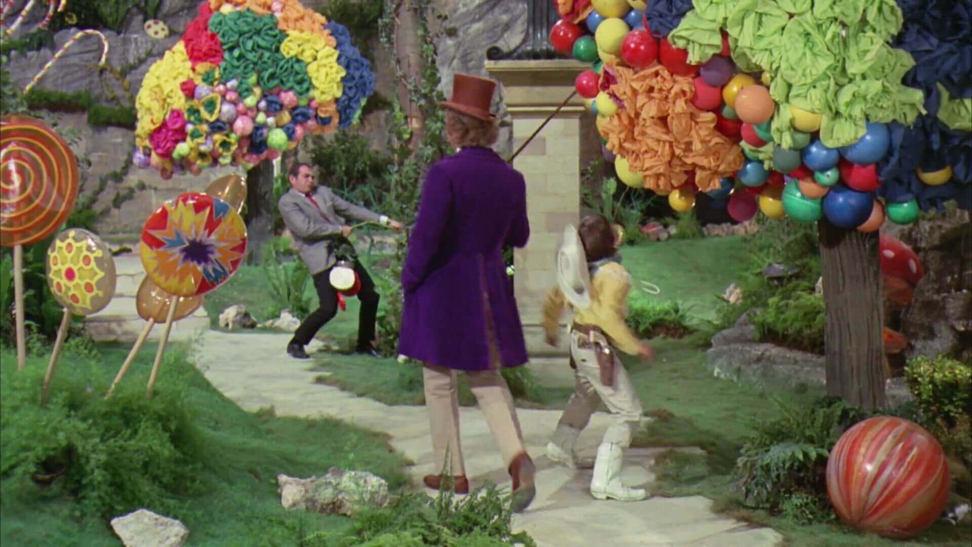
Willy Wonka and the Chocolate Factory's Movie Color Palette
Other times, color in cinema does a great job of instilling within us a feeling of whimsy, or peculiarity. Perhaps nobody does a better job of creating peculiar, yet enticing sets than Wes Anderson. This next video explores Anderson’s color palettes and how they fit into Anderson's directing style. You’ll notice that his movie sets are almost always colorfully expressive.

Color Theory and Wes Anderson’s Style • Subscribe on YouTube
It’s one thing for a movie set to have colors, it’s another for those colors to have subliminal meaning. Of course “subliminal meaning” carries with it a lot of subjective baggage, but most filmmakers would agree that the overuse of a certain color, whether it be red, blue, green, yellow, etc., results in a tonal impact on the story.
So, rather than all of these colors being mixed and matched like they were in many of the sets of Willy Wonka and the Chocolate Factory, filmmakers can carefully play with color for tonal effect. This next video explores how color has been used throughout cinema history as a means of subtle suggestion.
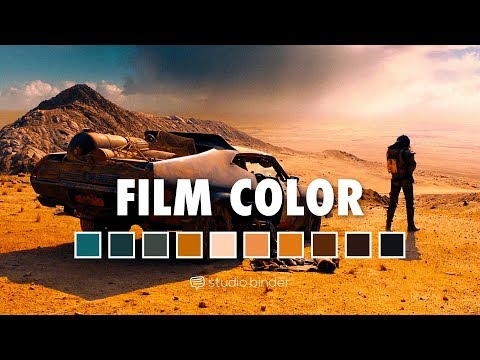
Color Theory in Film • Subscribe on YouTube
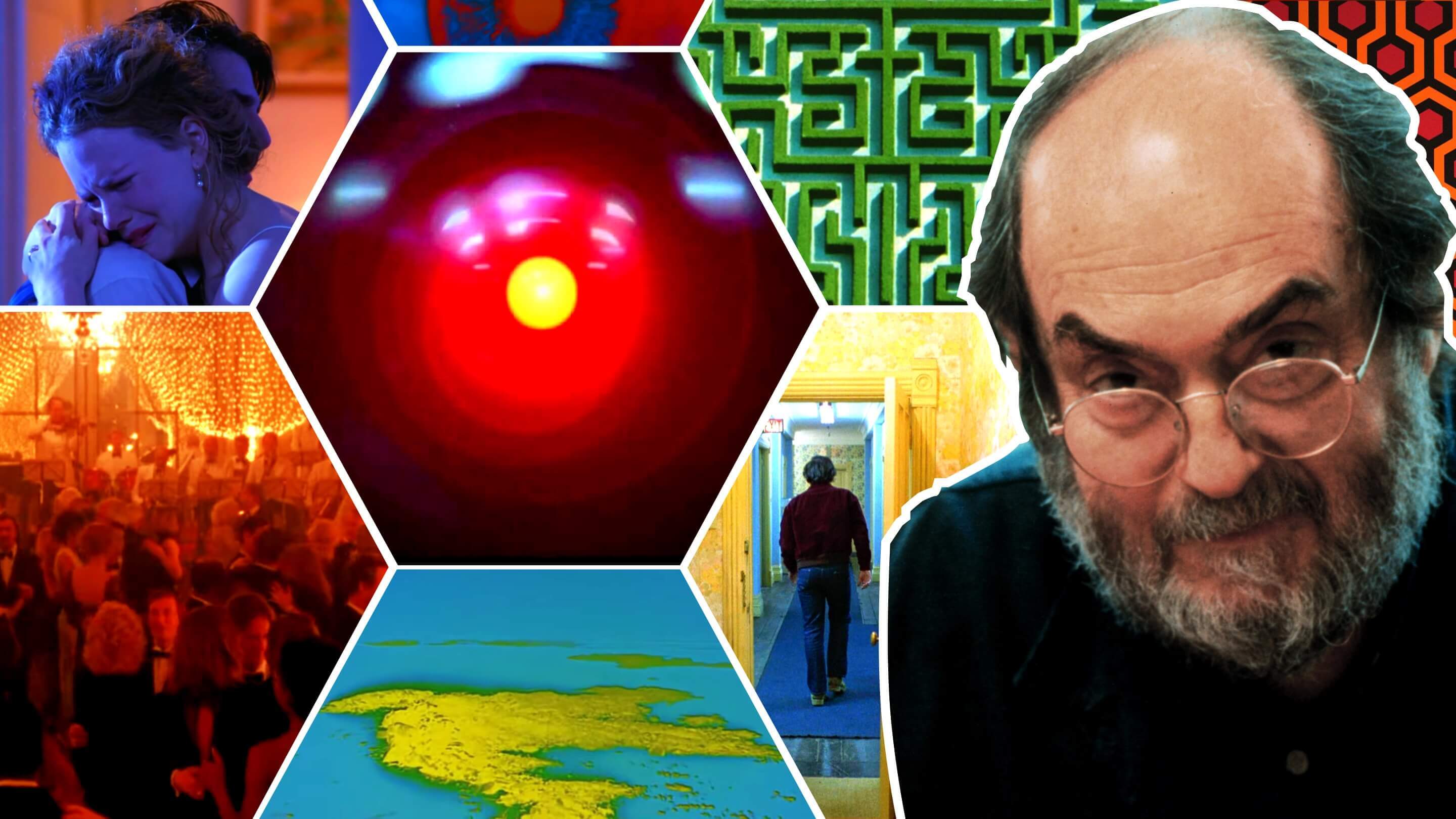
Few filmmakers are better at this kind of conscious application of color than Stanley Kubrick. Kubrick is a master of allowing a single color to dominate the visual mood of a scene. Let’s look at a few examples to see how he does it.
Kubrick often uses red to suggest hostility and high-tension, like he does in this scene from The Shining.
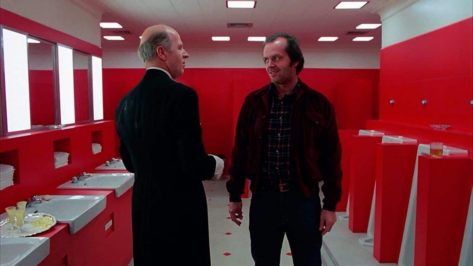
Mise en Scene Elements of Set • The Shining
Kubrick uses green in two ways — to connect us to the natural world:
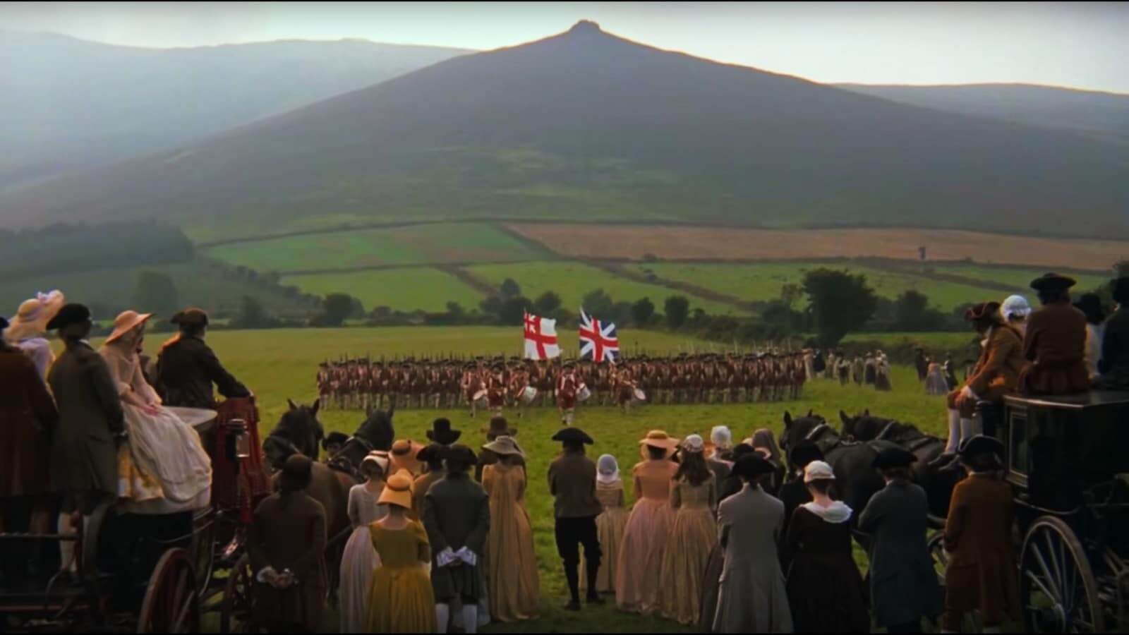
Mise en Scene Elements of Location • Barry Lyndon
And to communicate a sense of life and death or birth and rebirth.
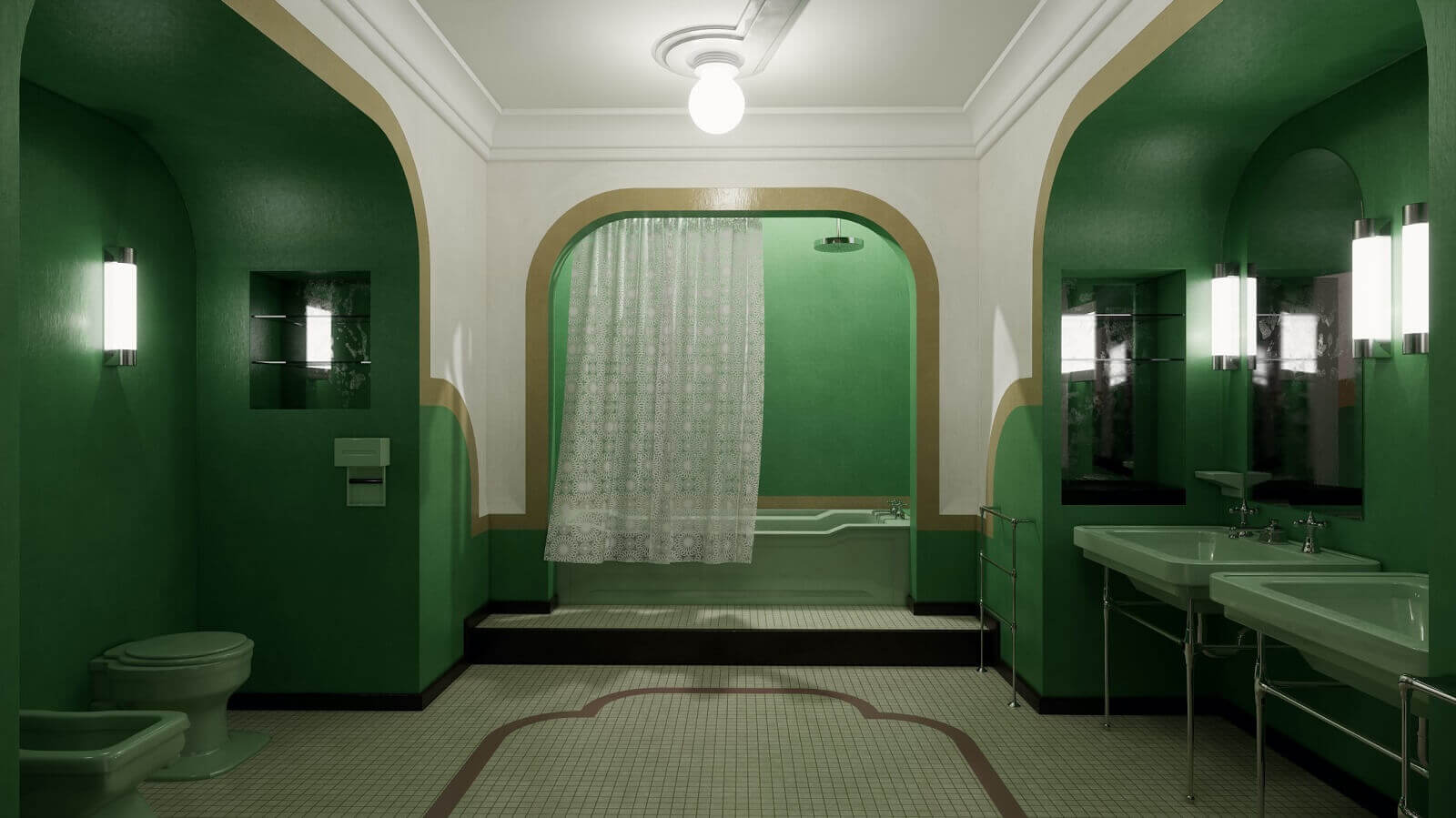
Mise en Scene Elements of Set • The Shining
There are a lot of different ways to use color in sets, whether they be constructed or natural. Consider how directors like Mel Stuart, Wes Anderson and Stanley Kubrick used color in their sets before you begin designing your own. But sets are just one part of color in the mise en scene film elements, let’s move on to props!
Color in Film Props
How to use color with props
Props play an enormous role in characterization and tone. For example: what if Batman used pink batarangs instead of black ones? Would the tone of the story still be dramatic? Or would it be kind of funny? How would we feel about his character? Would we still think of him as a brooding vigilante? Or more of a satirical superhero?
There’s no right or wrong when using colors with props, but you should be mindful of the impact they may have on the audience. Sometimes it’s okay for props to be colorful for the sake of being colorful, like they are in Jacques Demy’s The Umbrellas of Cherbourg:
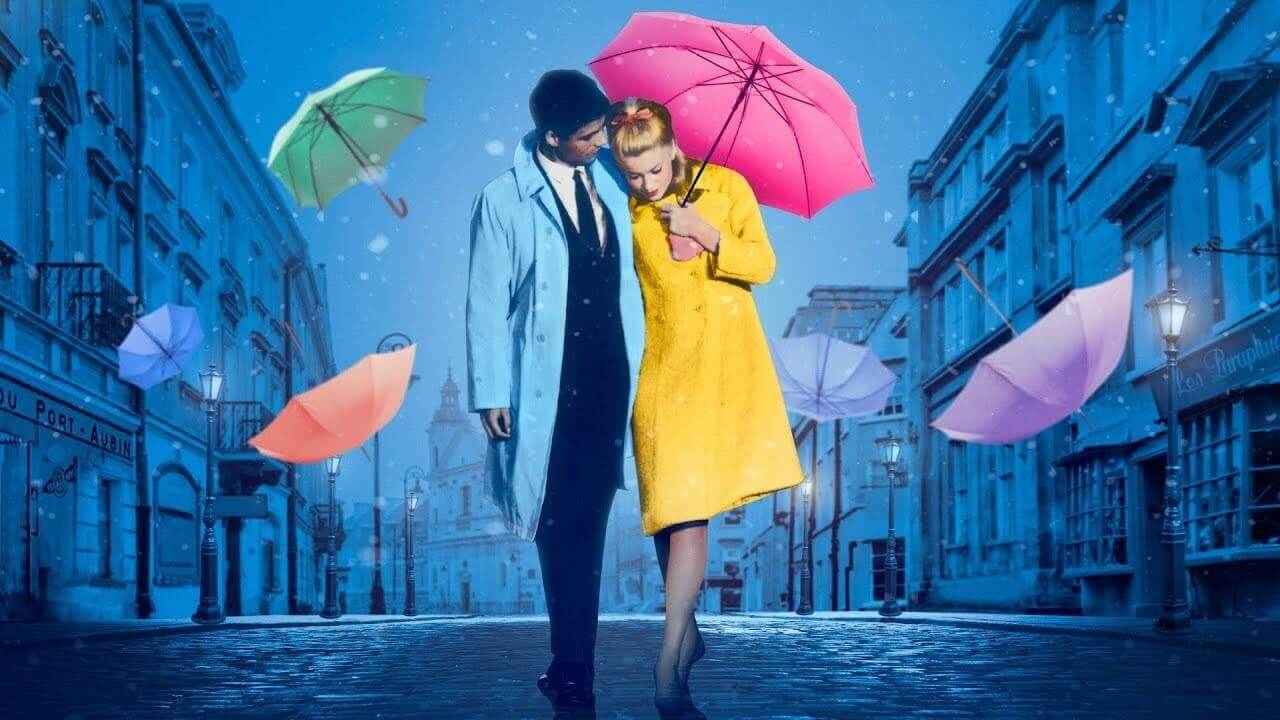
Mise en Scene Examples • The Umbrellas of Cherbourg
Other times, it makes more sense for the color of a prop to have intrinsic meaning or for it to aid the theme of the story. Let’s look at some of the best props of all-time to see what makes them stand out.
First, the Golden Snitch in Harry Potter:
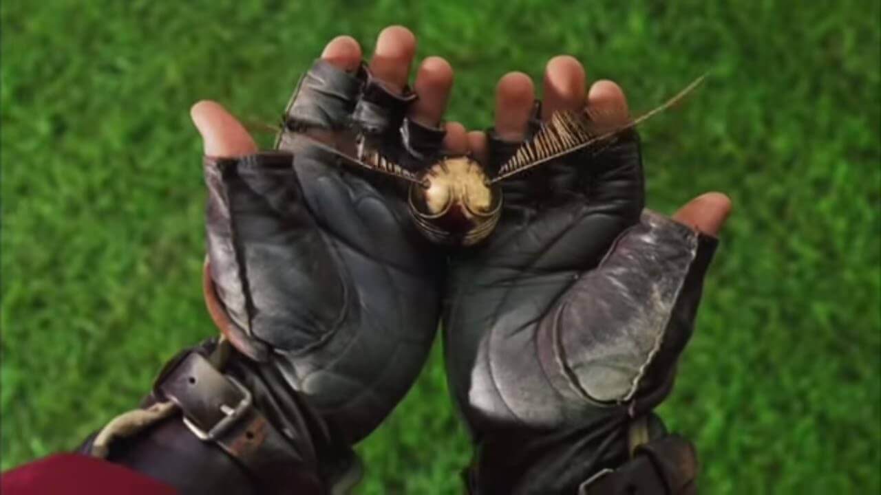
Mise en Scene Analysis • Harry Potter
When gold is used as the color for a prop, we think that it must be an object of value. More importantly, we think that it’s an object characters covet. So when our protagonist gets their hands on it, we usually regard it as a victory.
Props can also use movie color palettes to communicate conflict. There is perhaps no better example of “prop conflict” than the red and blue lightsabers in Star Wars.
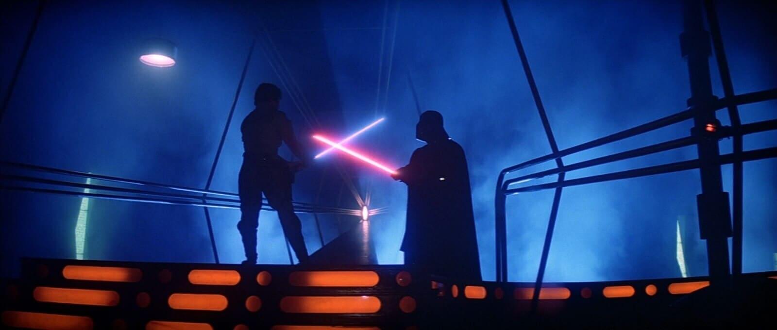
Mise en Scene Props • Star Wars
There are other lightsabers colors, but this “good vs. evil” conflict in Star Wars is best exemplified by blue and red. The blue and red prop “color in film symbolism” is used in other films to suggest diametric differences as well.
Take The Matrix for example: Morpheus offers Neo two pills — one blue, one red. He’s told that the former will allow him to return to his old life, and the red will show him the Matrix.
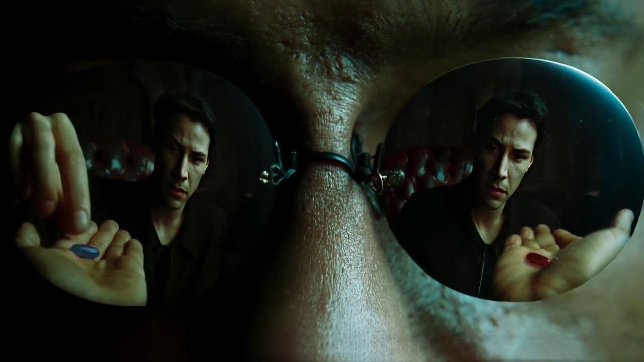
Mise en Scene Examples • The Matrix
Color can be used with props effectively when we’re mindful of the impact they have. Stanley Kubrick used color to make his props stand out too. Let’s look at a few examples to see how he did it:
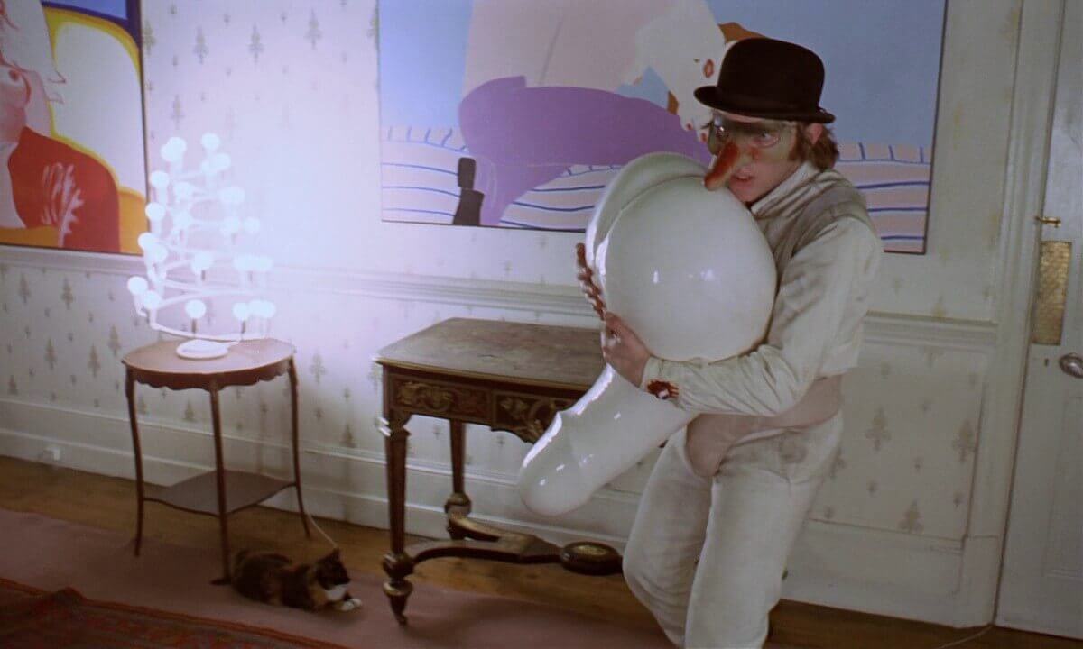
Mise en Scene Examples • A Clockwork Orange
This prop is so juvenile that it should speak for itself. But what do we make of the color? Perhaps it’s nothing… or perhaps the fact that it’s porcelain white is ironic. We typically regard white props as symbols of purity. Conversely, we typically regard phallic statues as symbols of domination.
It’s possible Kubrick could’ve intended for the choice of color in this prop to have an ironic effect — or it’s possible that my interpretation is entirely incongruent to what Kubrick intended. Alas, therein lies the rub in film criticism and film color theory!
Here’s another example from Kubrick that may be more concrete.
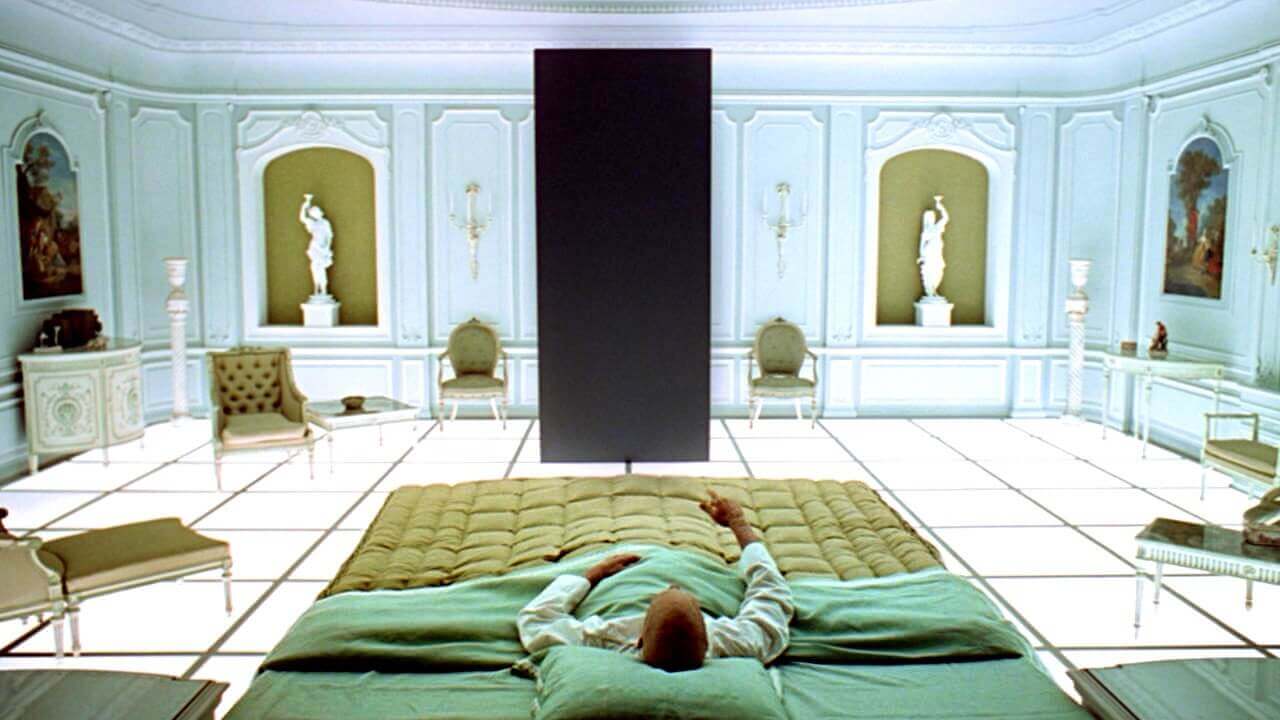
Mise en Scene Examples • 2001: A Space Odyssey
In 2001: A Space Odyssey, Kubrick uses the monolith to stress the absence of color. We’ve touched on how different colors can have different tonal effects, but what is the tonal effect of the absence of color? Well, it’s mysterious that’s for sure. And perhaps more importantly, it juxtaposes white with very specific pops of green.
Ultimately, this color conflict — or color vs. non-color conflict — results in visual symbolic depth. Next, let’s look at some examples of how to use color with costumes, hair and makeup.
Movie Color Schemes
Color in costumes, hair, and makeup
There are three ways to express the physical appearance of characters: with what they wear, how they style/color their hair and how they apply their makeup. Not every character expresses themself in a bold fashion. More often than not, characters are made out to appear as one of the pack. But when a filmmaker or designer decides to give their character a bold appearance, it can have a strong effect on the story. The filmmakers behind Joker, for example, clearly put a lot into Arthur's costume design.
Let’s look at a few examples of how color in costuming/hair and makeup can help express the physical appearance of characters. Our video on The Boys shows how expressive production design can be a superpower.

Mise en Scene Techniques in The Boys • Subscribe on YouTube
The Boys does a great job of showing how to highlight certain characters through physical characterization. We recognize Homelander by his swooped blonde hair, Black Noir by his signature suit, and Maeve by her Amazonian headband. Consider adding “trademark” items to your characters like The Boys does to further develop your mise en scene.
Let’s use Paddington 2 as our next example: I have to imagine when the director and production designers read the script, they probably thought “Okay, so Paddington bear goes to prison. How do we take that and turn it into something not incredibly depressing? How about when Paddington does the laundry in prison, he accidentally mixes the reds with the whites?"
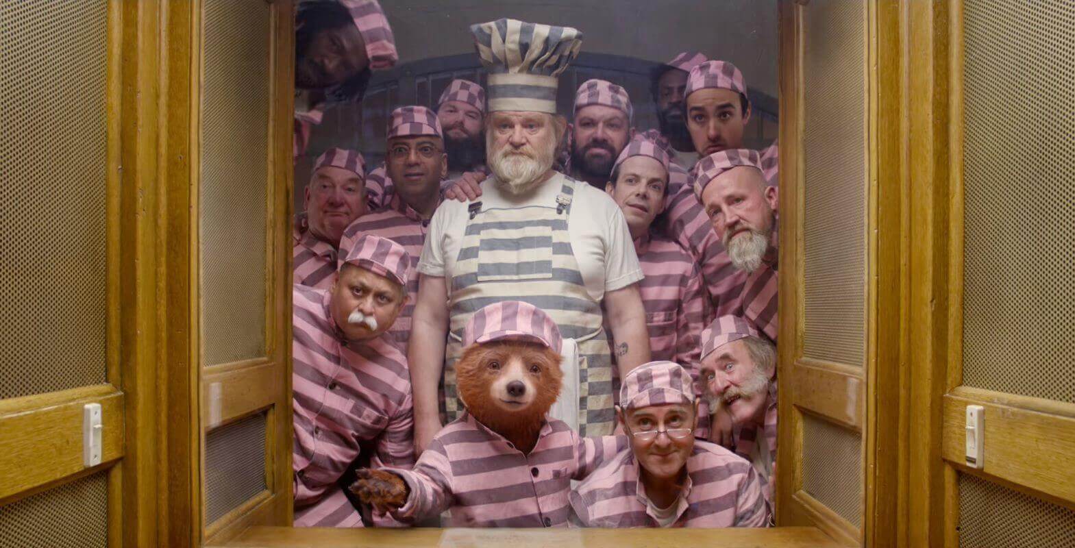
Mise en Scene in Film • Paddington 2
Aha! An imprisoned bear wearing a pink and grey jailbird outfit is whimsical, not sad. Oh, and what if we give some of the guys funny mustaches and beards? Perfect.
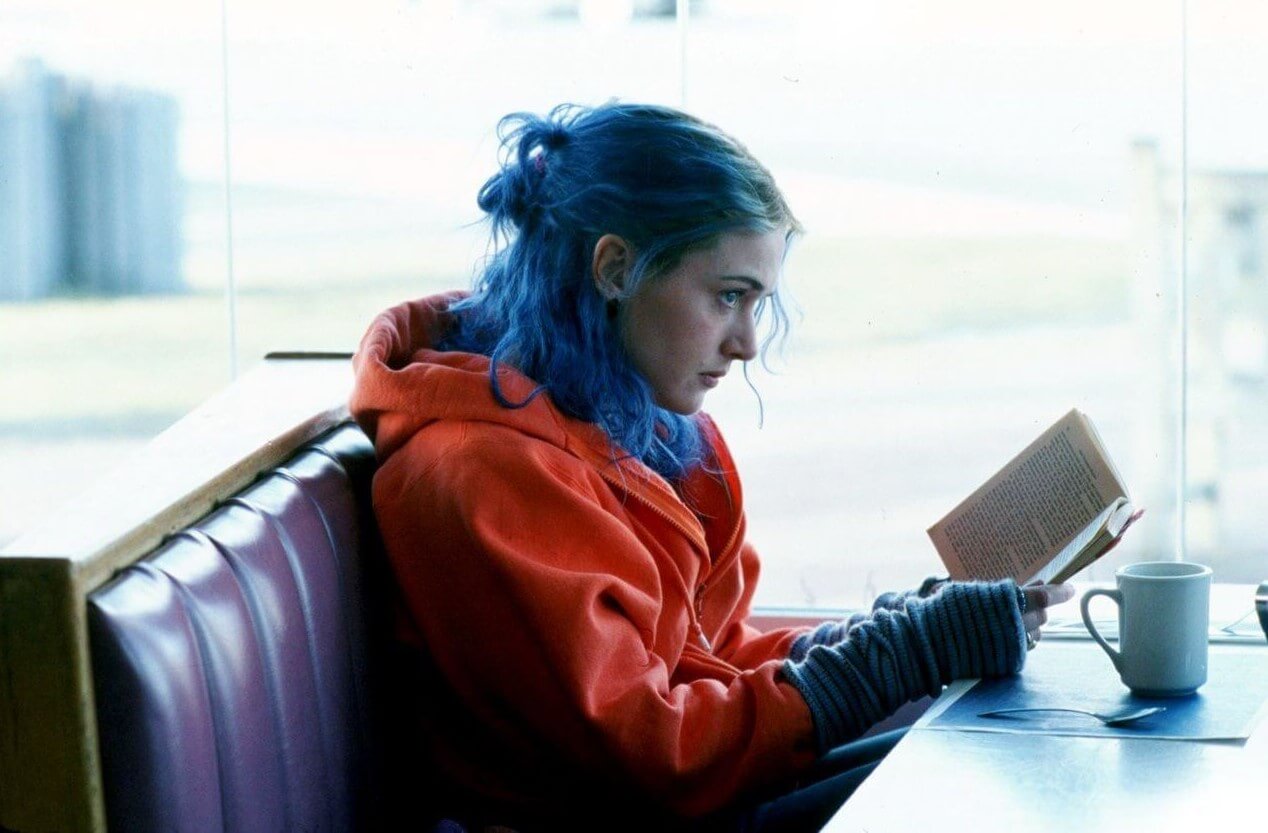
The color of a character’s hair can also make them stand out. Before the death of the Manic Pixie Dream Girl trope, many “quirky” female characters — usually written by men — had vibrantly colored hair.
Eternal Sunshine of the Spotless Mind • Mise en Scene
In the past, “blonde bombshells” were used in so many films of the Hollywood Golden Age that they became cliched. Alfred Hitchcock actually commented on this specific obsession in his classic film Vertigo by making Scottie (James Stewart) force his love interest Judy (Kim Novak) to go blonde.
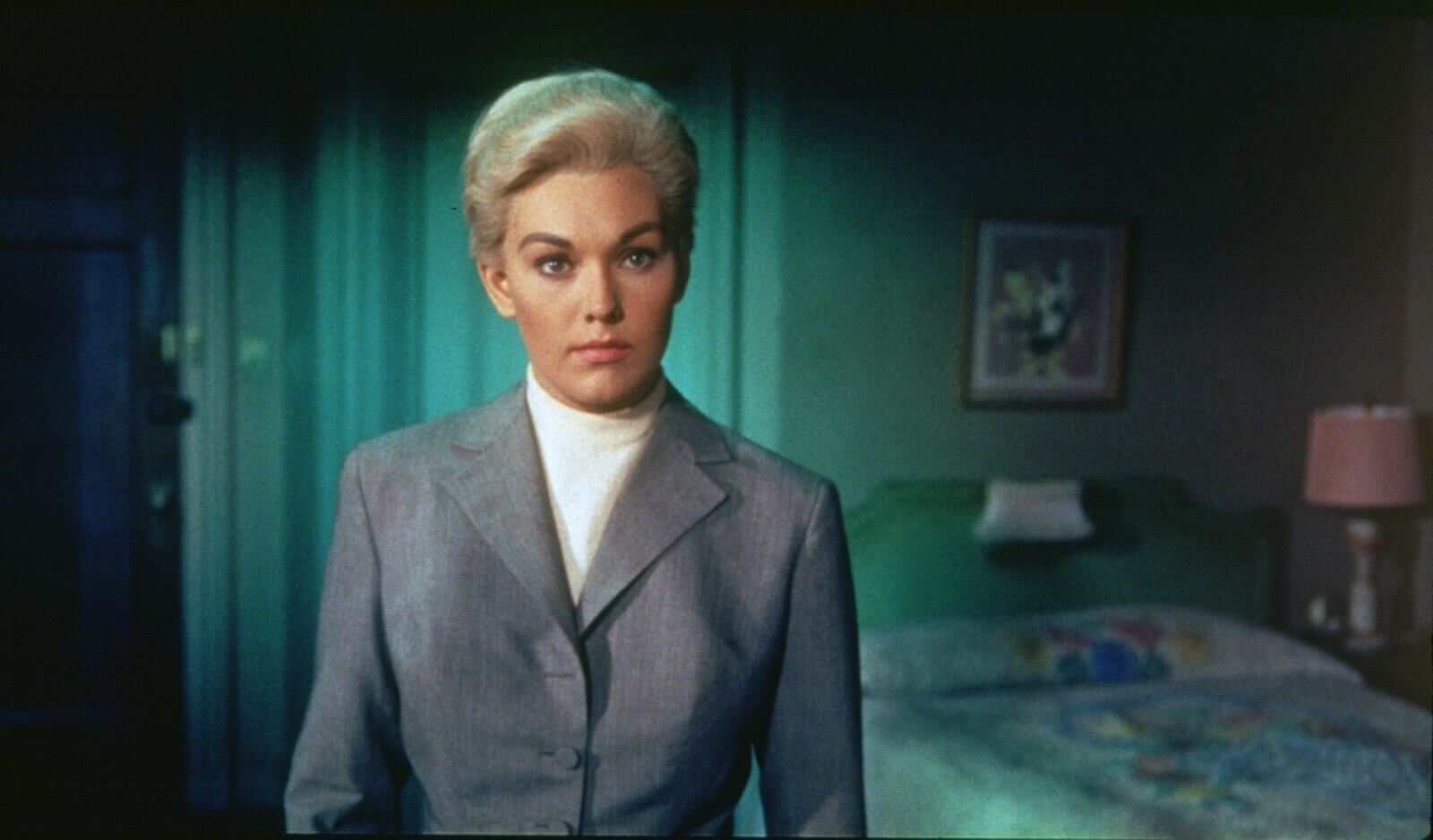
Mise en Scene in Film • Vertigo
Makeup also plays an important role in mise en scene. Think about Arthur Fleck in Joker. The application of red, white and blue clown makeup turns him from a regular guy on the street into the Clown Prince of Crime.
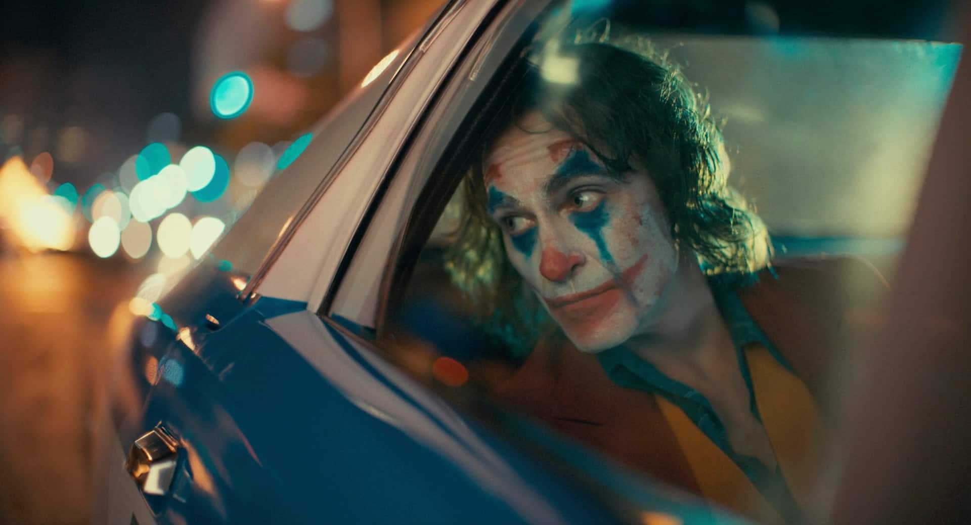
Mise en Scene in Film • Joker
As you can see, color is one of the most useful tools filmmakers can use to express the physical appearance of their characters. When conceptualizing the physical appearance of your characters, think about how filmmakers and production designers used color in costuming/hair and makeup to expert effect.
Now, let’s move on to one of the most visually enveloping aspects of mise en scene: the lighting.
Film Color Palette Overtones
How to use color with lighting
Any time you use artificial light — which is almost always in film production — you run the risk of things appearing unnatural. Some filmmakers lean into this artificiality and use certain lighting techniques to create synthetic worlds, others use lighting as a means of expression. Let’s look at a few examples of color lighting in film to see how different filmmakers add visual flair to their mise en scene.
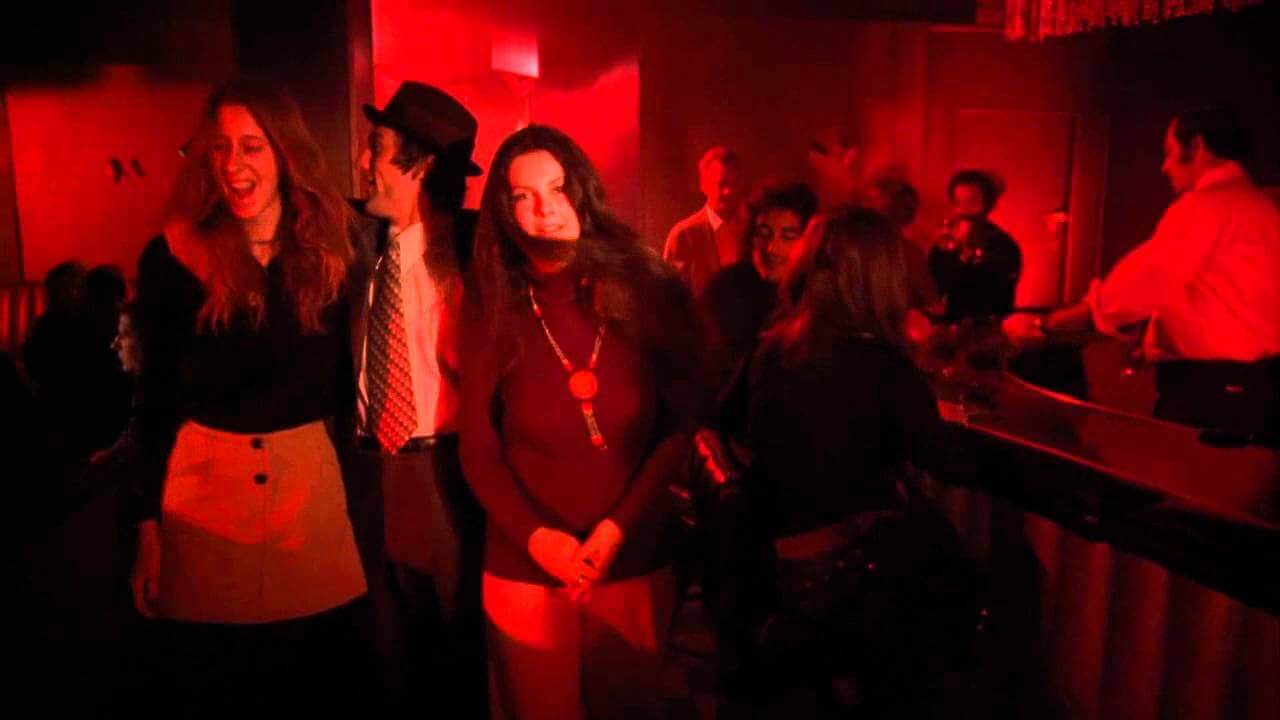
Different Meanings of Colors Lighting • Mean Streets
Martin Scorsese uses “red light” in his movies to evoke danger and to suggest sin. Other filmmakers use red in movies to similar effect. It should come as no surprise that Stanley Kubrick uses this trick too, both naturally:
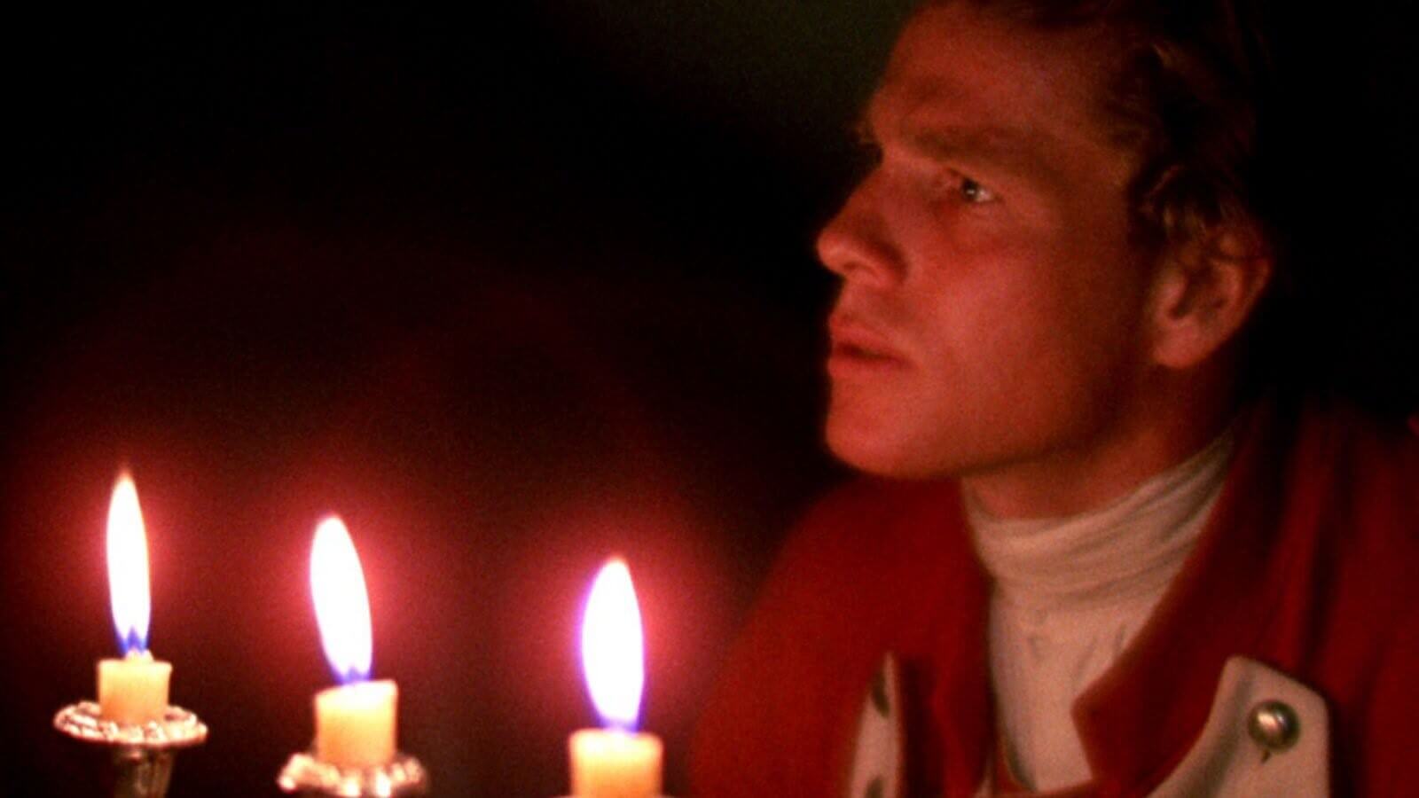
Different Meanings of Colors Lighting • Barry Lyndon
And unnaturally:
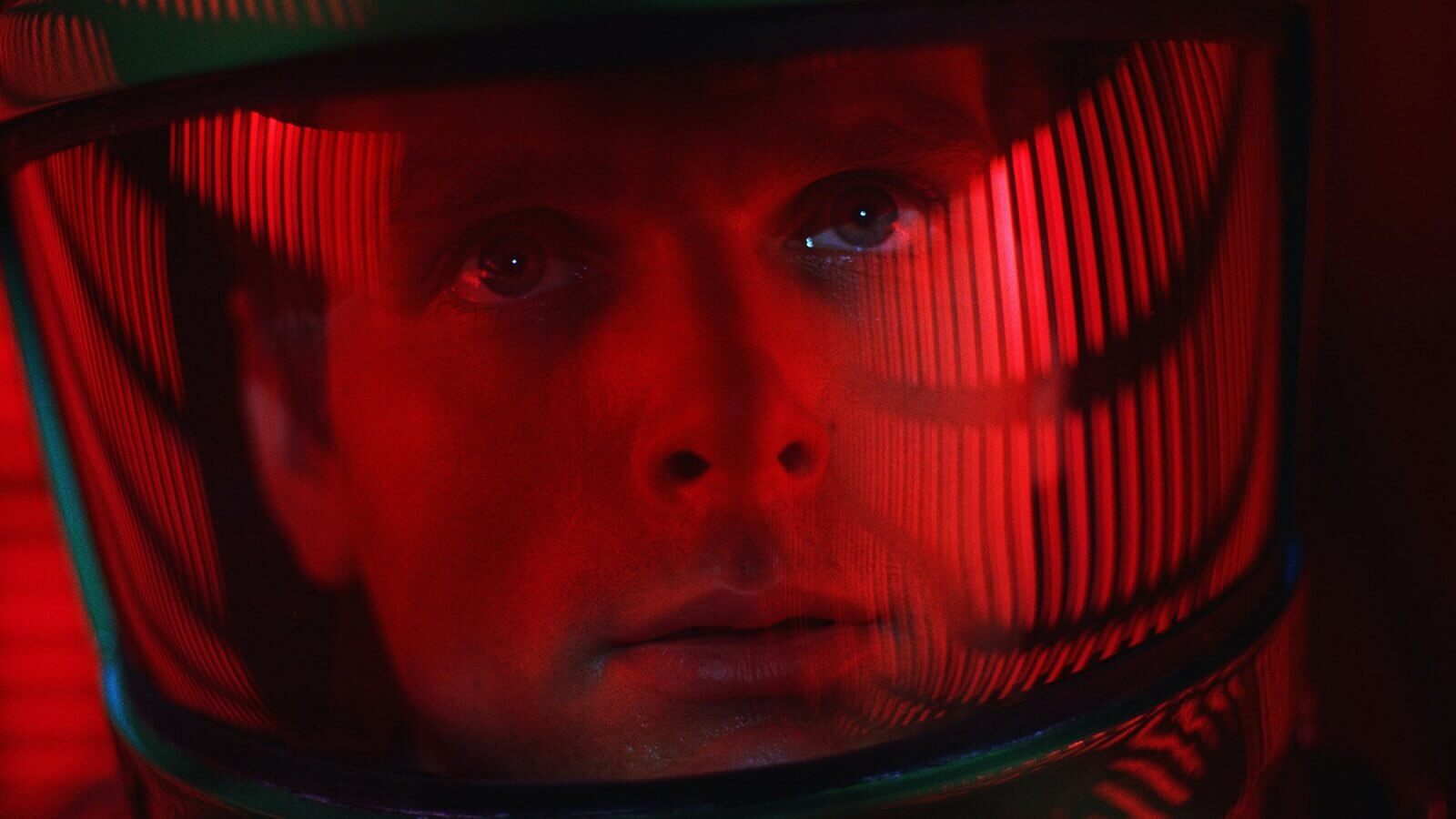
Different Meaning of Colors Lighting • 2001 A Space Odyssey
Blue light is often used to exaggerate the effect of moonlight. Look at the “cold” visual mood of this image from Blade Runner 2049 for example:
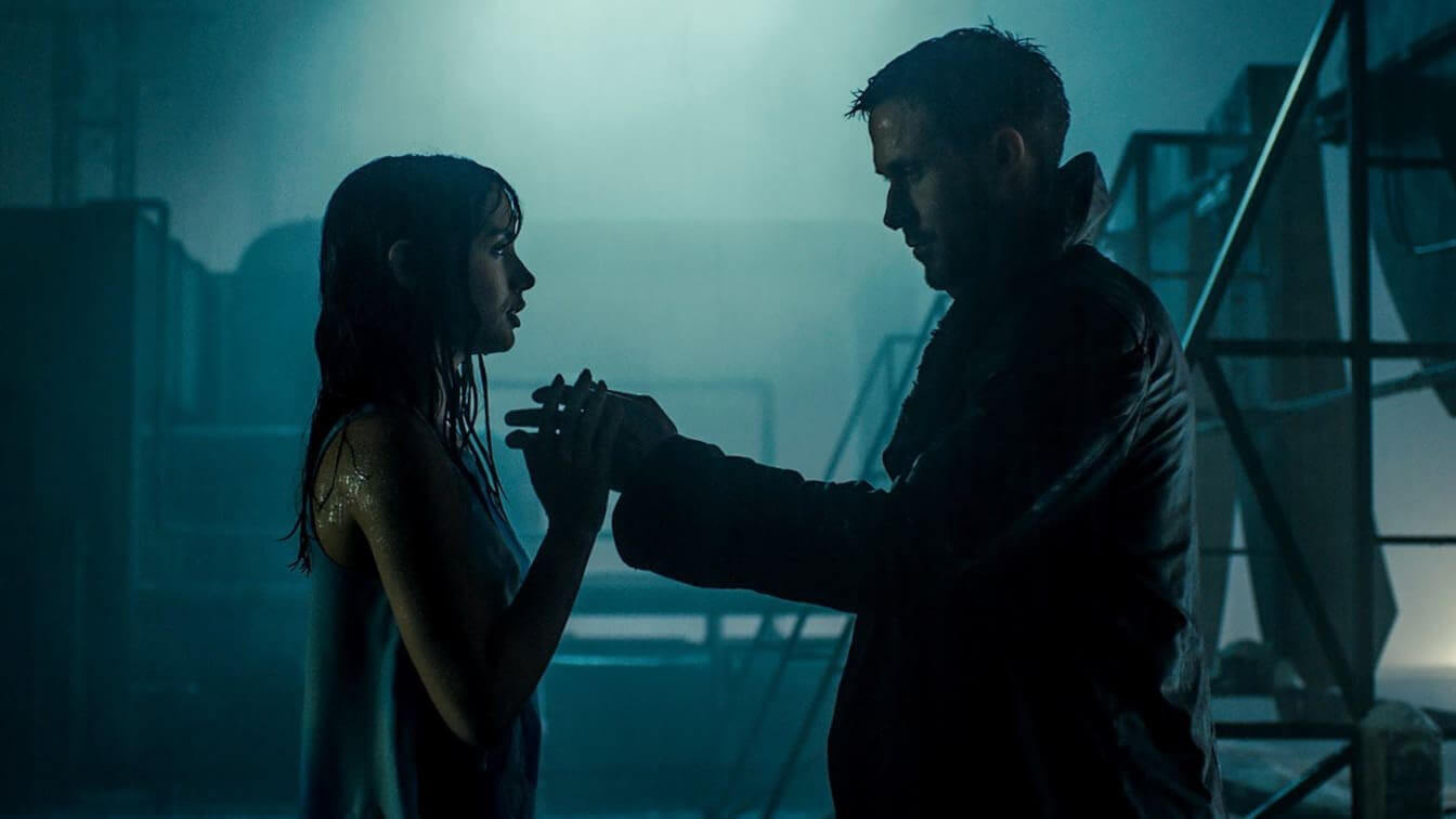
Different Meanings of Colors Lighting • Blade Runner: 2049
This image is desaturated to the point where I’m not quite sure whether an actual “blue light” was used or they used color grading in post. But the main point is that its tone is very “cold.” As such, we’re immediately able to deduce that it takes place at night.
A more exaggerated example of using blue light as a substitute for moonlight can be seen in Eyes Wide Shut.
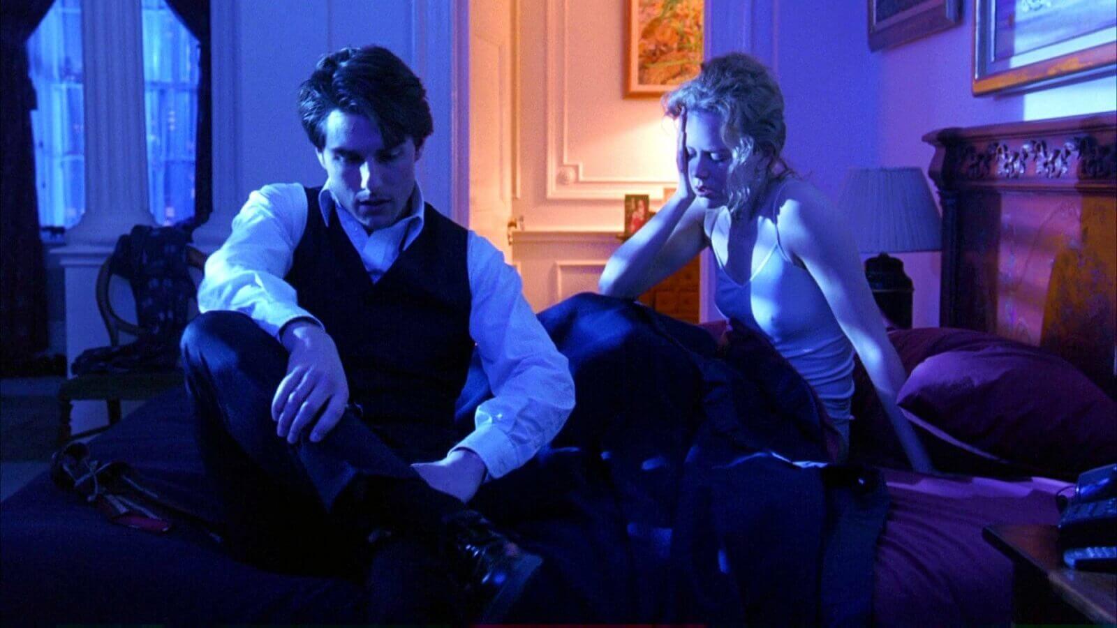
Different Meanings of Colors Lighting • Eyes Wide Shut
There are multiple scenes in Eyes Wide Shut where blue light is used as a substitute for moonlight. Ultimately, the decision to use blue light is a stylistic one — perfect for the dreamlike fantasy of the film. It can work well when used considerately, but it can also be viewed as “cheesy.”
“Yellow” and “white light” are perhaps the most common types of lighting in film. We see them in nearly every frame — just check the frame above from Eyes Wide Shut; you’ll notice that although the frame is dominated by blue light, there’s still white light in the background. We see yellow light used elsewhere in Eyes Wide Shut to communicate elegance and grandeur. Check out the image below:
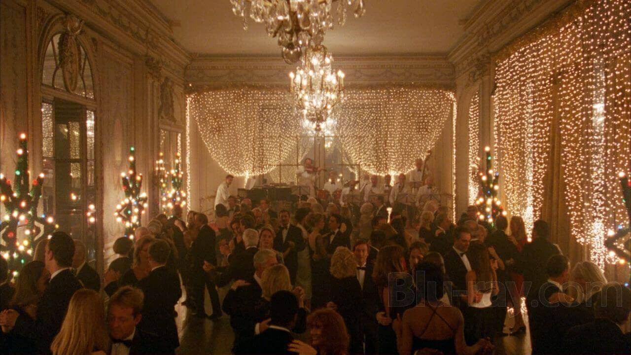
Different Meanings of Colors Lighting • Eyes Wide Shut
As you can see, the Christmas lights communicate a sense of wealth and grandeur. Paul Thomas Anderson does something similar in Phantom Thread as Reynolds and Alma dance alone.
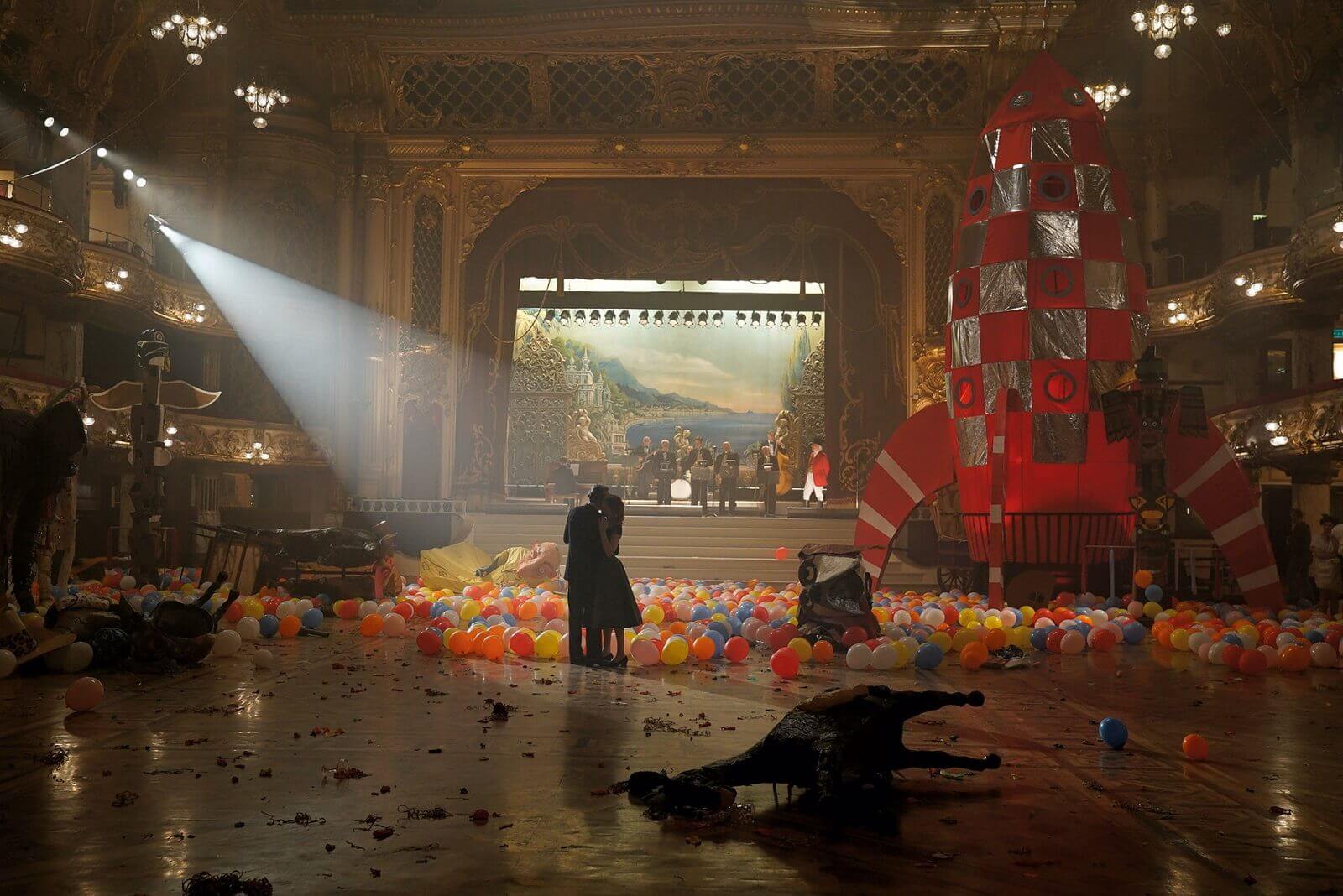
Different Meanings of Colors Lighting • Phantom Thread
We could break down a million different reasons why this shot is so brilliant, but for the sake of focus, let’s stick to lighting. You’ll notice that the brightest light is directed at the two main characters. Since this is the case, it’s fair to say that PT Anderson wanted the two main characters to be the central focus of the shot.
Consider framing your characters under direct light to highlight them in a visual sense. You can play around with different colored lighting — red, blue, yellow and white — to have different tonal effects on the story.
UP NEXT
Elements of mise en scene
We touched on a few different elements of mise en scene that filmmakers use to add visual expression to their works, but there’s so much more than what we went over here. In this next article, we break down mise en scene elements in further detail by looking at examples from Titanic, The Shawshank Redemption and more. By the end, you’ll be ready to apply a variety of new different mise en scene techniques to your own production.
Up Next: Mise en scene elements →
Share your vision with elegant shot lists and storyboards.
Create robust and customizable shot lists. Upload images to make storyboards and slideshows.
