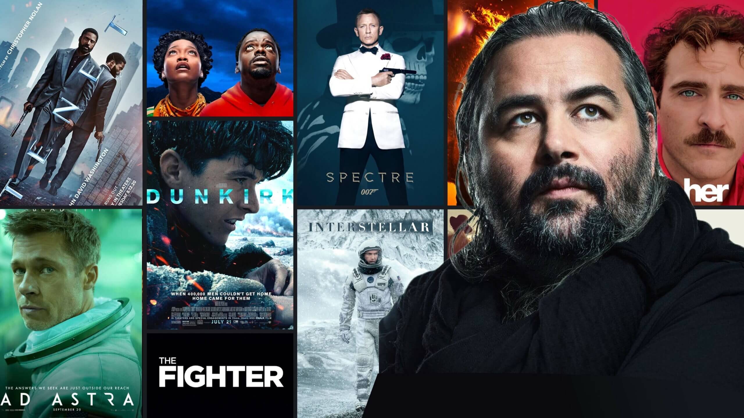
Hoyte van Hoytema is a cinematographer at the top of his game. He began with smaller projects in Europe before shooting some of the biggest Hollywood blockbusters we’ve ever seen. If someone were to ask for a description of Hoyte van Hoytema movies, what would you say? It’s hard to pin down a distinct look or style. And that’s his superpower — to facilitate and support the director to achieve their vision for each particular story. Let’s take a tour through a select filmography to see if we can identify the Hoyte van Hoytema cinematography style.
Best Hoyte van Hoytema Movies
Hoyte van Hoytema cinematography
Before we run through some of the best Hoyte van Hoytema movies, let’s take a minute to recognize just how varied his cinematography is. He has worked with directors like Spike Jonze, David O. Russell, Tomas Alfredson, Jordan Peele, and Christopher Nolan. These are all strong visual directors who require a jack-of-all-trades like Hoytema to execute.
He’s also worked in a variety of movie genres. In the war film (Dunkirk), he drops us into the action; with horror (Let the Right One In), he gives us monstrous intimacy; in science fiction (Interstellar, Ad Astra), he brings a visual freshness we haven’t seen since 2001: A Space Odyssey.
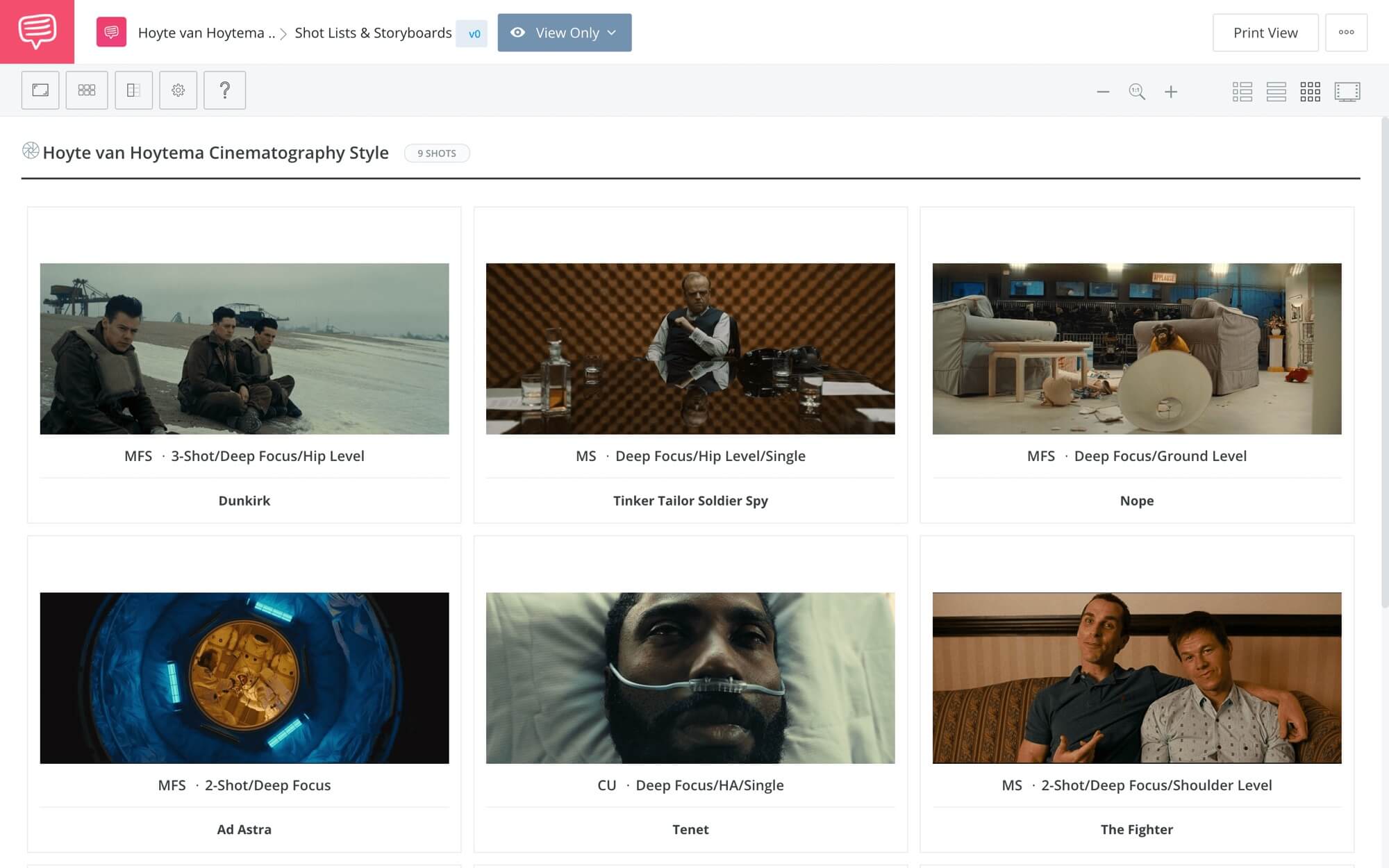
We imported some of our favorite shots from Hoyte van Hoytema movies into StudioBinder’s storyboard creator. Click the image to see the entire collection.
Hoyte van Hoytema Movies • See the entire collection
Hoyte van Hoytema Movies
Ad Astra (2019)
Lunar Rover Chase Behind the Scenes
While the plot of Ad Astra left something to be desired, the imagery is top shelf. This should also be credited to Production Designer Kevin Thompson for overseeing the look of a science fiction epic that doesn’t quite look like anything else we’ve seen. And, of course, the way these sets and locations are lit and photographed by Hoytema complete the vision.

Color in Ad Astra • Hoyte van Hoytema Movies
One element that really stands out is the use of monochromatic color schemes. It’s almost a fusion of classic and modern sci-fi aesthetics and somehow it works beautifully. It’s always inspiring to see how a simple element like colored lighting can help put us mentally and emotionally in such fantastical settings.
Hoyte van Hoytema Cinematography
Conclusion
If you’re looking for a new vision of what science fiction movies look like, start here. It is truly transportive images that feel familiar and foreign at the same time.
Hoyte van Hoytema Cinematography
Dunkirk (2017)
Why Nolan and Hoytema chose IMAX cameras
The theory goes: the larger and clearer the image, the more immersive the experience. That was the goal behind Nolan and Hoytema’s choice to shoot their white-knuckle spectacle using large format and IMAX cameras. Smartly, they also knew that because the image is bigger, you should keep the compositions cleaner.

Center-framing in Dunkirk
Center framing helps keep what matters most in focus and the audience won’t have to turn their heads to follow the action. With the subject centered, the rest of the massive image is there to provide that immersive context.
When you couple that with the jaw-dropping, practically-shot aerial cinematography, you get a truly unique cinematic experience. As Nolan put it, he was aiming for “virtual reality without the goggles.” And if you were lucky enough to see Dunkirk in IMAX, that’s exactly what it was.
Hoyte van Hoytema Cinematography Style
Conclusion
With the decision to shoot large format cameras, Hoytema puts the audience directly on Dunkirk beach. Along with Nolan’s non-linear narrative structure, this is a movie that deserves to be experienced, not just seen.
Best Hoyte van Hoytema Movies
The Fighter (2010)
How they shot The Fighter
Not everything that constitutes the Hoyte van Hoytema cinematography style are massive blockbusters. It’s easy to forget that he was also behind some very grounded and emotional personal stories as well.
Case in point: David O. Russell’s The Fighter.

Gritty, Grounded Realism in The Fighter
Obviously, the handheld shots keep us grounded. Building on that is the “home video aesthetic” that makes it more than real, it makes it personal. This is another example of how Hoyte van Hoytema movies are tailormade for the story they tell.
When people think of “good” cinematography, they naturally think of beautiful images. But actually good cinematography is whatever is best for the story, as The Fighter proves.
Hoyte van Hoytema Movies
Conclusion
Honestly, when watching The Fighter, the performances are so captivating, the cinematography takes a back seat. But, again, that’s what it was supposed to do.
Near Future Cinematography
Her (2013)
The Beauty of Her • Hoyte van Hoytema Cinematography
Her is a fascinating example of how to present a near-future world. It looks and feels like “the future” without over-extending that idea. And a large part of this is the soft lighting and lens flares.

Lens flares actually work for Her
One method to get these soft and warm flares was to use lenses without coatings. Most of the time, artifacts like lens flares are to be eliminated with these coatings. But it just goes to show that sometimes these “mistakes” can actually add a layer or texture to evoke a certain mood.
Hoyte van Hoytema Cinematography
Conclusion
Hoytema’s work in Her gives us a romantic and slightly futuristic world. DPs working in either romance or sci-fi would benefit from studying this one.
The Final Frontier
Interstellar (2014)
Hoyte van Hoytema cinematography is a trip to the stars
There are elements in Interstellar that make it such a gripping spectacle. First and most obviously, the scale of space, strange new planets, and black holes leave us awestruck. But, secondly, the close-ups keep the story anchored by the family story at its core.

One man vs. one universe
It’s a tightrope act to present a film on both a macro and micro level. Too much in any one direction, and we lose the connection between them. Hoytema shot the film using anamorphic lenses, perfect for the widescreen spectacle.
But to accent the human drama, anamorphic diopters allow the camera to be physically closer to the actors and remain in focus. If you recall, one of the themes in Nolan’s film is that love is something that can transcend space and time. And we need these intimate close-ups, to amplify that love between father and daughter.
Hoyte van Hoytema Cinematography Style
Conclusion
Big ideas, big canvas, big love. Hoytema certainly used every tool available to put Nolan’s love letter on screen.
Hoyte van Hoytema Movies
Let the Right One In (2008)
Themes explored in Hoyte van Hoytema movies
Another lesson we can learn from Hoyte van Hoytema movies is that shallow focus is an excellent way to tell a story visually. Oskar, the protagonist, is a loner. His world is insular. Which is why the decision to shoot with a shallow depth of field fits this story so well.

Oskar’s internal world
Look at the shot above — Oskar, isolated in his room with the outside world out of reach…and out of focus.
Another benefit of shallow focus is the ability to rack focus. It’s essentially editing within the same shot. By moving from foreground to the background, each of these frames becomes more substantial and rich with information.Hoyte van Hoytema Movies
Conclusion
Of all Hoyte van Hoytema movies, Let the Right One In is one of the most intimate and visually layered.
Hoyte van Hoytema Nope
Nope (2022)
Hoyte van Hoytema Cinematography Style • Subscribe on YouTube
In one way, Nope is the moment the Hoyte van Hoytema cinematography style comes full circle. A Hollywood spectacle shot in IMAX about people trying shoot an extra-terrestrial spectacle in IMAX.

Nope • A spectacle about spectacle
As we explained in our video, Hoytema took an old-fashioned film technique (day-for-night) and found a fascinating way to update it. Combining infrared with color film, he was able to create a “night” with more depth and clarity than even regular nighttime cinematography couldn’t.
Most of the time, darkness you can’t see into is frightening. What we learned from Nope is that it can be just as frightening when you can. To gain further insights into Nope, take a look at our blog post Nope Explained.
Hoyte van Hoytema Nope
Conclusion
Jordan Peele’s revisionist alien epic is spectacular in every sense of the word. He was smart to choose a DP like Hoytema who has been mastering spectacle for years.
Hoytema Does Bond
Spectre (2015)
Spectre’s Incredible Long Take
There’s a lot to like from a cinematography point of view in Spectre. The long take above, for example, is the perfect vehicle for both the massive scale of a blockbuster and the suspense of the operation. Granted, it’s not a true long take — it’s stitched together with multiple shots — but the final product achieves everything it needs to.

A villainous introduction
There’s also the exquisite introduction of Blofeld. Shot in silhouette and only revealed with simple blocking, it is a highly unrealistic set-up. Which would be a problem if the imagery wasn’t so striking.
Hoytema also went out of his way to shoot close-ups without much fill light. Instead of the classical Hollywood three-point lighting, this gave his shots more edge and personality than we typically see in a Bond film.Hoyte van Hoytema Cinematography
Conclusion
For many people, Spectre is not one of the best Bond films. But those criticisms don’t often extend to Hoytema’s cinematography, which is rather sumptuous.
Spy Film in Reverse
Tenet (2020)
Tenet Fight Scene • Hoyte van Hoytema Cinematography
Do you understand what Tenet is about? Does it even matter when the visuals are so arresting that your brain is stuck trying to figure out how they shot it? At some points, it is Nolan’s most beautiful-looking film — from the exotic locations to the ballet of car crashes in reverse.

The protagonist in Nolan’s high-concept spy thriller
As we saw in the video, shooting a fight scene from two different points of view is a masterclass of editing and cinematography. In anyone else’s hands, it would have been a disaster.
All of this culminates in the final mission. Again, most people probably had very little understanding of what was actually happening. But the blending of forwards and backwards footage on top of big budget action spectacle is worth the price of admission.
Hoyte van Hoytema Cinematography Style
Conclusion
Tenet may be a better watch with the sound off. That way, we can soak up images at the pinnacle of big budget, spy-action wizardry.
Spies Like Them
Tinker Tailor Soldier Spy (2011)
A different kind of spy film
In Tenet, Hoytema went big. In Tinker Tailor Soldier Spy, he went small. There are few films as slow and as taught as this one. From a cinematography perspective, this is about creating pressure and claustrophobia.

This set alone should have won the Oscar
Hoytema uses zoom lenses to suggest that someone is always watching. He uses telephoto lenses to compress the space. Watching this movie is like a noose slowly tightening around your neck.
Best Hoyte van Hoytema Movies
Conclusion
It’s a slow burn but it gets real hot in the end. Pay attention to the small but effective choices in lenses that work on your subconscious. You’re tense but it’s not obvious why.
Related Posts
UP NEXT
Drive Cinematography Breakdown
As we’ve seen, Hoyte van Hoytema’s cinematography style can be likened to a chameleon. He doesn’t seem to impose much of a personal style on the material — he simply adapts to it. Another DP with a similar approach is Newton Thomas Sigel who lensed the exquisite-looking Drive. In the next post, we’ll talk about how they shot the Neo-Noir lighting, the benefits of shooting digitally, and the storytelling done with composition.
Up Next: How They Shot Drive →
Share your vision with elegant shot lists and storyboards.
Create robust and customizable shot lists. Upload images to make storyboards and slideshows.

