T
he late Stephen Hawking said, “Science is beautiful when it makes simple explanations of phenomena.” This sentiment rings true for advertisers as well. When a brand has a product or service they are looking to promote, they want a tool that easily informs customers about its benefits. This is where explainer videos come in handy.
An explainer video is a 60 to 90 second marketing video meant to showcase a product’s lifestyle advantages. Sure, these videos are ideal for strengthening brand personality, but how?
In this post, we’re going to examine the basics of the medium, and what personal branding trends are influencing explainer videos.
Alright, let’s get started!
Watch: The Top Explainer Video Trends for Your Brand
Shapes with motion in explainer videos
Shapes with motion in explainer videos
When it comes to a product or service, a customer wants to know how will this improve the efficiency of my work, and the comfort of my life
For brands, the goal of an advertising campaign is to generate awareness, encourage client engagement and increase conversions. To accomplish this, a brand must identify a customer’s pain points.
Pain points are obstacles that a client is aware of, and looking to overcome. In essence, they need a problem-solver, and are turning to the brand for help.
With an explainer video though, brands only have a minute or so to connect with their audience. Because of this, advertisers have been relying on geometry to do the heavy lifting.
Take Quadro for instance.
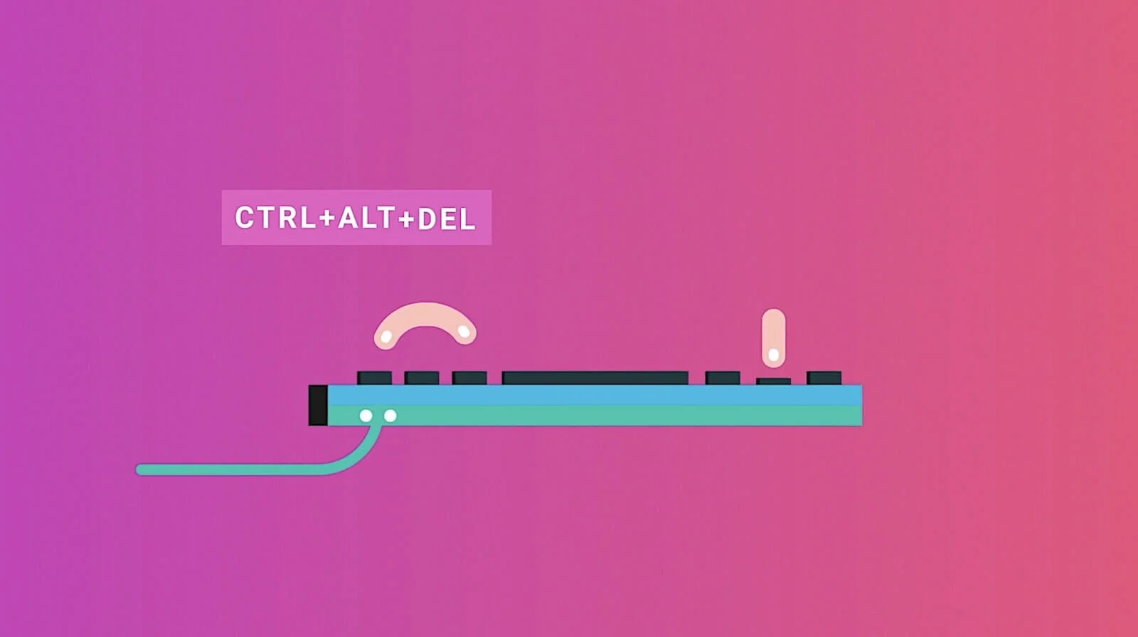
Explainer videos use geometry to help personal branding. Quadro (2017)
Here, simplicity is key for the brand. They want customers to know that through their personalized interface, optimal workflow increases. But how do they explain these benefits in a succinct and compelling way? With basic shapes.
Geometric psychology tells us that squares represent stability and balance. Also, straight lines showcase strength and efficiency. These are the same elements Quadro hopes to convey to their audience. By shapeshifting the square design of a computer, the brand is instilling a sense of harmony and progress within the customer.
But the explainer video doesn’t stop at familiar shapes. As in the image above, it mimics the fingers of a human hand. This is another psychological tactic known as Gestalt Theory.
Gestalt Theory suggests that humans tend to organize familiar, separate shapes into a unified whole. Sure, we only see these strange, finger-like designs at first. But soon, our mind is transforming the pieces into an entire hand or body.
This psychological tool reduces the amount of work required by designers, and also creates a more vivid sensation in the mind of the viewer.
Reducing clutter in design is a familiar approach in refining brand personality. And it’s something explainer videos have employed to further address client pain points.
Consider the “Communication Without Chaos,” video by Slack.
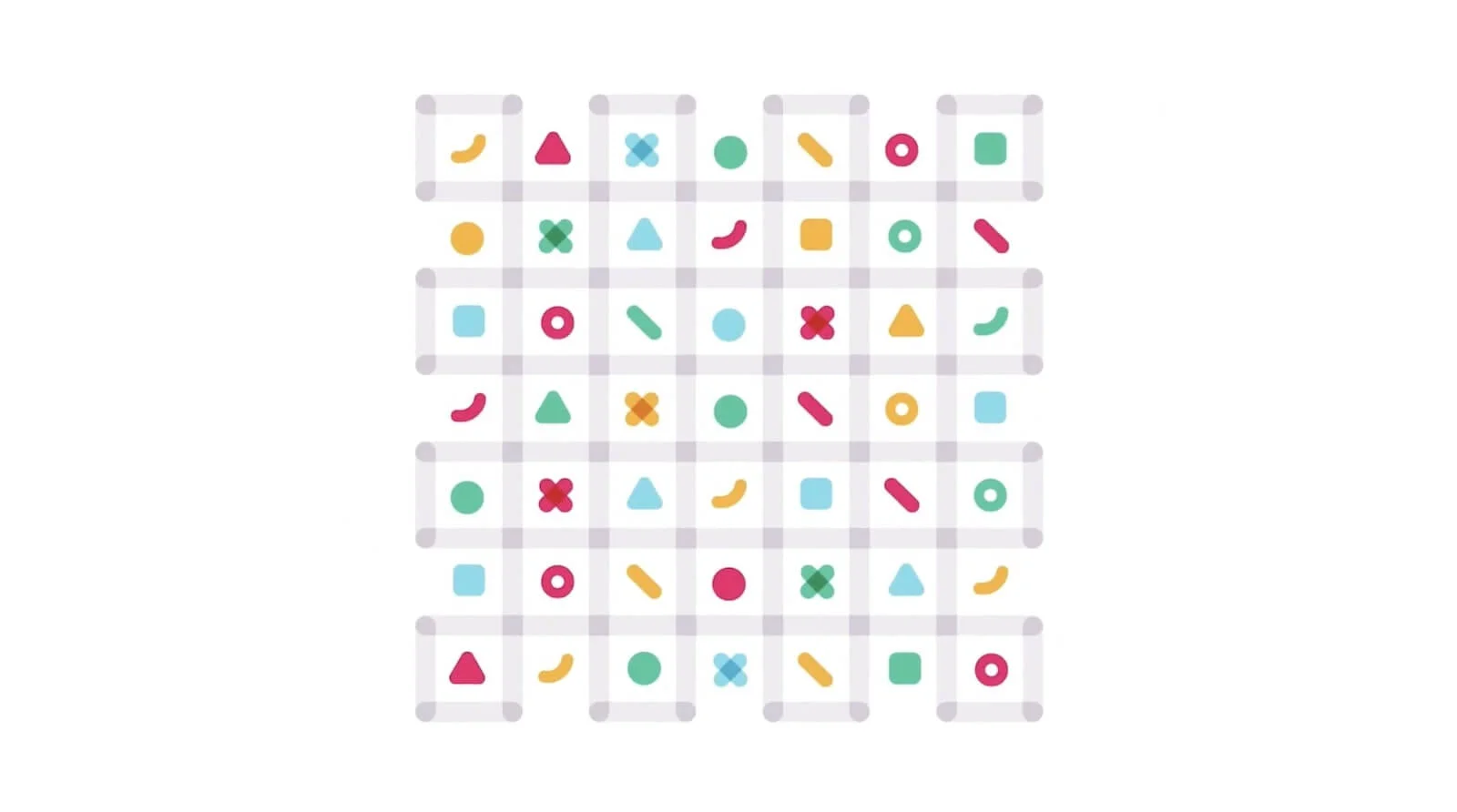
Simplicity in an explainer video helps to reduce pain points. Slack (2018)
With Roman Mars of 99% Invisible doing the voice over, the video shows how Slack’s platform conveniently connects users to the project resources they need.
Unlike Quadro’s video, Slack relies completely on the strength and history of the most familiar of shapes.
According to the book, “Signs of life: The Five Universal Shapes and How To Use Them,” anthropologist Angeles Arrien argues that five basic shapes have resonated most with humans throughout the ages. These include the square, circle, triangle, cross and spiral.
For Arrien, the success of these shapes is due to their ability to connect purpose with form. A circle rolls freely, a square suggests balance and security and a spiral has an unending consistency.
Again, for advertisers, the idea is to plant the benefits and ethics of a brand within the client’s subconscious. Remember, just because the shapes are simple, doesn’t mean their message is.
Stripe Connect also embraces these “universal shapes” for their explainer video.
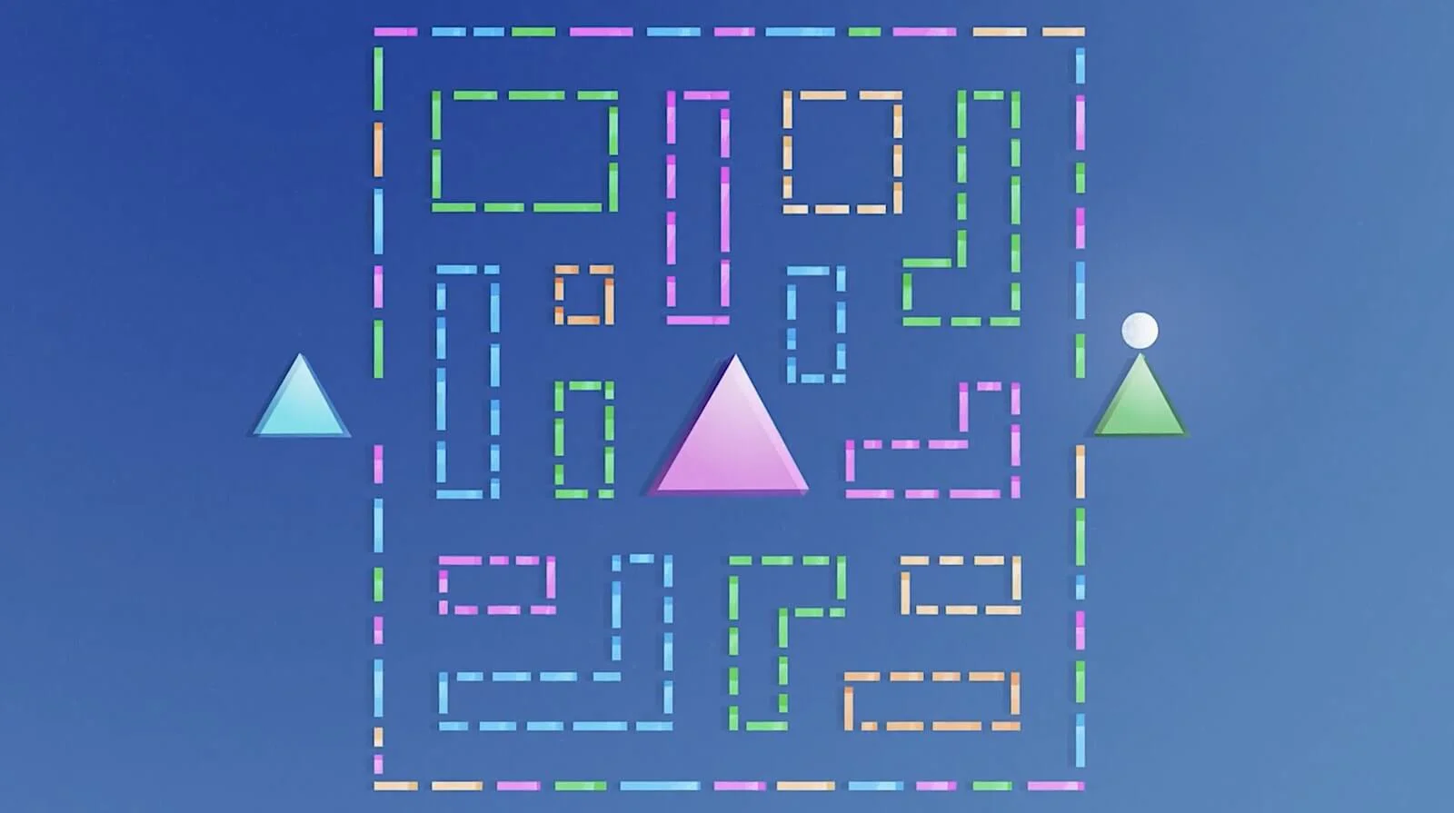
Universal shapes benefit the best explainer videos. Stripe Connect (2018)
As we can see, brands have a limited amount of time to entice their customers. By utilizing the benefits of geometry and psychology though, they are increasing their chances for client connection and conversion.
Explainer videos use handmade illustration
Explainer videos use handmade illustration
Okay, you’ve put in the hard work of developing your product, and now it’s time to focus on the personal branding of it. But, not everyone has a budget that can handle helicopter shots and elaborate explosions.
Live-action productions can be costly, which is why the animated explainer video is so appealing.
Instead of worrying about location scouts, sets and actors, a brand can bypass the shooting phase of a production and move right into the editing.
Yes, the feasibility of animation cuts down on time and labor costs. But more importantly, it adds the necessary human touch to the campaign.
Consider how Amex explains their card member benefits.

The animated explainer video adds the necessary human touch. Amex (2018)
In a world dominated by computer-based media, hand drawn animation offers a kind of comfort advertisers are looking to promote. When it comes to branded content, the objective is people stories over product stories.
The knowledge that another human being physically created the animation is powerful. Here, Amex is saying yes, we are offering you a service. However, our mission is to benefit your lifestyle and business. These drawings compliment the message by showing it’s the human element that Amex is most interested in.
As mentioned, story is at the heart of most advertising campaigns. And one of the key benefits of animation is its limitless options when it comes to storytelling.
Consider how Intercom approaches customer connectivity.
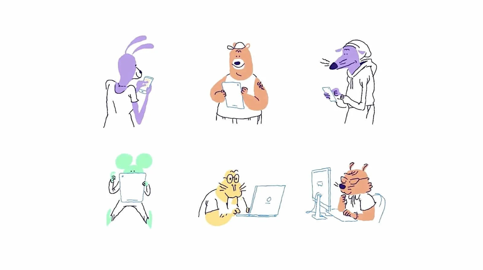
The animated explainer video offers a large canvas for personal branding. Intercom (2018)
In this spot, various species from the animal kingdom perform the duties of Intercom clients. Despite the excitement, or perhaps horror, we’d feel watching a rodent check their email, there’s something attractive about alternate realities.
One of the touchstones of animation is that it is not bound by the laws of this world. Because of our literary history, fairy tales and the supernatural have been popular modes to explain a moral lesson.
Brands are not necessarily trying to comment on a particular morality. Instead, they use the fantastical in connecting with viewers and their love of stories.
Although these animations often forego the pace and complexity of computer-generated shapes, they still seek to relate to the busyness of our own reality.
Take a look at how Slack deals with the often-crippling chaos of the work environment.

The animated explainer video plays on our love of storytelling. Slack (2018)
When the video begins, a character moves through the disorder of a hostile work space. But when the Slack application is introduced, a sense of tranquility takes over the employees.
The congestion of the previous scene disappears, and the simplicity and clarity of the drawings become more apparent. Again, the animations reflect the objectives of the brand.
Yes, most of these advertisers are involved in technological innovation. But as their explainer videos show, without connecting to a human directly, the client may be less inclined to invest in the product.
Live action meets 2D in explainer videos
Live action meets 2D in explainer videos
We’ve discussed how advertisers use animation and motion graphics to enhance their explainer videos.
Well, like the best ice cream, sometimes it pays to combine different elements into one. This can certainly be the case with live action production.
What’s great about merging live action and motion graphics is that you’re bringing out the best of both worlds. The live action component provides the essential human touch to the presentation.
The animation element meanwhile enables the most intricate features of the service to be visualized in a simple, yet dynamic way.
Take this Zendesk video for example.
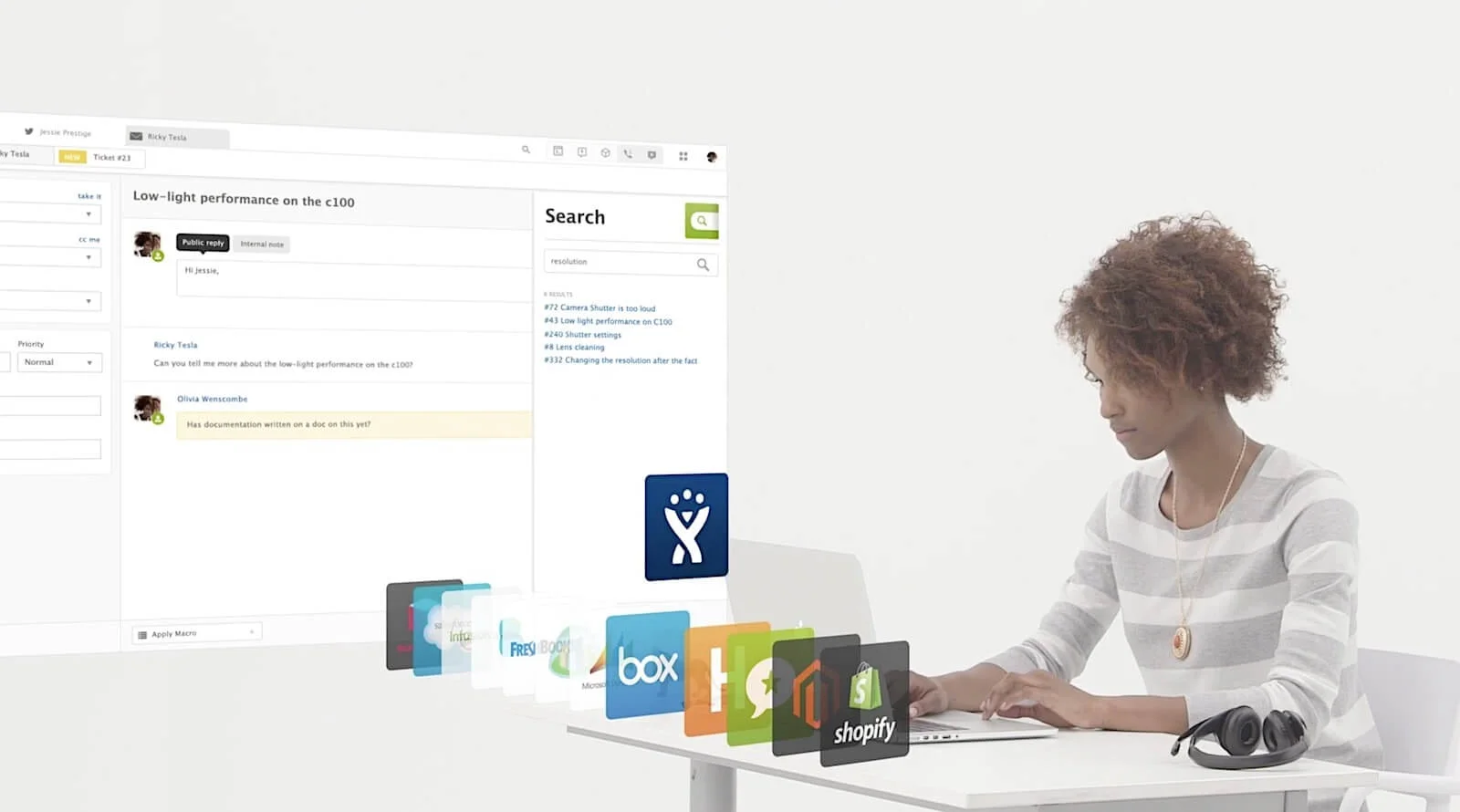
The best explainer videos combine mediums to benefit brand personality. Zendesk (2018)
Zendesk creates customer support software. Of course, we’ve all had our horror stories dealing with customer service. The brand though wants to illustrate how their approach to client fulfillment is intuitive and worry-free.
Here, the scene unfolds as if it were happening in real time. We see how a potential customer successfully navigates the Zendesk interface.
The variables and moving parts of a product can be numerous. By reviewing its potential through live action and animation though, the service can engage with the viewer in a more meaningful way.
Consider the approach that Pinterest takes.
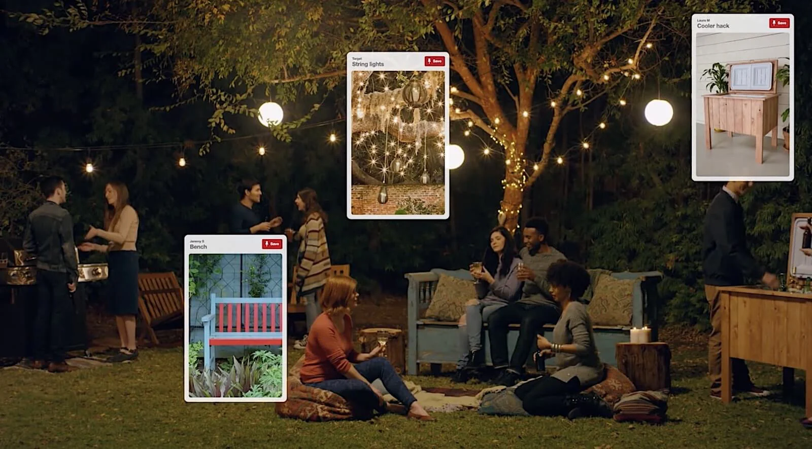
The best explainer videos break down complex functions
As we’ve seen with the best branded content, the hope of advertisers is to focus on the benefits of a product rather than the features.
Yes, features are important. But, if you can’t showcase those features in a simple and practical way, then the advantages of your service will be lost on the consumer.
In this case, Pinterest shows their product in action. You get a sense in real time how their clients benefit from the experience, and how simple it is to use the service.
This is also how Casper approaches the marketing of their mattresses.
Now, one could argue it’s easier to convince someone to lay on a bed than join a social platform. After all, does sleep really require thorough instruction?
With this example though, it’s not about the instruction of sleep, but the emotion associated with it.

The best explainer videos find the balance between product benefits and features. Casper (2018)
Typically, someone doesn’t wish for a restless sleep. As this video shows, the comfort and security one desires from their slumber is a result of their mattress.
Here, the combination of mediums creates a better chance for audience engagement. Ultimately, you achieve the power of imagination, and the element of human relate-ability.
up next
How to Make a Commercial People Will Actually Share
More and more, advertisers are seeking to implement their brand personality into every aspect of production.
As these explainer video examples show, connecting with consumers is just as important as pitching the product. Just because something is technically complex, doesn’t mean it has to be boring and cold.
Want to take your own explainer video to the next level? Sign up for StudioBinder and start turning your ideas into reality!
And if you want to learn more about creating audience engagement, check out our top video trends series!
Up Next: How to Make a Commercial People Will Actually Share →
Project management for video creatives. Tasks, file sharing, calendars and more.
Manage video production timelines, tasks, storyboards, shot lists, breakdowns, call sheets. Made for video creatives, new media and film.
