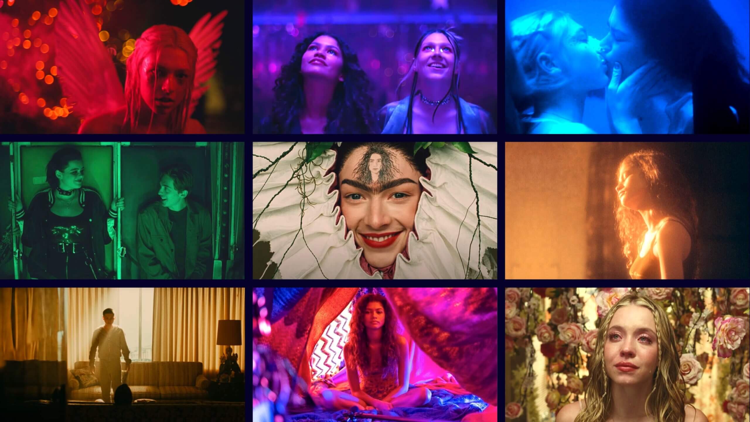
Euphoria is one of the most popular shows on television, and its success is in large part due to its distinct visual style. The Euphoria cinematography became iconic right from its pilot, and its influence can be seen in many shows and films that have come in its wake. Euphoria’s singular look comes from a confluence of cinematic techniques, from bold lighting choices to unexpected camera movement. In this post, we’ll break down the factors that make up Euphoria’s visual approach, and tell you how you can achieve it on your next project.
Euphoria Director of Photography
Euphoria’s "emotional realism"
Euphoria’s cohesive look comes from the top. The showrunner, Sam Levinson, said from the outset that he wanted Euphoria cinematography to achieve an “emotional realism.” Anyone who’s seen the show might find this description puzzling: the series’ look certainly doesn’t seem to fall under what we would conventionally think of as realism.
But to Levinson, emotional realism meant making the internal external. In other words, he wanted to show the extreme highs and lows of adolescence visually, even if those visuals didn’t adhere to a physical realism.
“He had this vision of making the show that looks like how teenagers imagine themselves,” said Euphoria cinematographer Marcell Rév of Levinson’s vision. “So he was constantly telling us that — why not give a show that’s not like a realistic portrait of the youth but more like how they portray themselves.”
Euphoria Season 1 trailer • Euphoria director of photography
So Euphoria’s look isn’t hyper-stylized for the sake of being hyper-stylized. It’s crucial to helping the audience understand what drives the characters.
Sam Levinson explains: “A question that Marcell Rev, our cinematographer, and Michael Grasley, our production designer, talked about a lot about is, ‘How can we create a world that reveals the hopes and wishes of the characters that exist within it?’”
Externalizing the internal • Euphoria visual
Having an overarching visual philosophy was crucial to Euphoria’s cinematic pallet. Euphoria, like most TV shows, uses multiple cinematographers, and so giving them a common goal allowed for a visual cohesion between episodes.
Now that we know what the Euphoria cinematography team was trying to achieve, let’s look at some of the key elements that helped them achieve it.
Was Euphoria Shot On Film?
Euphoria lighting
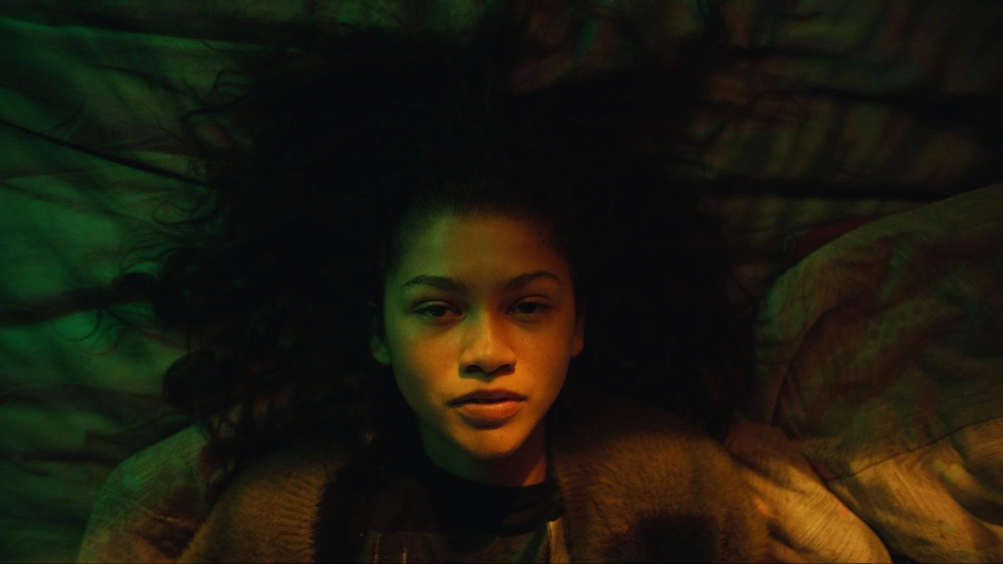
Probably the most instantly recognizable element of Euphoria cinematography is its lighting. The lighting choices on the show are loud and stylized, often using bold hues to heighten the drama and emotion in a scene.
Colorful lighting • Euphoria camera work
But while Euphoria’s lighting is often very colorful, there’s a method to the madness.
“It has to be colorful in a way, I think, to feel that elevation,” said Rév. “But we didn’t want it to go like rainbow colors, or with no real system in it. So, most of the time, we’re using primary colors, and I’m relying a lot on the orange-blue color contrast, which is a really basic one… We use that in night scenes, as well as in day scenes.”
As the Euphoria cinematographer notes, the orange-blue contrast is a classic use of a complementary color scheme. And it is used in countless films and TV shows. But Rév cranks up the orange-ness and blue-ness of the lights, creating a contrast that goes beyond the reality of a setting.
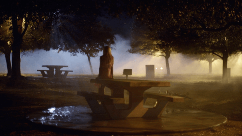
Take a look at this shot:
Euphoria lighting • Euphoria cinematography analysis
Describing the approach to this frame, Rév said, “The idea here was kind of like a moon-ish backlight and then add tungsten units, like street lamps behind the trees.” Tungsten lights naturally emit an orange glow, which complements the cool “moon” light perfectly.
As we can see from the Euphoria cinematographer’s approach, the lighting is not completely divorced from the physical reality of the situation. The blue is motivated by the moon, the orange by streetlights. But the degree to which he leans into this contrast is what goes beyond reality and into emotional realism.
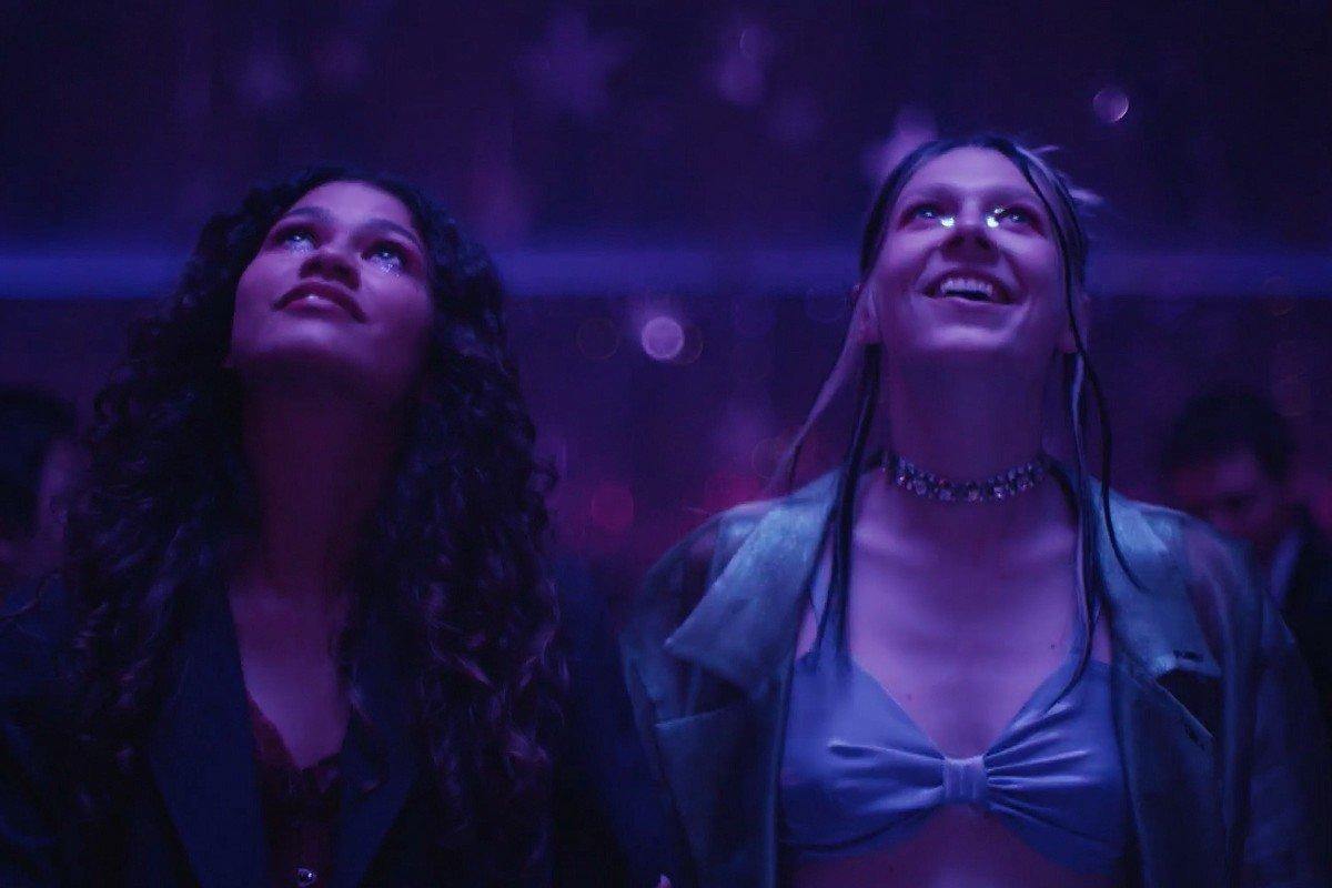
Of course, some of Euphoria’s most iconic lighting setups can be found in its plentiful party scenes. This is where they will often use blues and purples to create visuals that are almost dreamlike.
Again, however, Rév is sure not to overwhelm the pallet with a kaleidoscopic amount of colors.
“Of course, you have party scenes and stuff, [with] basic colors. Sometimes, it’s red; sometimes, it’s blue,” explains the Euphoria cinematographer. “But we try to stick to one defined color, and not be all over the place.”
Take a look at this party scene and see Rév’s approach in action.
Euphoria lighting
The scene is vividly colorful, but really doesn’t use more than two colors — the lighting is either purple or blue.
Even though the color of the lights are largely uniform, Rév uses a multitude of different light sources. According to the cinematographer, the crew used “old school tungsten lights [and HMIs]... And, of course, we’re using the advantage of the SkyPanels, and LED lights.”
He doesn’t lean on LEDs, however: “I think it seems more like an LED-lit show than it is, really. Most of the time, it’s old school lighting, and a lot of big light boxes and special light rigs.”
In arguably the boldest visual choice of the show, Rév and Levinson decided to shoot the second season on film. Specifically, they used Kodak’s Ektachrome format and Vision 3 500T stock.
Note the slight change in the show’s texture:
Euphoria season 2 • Was Euphoria shot on film
Even though the look of the show was only slightly altered, the use of film completely changed how the crew needed to light scenes, particularly when using Ektachrome.
“It’s… a very, very contrasty stock,” said Rév of Ektachrome. “It’s a reversal stock but we processed it as a negative, which gives you these weird colors and creates a very thin, green, muddy negative that you either have to color correct or correct with filters in the camera.”
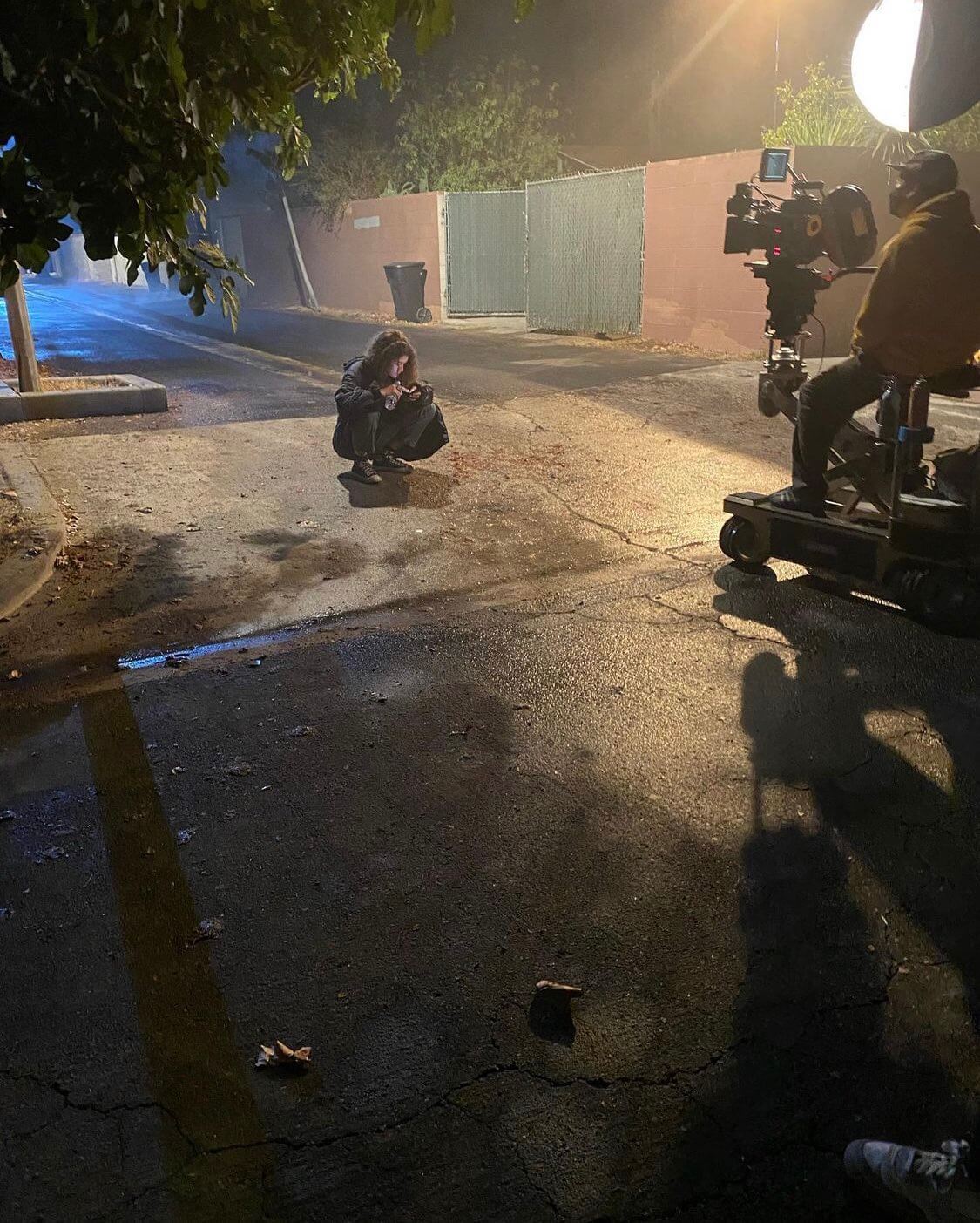
A film camera on season 2
This meant that how lighting looked on set was vastly different from how it was being received on the camera.
“Because you end up with such a contrast-y image, lighting-wise you do the opposite of what you would do with digital or another film stock. You create a very flat situation with a lot of light because it’s such a sensitive stock,” said Rév. “It’s a really unflattering image on the day, like a bad sitcom.”
For as much attention as it gets, lighting isn’t the only aspect of the Euphoria cinematography that makes it so distinctive.
Euphoria Cinematography Analysis
Euphoria’s camera movement
The camera in Euphoria is almost constantly moving. To Rév, this quality is perhaps even more important than lighting.
“For camera movements, we really wanted it to have a certain energy that ties the different storylines together,” the Euphoria cinematographer says. “So, I would say the camera movement is the glue in the show, that glues it together.”
The camera’s movement has a specific quality to it. With a few exceptions, the camera seems to float, giving it an ethereal quality matching the show’s mood.
“When the camera is moving, it’s always on tracks or on a dolly,” said Levinson. “We do very little handheld camerawork. And probably 70 percent of the show is shot on sets.”
These sets are key to the camera movement. Because the sets are built from the ground up, they are often constructed with specific camera maneuvers in mind.

On Camera Movement and Sets
“We do shots and scenes on Euphoria that are built around the camera; we have to build sets around certain camera moves. So for that you have to really plan it precisely and the storyboard is just the easiest way to do that.
— Marcell Rév
Take a look at this final shot from Euphoria’s pilot. Note just how complex and seemingly impossible the camera movement is.
Euphoria pilot • What camera is Euphoria shot on
The shot takes place in Jules’ small bedroom, the size of which exudes a coziness that indicates the solace the characters find inside it. The camera glides towards the bed and then hangs over the two friends, emphasizing the intimacy of their relationship. But how was the camera able to get high enough to get both of them in the shot?
The answer lies in the set. “The ceiling is actually just on hinges, [operated] with ropes, so that the ceiling could come off and the camera could get above them,” explains Levinson.
These specific sets are all over Euphoria. We can see another example in this mind-bending shot:
Euphoria shots • Euphoria best cinematography
Breaking through the mirror here is crucial to indicating Kat’s transition into her other, secret life. The shot is achieved through a blend of CGI wizardry and simple on-set, practical effects. The crew used a body double to mimic Kat’s movements. And there was in fact no mirror involved, so the camera could move through the frame on a crane without any stitching.
Euphoria cinematography’s penchant for camera movement also results in some incredible long takes. Arguably the most complex of these can be found in the carnival scene in Season One.
The sequence required a Technocrane, dolly, and four stitches to pull off. Again, being able to build their sets helped tremendously in getting the shot.
“It was really beneficial to design the carnival the way we can really shoot it,” notes Rév. “We set up like a hundred feet of dolly track, and we could shoot it one way, and we could look in the other direction, as well, because the set was working that way for us.”
Check out the behind-the-scenes footage of the scene:
Euphoria carnival scene • Euphoria behind the scenes cinematography
Of course, this level of complexity requires a massive amount of planning, including storyboarding the camera movements.
“Marcell and I sat down with Peter Beck, our storyboard artist, and we basically storyboarded the entire episode,” says Levinson. “There were roughly 700 or 800 boards, and then, in conversation with [production director] Michael [Grasley], we built all the sets from those boards.”
The shot took a whopping six days to finish, a rarity in television. “Part of the nature of television is that it doesn’t usually allow for a lot of indulgence,” explains Levinson.
“On this show, we made the decision in advance not to do a lot of coverage, which is unusual for television. But in deciding to shoot that way, we accepted the fact that we had to really plan the thing out to get it right.”
This type of auteur-esque control is what allows Euphoria cinematography to look so striking. It’s a show which has a visual style that few other series have ever matched.
Up Next
Zack Snyder Visual Style
Now that we’ve looked at one hyper-styled visual template, let’s keep rolling into another. Zack Snyder has some of the most distinct cinematography in the business today, and we’ll break down just how he achieves it.
Up Next: Snyder Style →
Showcase your vision with elegant shot lists and storyboards.
Create robust and customizable shot lists. Upload images to make storyboards and slideshows.
