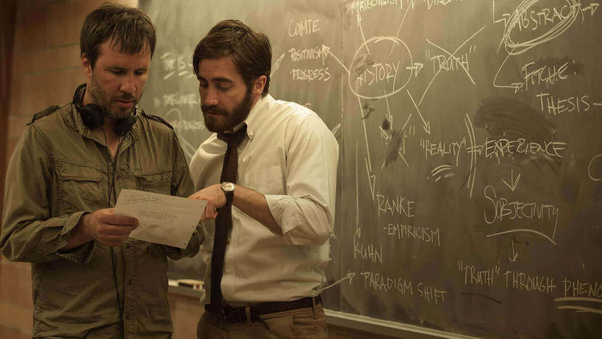
Denis Villeneuve, director of such modern classics as Blade Runner 2049 and Sicario, has yet to make a bad movie. His first two features might be flawed but they are still fresh and exciting. Between his 2nd and 3rd features, Villeneuve took a nine-year break but, since he’s been back, he’s never missed the mark. But what exactly makes Denis Villeneuve movies so good?
This is not a “Denis Villeneuve Movies Ranked” article. Instead, we’ve taken a tour through his strongest films, highlighting moments that prove that he belongs on a list of the best working directors.
Table of Contents
Everything you need to know about Denis Villeneuve
1
Filmography
A Complete List
Filmography
Denis Villeneuve movies
August 32nd on Earth (1998)
Young Simone is involved in a near fatal car crash, and as she questions her mortality, she also decides to have a baby. Her candidate for a father is her best friend Phillipe who happens to be seeing someone. He agrees, as long as they conceive in Salt Lake City, in the desert. The trip teaches many lessons about love, solitude, and self-discovery.
Maelstrom (2000)
After plunging her car into a river, a woman encounters a man who helps her come to terms with her life.
Polytechnique (2009)
A dramatization of the Montreal Massacre of 1989 where several female engineering students were murdered by an unstable misogynist.
Incendies (2010)
Twins journey to the Middle East to discover their family history and fulfill their mother's last wishes.
Prisoners (2013)
When Keller Dover's daughter and her friend go missing, he takes matters into his own hands as the police pursue multiple leads and the pressure mounts.
Enemy (2013)
A man seeks out his exact look-alike after spotting him in a movie.
Sicario (2015)
An idealistic FBI agent is enlisted by a government task force to aid in the escalating war against drugs at the border area between the U.S. and Mexico.
Arrival (2016)
A linguist works with the military to communicate with alien lifeforms after twelve mysterious spacecraft appear around the world.
Blade Runner 2049 (2017)
A young blade runner's discovery of a long-buried secret leads him to track down former blade runner, Rick Deckard, who's been missing for thirty years.
Now that you're refreshed on his films, let's dive into them and learn a bit more about how he makes it all happen.
2
Cinematography
Techniques
2.1 Inverted Camera Angles in Polytechnique
Presenting a world upside down
In cinematography, it's not only important "what" the camera shows us. Presentation is also crucial. A subject's meaning is altered by the lighting, framing, and what type of lens you decide to use.
The camera angle can also have a significant impact. In Polytechnique, Denis Villeneuve films with extreme oblique and inverted angles to suggest a world in chaos. Let's take a look at a couple of examples from the film and see how these angles are motivated.
Jean-Francois (Sebastien Huberdeau) survived the mass shooting, but his world is forever fractured. He feels enormous guilt for his failure to prevent his classmates' deaths.
Life after the tragedy has been a struggle.
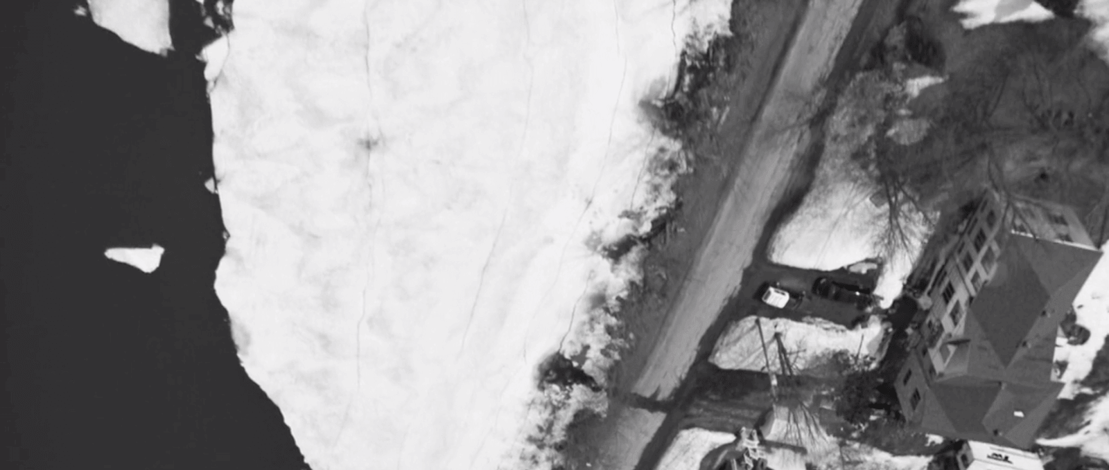
As he drives to visit his mother (Johanne-Marie Tremblay), we track his car with an inverted aerial shot. Most aerial shots assume a shallow angle of their subject, somewhere between 20 to 70 degrees. Others will shoot straight down at 90 degrees in what we call a God’s Eye View shot.
But rarely, if ever, do we see an aerial shot with a steeper angle than that.
In this case, the camera frames Jean-Francois' vehicle from perhaps 120 degrees. We see him below and behind us.
This produces a dizzying vertigo effect.
Tipping past our equilibrium
When Jean-Francois commits suicide a few scenes later, this aerial shot is finally motivated. Since the massacre, Jean-Francois has lost his equilibrium.
His world has lost its center.
The final shot of the film pushes an oblique angle even further. In this case, we track along the ceiling of a hallway in the school. But the camera is completely inverted 180 degrees. The "floor" is the ceiling and vice versa.
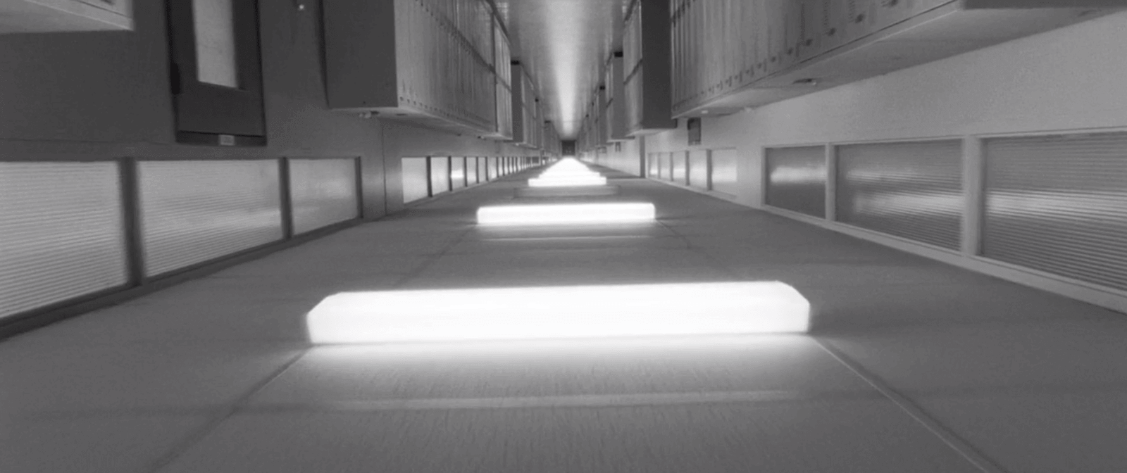
Down is up, up is down
What are we to take away from Villeneuve's parting shot?
Has the world lost its equilibrium?
Perhaps. But just like Valerie (Karine Vanasse), we must continue.
Denis Villeneuve films approach violence in a very particular and brutal way but he tempers this darkness with poetic shots like the one above.
How would you use an inverted aerial or tracking shot like Villeneuve?
When considering a shot like these in your next project, make sure they are thematically motivated. You can communicate a lot about your characters and their mental state with a simple camera angle.
Related Posts
2.2 Lighting for Character in Sicario
Using light and shadow thematically
In a scene of two people talking, the dialogue and performances are the audience's primary focus. But there are opportunities elsewhere to enhance the scene's power and meaning.
Editing, music and sound, costumes, production design--all of these should support the scene. Cinematography can also be used in practical ways to communicate character.
How do Denis Villeneuve films like Sicario use shot composition to reinforce character and power dynamics?
One of the final scenes in the film is a fantastic example of this process.
Ready?
At the end of the film, Kate (Emily Blunt) has found herself in the dangerous world of drug cartels. Even more dangerous is her colleague, Alejandro (Benicio Del Toro).
After their mission went off the rails, Alejandro appears in Kate's apartment. He forces her to sign a statement claiming no criminal procedures took place.
He sits her down, at gunpoint, and explains that her options are death or compliance. It is a tense scene and also heartbreaking as Kate is made to compromise her moral integrity.
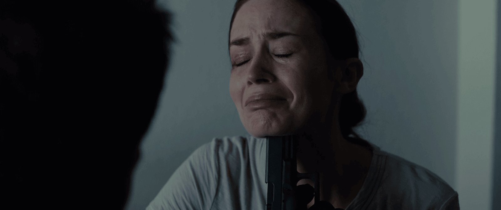
Be dishonest or dead?
But how can specific lighting techniques enhance elements like character development?
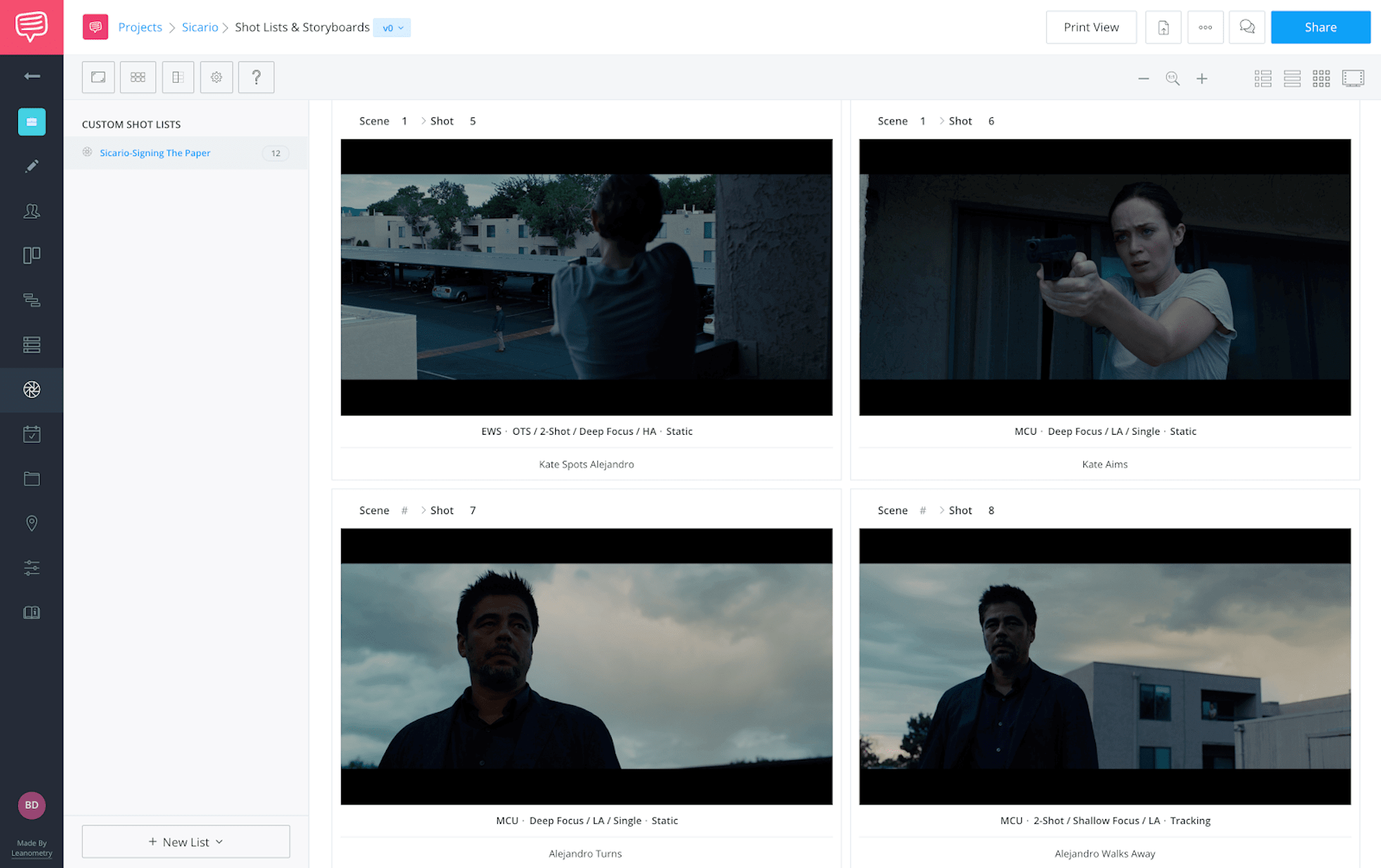
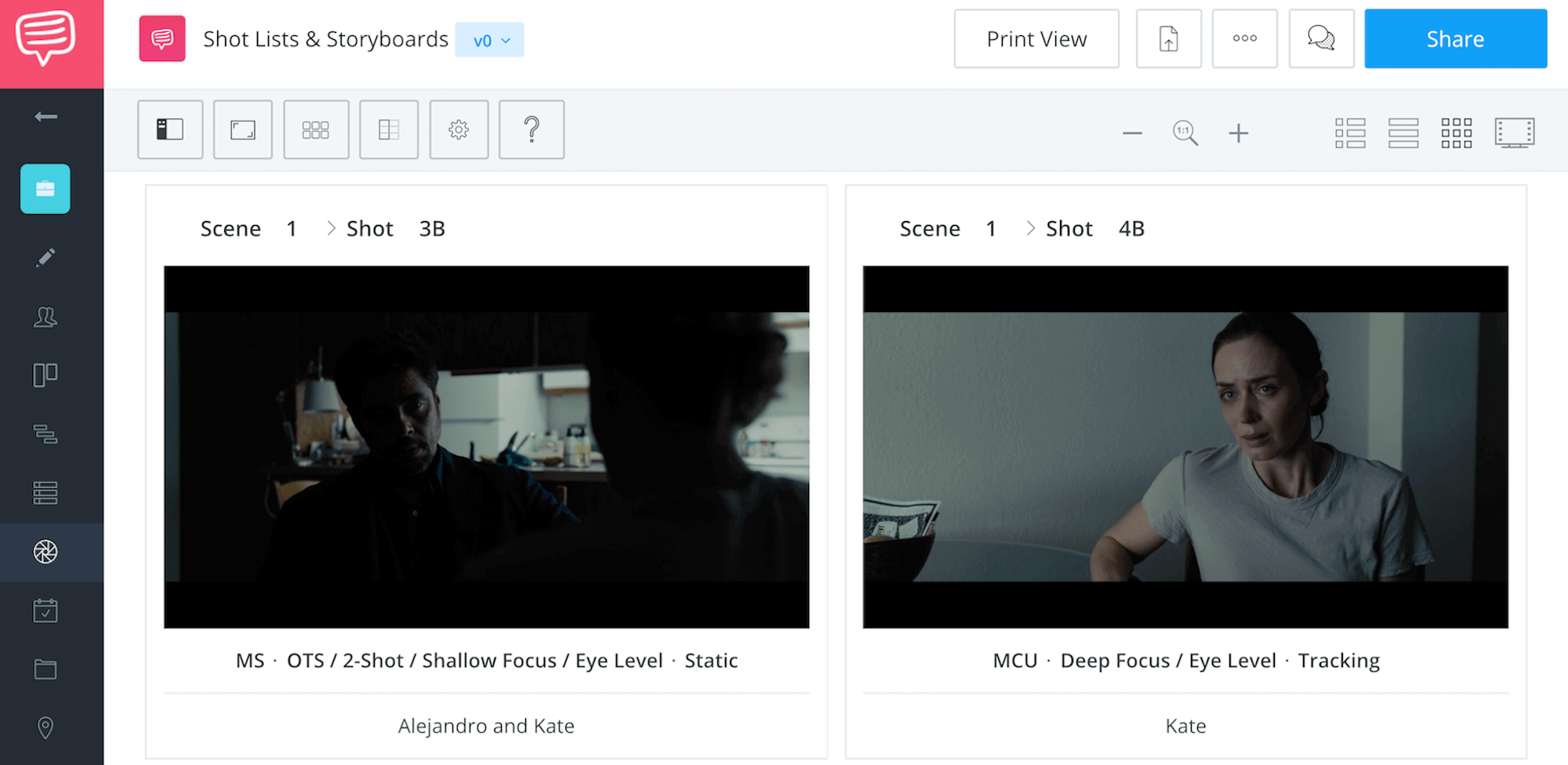
We’ve broken the entire scene down so you can see every shot. Check out our StudioBinder shot list below:
As Kate walks in from the balcony, she stands in silhouette against the window, exposed. Alejandro sits in the darkness, concealed.
He's gotten the drop on her.
In Kate's single, she sits in front of a white wall wearing a light gray shirt. She is also well lit, erasing most of the shadows. She is shadowless because she has no secrets. She is pure but vulnerable because of it.
The reverse of Alejandro is lit much differently. He is camouflaged with shadow. At points, we can only see the glint of his left eye.
Alejandro is nothing but secretive. He is morally fluid and has the capacity for darkness that she will never have.
These ideas are reflected and reinforced by the lighting.
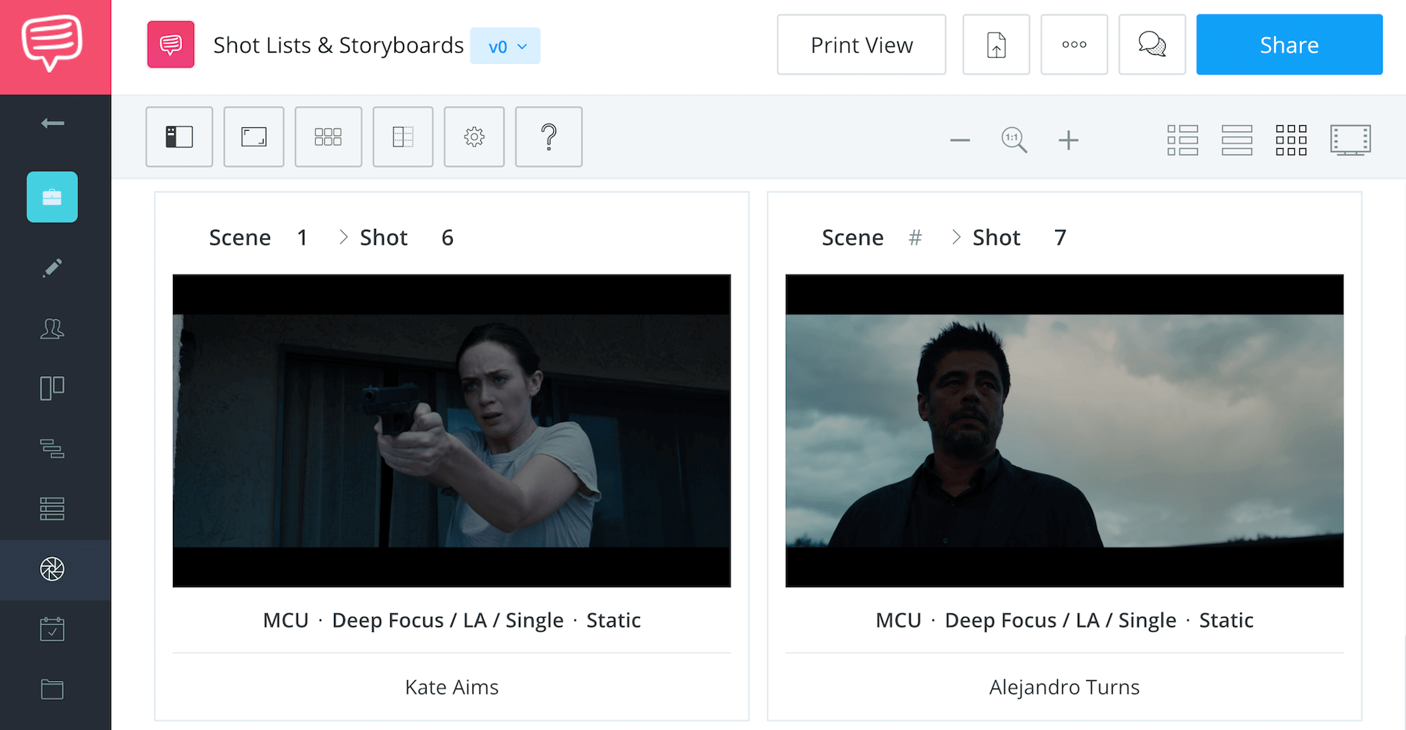
After she signs and Alejandro leaves, Kate grabs her gun. She returns to the balcony and aims at Alejandro as he walks away. Now she is in control of the situation, and the lighting scheme marks this reversal.
A dark background now surrounds her while the sky behind him fully exposes Alejandro. Both characters are framed in a low angle, which is often used to give a character power.
But there is a difference here as well. The angle on Kate is low but only to match her eye-line. The angle on Alejandro is much lower and contrary to his eye-line.
Even in this situation, Alejandro is the more powerful of the two. If Alejandro felt threatened, we would frame him in a high angle, looking down.
But there is no threat. He knows she won't pull the trigger.
Do you have a tense dialogue scene in your script? Could you use light and shadow to create a power dynamic like this scene in Sicario?
If you’ve seen this technique used elsewhere, let us know in the comments.
3
Production Design
Villeneuve Worlds
3.1 Establishing Landscapes in Blade Runner 2049
Building worlds
A hallmark of science fiction cinema is the creation of new worlds. The appeal for audiences is being transported to these foreign or strange places. It could be a distant planet, an alternate reality, or our near future.
The story and characters provide us with the micro-view of these worlds. But how do we complete the world-building process? How do we convince the audience that this world extends beyond the frame?
Establishing shots and production design.
In some genres, establishing shots function as a bumper or filler between scenes. They signal to us that we're moving locations, but they do little to enhance the storytelling.
In excellent science fiction movies, this is not the case. With any new world, there is a lot of information to provide the audience. How does this world work? How do people live? Let's look at how Villeneuve uses these tools for world-building in Blade Runner 2049.
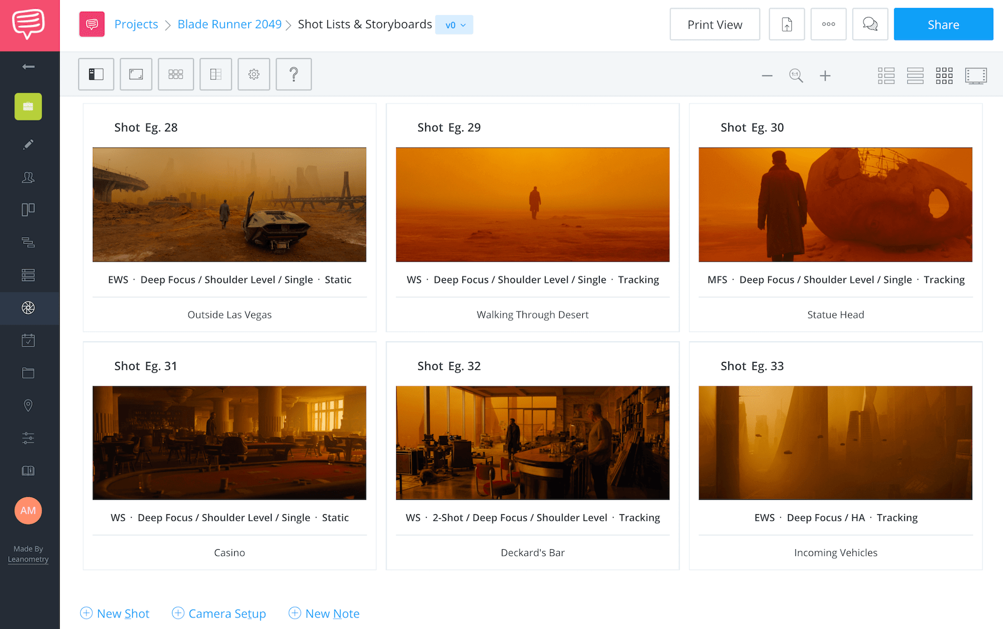
Our first look at this world is a group of aerial shots of what we assume is an agricultural region. We see a gigantic solar farm, populated with a series of circular grids of panels and looming towers. We know now that solar power has become a dominant resource.

Our first glimpse at the future
The next shot is a flat, fragmented plain. This is clearly farming land, but it tells us more than that. Every inch of available land is being utilized. The population has grown, and the demand for food production has reached a tipping point.
Later, 'K' (Ryan Gosling) flies into Los Angeles. This is our first introduction to the city, and the presentation is deliberate. The sequence is comprised of graceful, floating shots as we take in the landscape.
The first three shots give us a glimpse at a sea of gray and claustrophobic urban sprawl. The buildings are lifeless and indistinguishable. There are no lights or colors anywhere.
In the next few shots, we start to see a little variety with small pops of distant neon lights.
We also get the first few skyscrapers, breaking up the vertical terrain.
The city begins to take shape.
Finally, the camera tilts with K's vehicle, and we get our first full glimpse of the LA metropolis. It is a massive hive of civilization and technology.
The centerpiece, of course, is the monumental LAPD headquarters. The size, architecture, and central framing of the building give us a clear message.
The LAPD is a powerful organization, one which one man will have to face before the end comes.
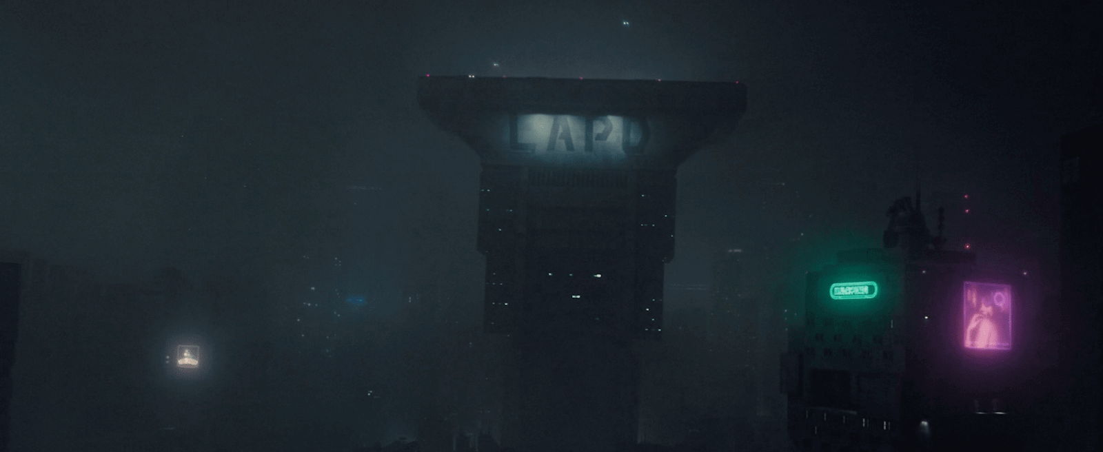
LAPD, a powerful institution
Let's recap: in the first 15 minutes, we've been adequately introduced to the world of Blade Runner. We've learned a lot about the world and the circumstances surrounding the narrative.
If you think these types of establishing shots are restricted to Act One, you’re sorely mistaken. The entire film has shots like this. Each location is designed with its own character and personality. You can immediately tell Denis Villeneuve's vision was clearly understood by the set designer.
Los Angeles is a claustrophobic sprawl, which Wallace Corp. HQ has a menacing, rigid order to it. These differences establish a thematic opposition between these two locations and what they represent.
We’ve used StudioBinder’s shot list feature to collect over 30 of the best world-building shots in Blade Runner 2049. Click the image below and see for yourself just how far they went.
We've even seen a variety of landscapes and locations. This world is LARGE, and we get a sense of that immediately. Presenting the size and scope of the world does wonders for an immersive cinematic experience.
In Blade Runner 2049, this is done with a few simple establishing shots and evocative production design. Denis Villeneuve’s next movie is an adaptation of the sci-fi classic, “Dune.” Chances are high that he’s going to push this world-building even further.
Can you imagine what a Denis Villeneuve Dune will look like??
Successful world-building is directly related to how much time and effort is given to shots like these. Establishing shots are opportunities to enhance and solidify your storytelling. Give the audience the experience of a complete and new world.
In your next project, consider how you can use these shots to your advantage with a thoughtful shot list. The audience might not see the immediate benefit, but they will feel it.
3.2 Color and Costuming in Enemy
Contrast creates conflict
Denis Villeneuve films can have surreal elements but you wouldn’t necessarily call him a surrealist. In his most esoteric film, there are a lot of unanswered questions. We've seen stories about doppelgängers before, but Enemy is in a class all its own.
Jake Gyllenhaal plays two roles: Adam Bell and Anthony Claire. Two men who are identical in appearance but live very different lives. Like many other movies about doppelgängers, Adam and Anthony represent two sides of the same coin.
Their personalities are as dissimilar as their images are similar.
How do you visualize their differences? Is there a way to separate the pair visually and thematically?
The answer lies in this scene from Enemy.
Both men have identical hairstyles and facial hair. Their costumes are the only way to set them apart visually. Adam is the more wholesome of the pair, and his outfits' color palette are generally lighter. Anthony is more aggressive and reckless, so his color scheme is darker.
We can make the straightforward argument that good guys wear white and bad guys wear black.
But this is only the beginning of how costuming is used in the film.
What we see around the characters provides additional context and meaning.

I think cinema is a tool to explore our shadows.
— Denis Villeneuve
In this scene, Anthony confronts Adam in his apartment. The power dynamic is evident between the two, but Villeneuve takes it a step further.
He highlights this situation with costume and production design.
In these two shots, notice the use of contrast in color and background. In Adam's shot, his white shirt blends perfectly with the cabinets behind him. He blends into the room, making him less physically imposing.
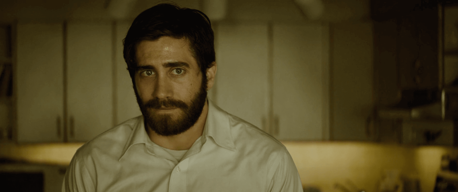

Adam blends in, weak
Anthony, on the other hand, is wearing a black leather jacket, separating him from the well-lit background.
His physical presence is darker, stronger, and imposing.
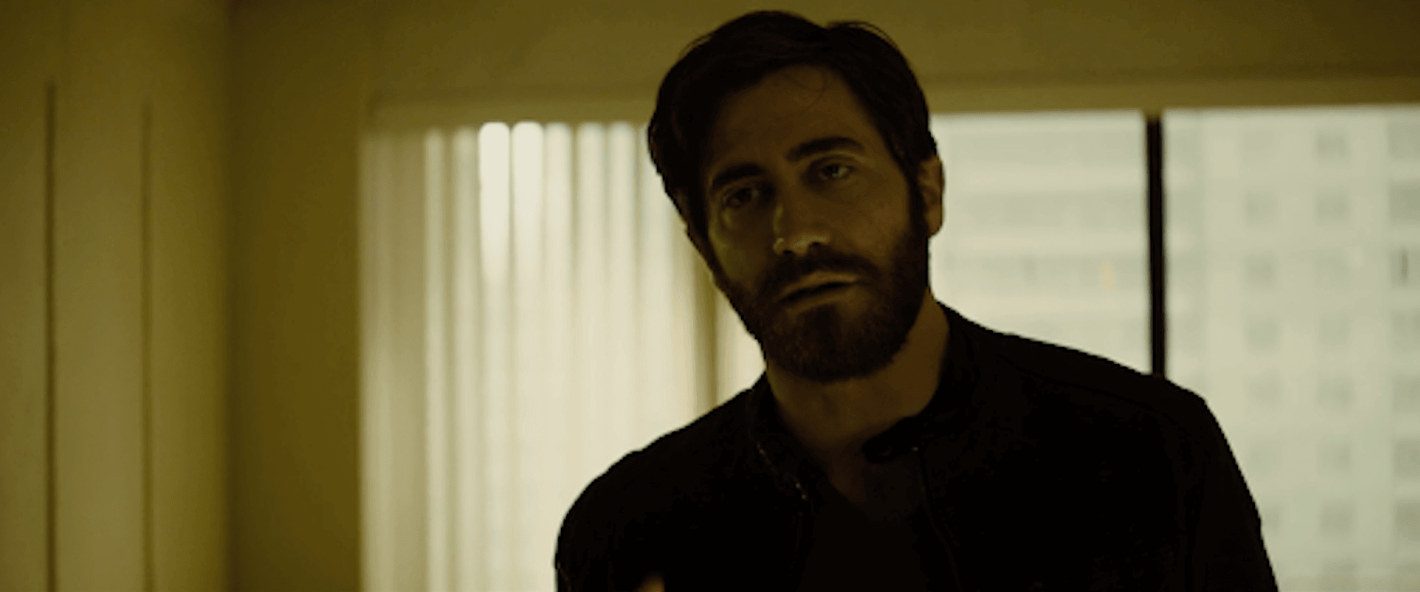

Anthony stands out, strong
Gyllenhaal’s performance as both characters makes their differences obvious enough. But the subtle choices in how you dress, light and stage these performances give scenes like this a subtextual and intangible quality.
Costuming is an essential part of the process. In your films, consider how costume can be combined with setting to push the symbolism even further.
Staging the scene this way is a subtle choice and one your audience shouldn't even notice. But it will work on a subconscious level, and it will elevate the film.
4
Editing
Villeneuve's Films
4.1 Crafting Complicity in Prisoners
Activating the imagination
Editing is all about manipulation.
It is a construction of sound and image to produce a story, a feeling, or a theme. Editing can provide meaning to a scene that might not have been in the script.
Editing can also activate the imagination and bring the audience further into the story. Villeneuve does this in a scene from the violent drama Prisoners. He doesn't show us the frightening images of a kidnapping.
Instead, he allows us to imagine it for ourselves.
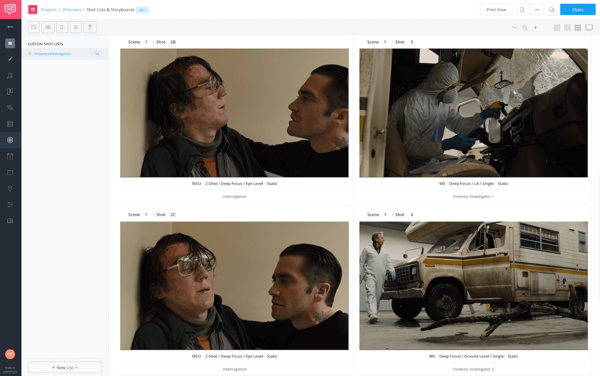
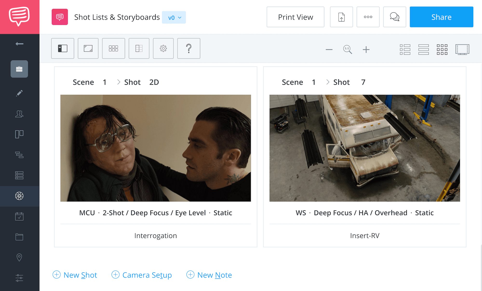
Let's break this scene down and talk about how this is done. Check out our StudioBinder shot list for a look at each shot included in the scene.
Two little girls have gone missing, and they've finally captured a suspect. Paul Dano plays the prisoner in question (Alex) while Jake Gyllenhaal's Det. Loki questions him.
Loki grills Alex about the kidnapping with questions about his motivation and processes. The interrogation is intercut with footage of Alex's RV being tested by forensic investigators.
During these shots, the interrogation continues in voiceover. Loki's questions attempt to construct a timeline of events. "Did you ask them to come inside the RV and then take them away?" "Did you tie them up?"
Alex denies having any involvement with the missing girls. But the scene is constructed to convince us that he is guilty. As we are shown images of the supposed crime scene, we imagine the kidnapping for ourselves. We visualize our own scene that shows Alex taking the girls.
We make him guilty in our minds. We "saw" him do it.
This judgment is critical because Alex's innocence is questioned throughout the film. Keller (Hugh Jackman) is convinced that Alex is responsible and goes to severe lengths to prove it. Keller travels along a moral tightrope in his search for the truth.
And because we've constructed our own version of what happened, we must examine our moral territory.


In contradiction and paradox, you can find truth.
— Denis Villeneuve
Through editing, Villeneuve complicates the audience's experience watching the film. We are no longer passive spectators; we have thrown our hat into the ring.
When editing a scene like this, keep the audience experience in mind. By engaging their imagination, they will bring themselves further into the story.
And that’s when you know you’ve got them.
4.2 Editing to Music in Incendies
Images + music = theme
Denis Villeneuve films the opening scene to Incendies like a music video. The relationship between images and music compliment each other in really interesting ways. The edit is designed around the music, but this is not a formal exercise without purpose.
This scene is much more meaningful to the story than we realize.
When you first watch Incendies, the context for this scene is missing. It only makes sense to the viewer by the end.
And only then does its real power reveal itself.
The music playing is a song by Radiohead called "You and Whose Army?" It begins as a quiet ballad without percussion. It is a soft vocal and a reverb guitar.
The images match this tone with a gentle, panning camera and slow-motion images. Our location is a decrepit and empty concrete room somewhere in the Middle East, where a group of young boys is getting their heads shaved.
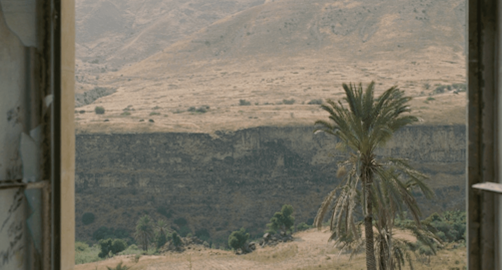

The first clues to our location
Their expressions tell us that they are possibly there against their will. The adult male soldiers carrying automatic weapons confirms this. The lyrics to the Radiohead track mention cronies, an army and the Holy Roman Empire.
It is a challenge: Bring your army and let's do battle.
And that's when we begin to develop a context for the scene. They are turning these boys into soldiers. Shaving their heads reduces their individuality as they now belong to the cause.
The song drops from the elegiac ballad into a much more powerful chorus. Drums and piano kick in and the song suddenly soars. The moment the percussion drops, the image changes dramatically.
We now face a young boy staring straight at the camera. In slow motion, the camera pushes towards his face as he endures the mandatory haircut.
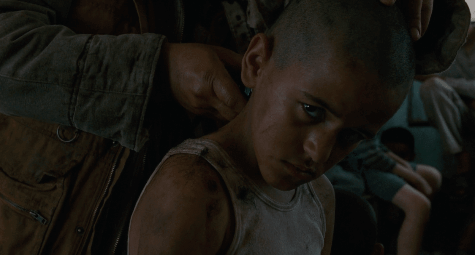

Breaking the fourth wall, but why?
He glares at us as the music's jump in energy signals his importance. We see a small tattoo of three dots on his heel just before this. It is only later that we understand the significance of the tattoo.
The lyrics and imagery are thematically linked. It is a powerful way to open the movie and a great example of editing to music.
Using a pre-existing song can be a risky decision. If the song is popular, most audience members have their own associations with it, which may compromise the effect you’re going for. Go through your script and consider what songs would have the most impact.
What are some of your favorite moments edited to music?
Tell us in the comments.
5
Sound and Music
of Denis Villeneuve
5.1 Soundtracking Threat in Arrival
Creating dread with music
Arrival is about the meeting of two worlds. Ours and theirs. To help establish this separation, the visuals are striking on their own. But the soundtracks representing those worlds also echo this idea.
How does Villeneuve use music to communicate the strangeness of these visitors? And how can music engage our imagination about these creatures before we ever see them?
We're going to answer those questions with scene studies from Arrival.
The first music we hear in the film is during the prologue. Louise Banks (Amy Adams) speaks in voiceover in what appears to be a flashback sequence. It is a romantically shot and edited sequence with a tragic conclusion.
The music is a melancholy arrangement of stringed instruments. We've never heard this particular score before, but we recognize that it is of our world. It is familiar and human.
The next time we hear music, Dr. Banks approaches the alien craft in a long, gorgeous aerial shot. This time, it is music that is NOT of our world. It is a droning hum with a melody that sounds almost like vocalization.
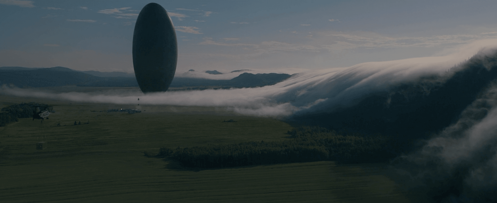

Alien music for an alien scene
The melody is close to what we may have heard in whale-song, but it is more foreign than that. Could it be a song sung by the aliens? We're not sure, and that uncertainty creates tension.
What are these visitors, and what do they want?
We've entered a new reality, one in which aliens exist, and that strangeness is heard before it is seen.
Later, Dr. Banks and the team enter the spacecraft. The score's threatening and alien tones increase. As they approach, we hear a foreboding and deep drone.
When the scissor lift carrying the team stops and they float briefly above the platform, the alien melody returns.
And as they walk towards the main chamber, we are greeted with a multi-layered harmonic blast. It sounds like a warning or an alarm coming from the ship itself.
A few seconds later, we see a shot of the team apparently walking on the ceiling, and we get a second warning blast.
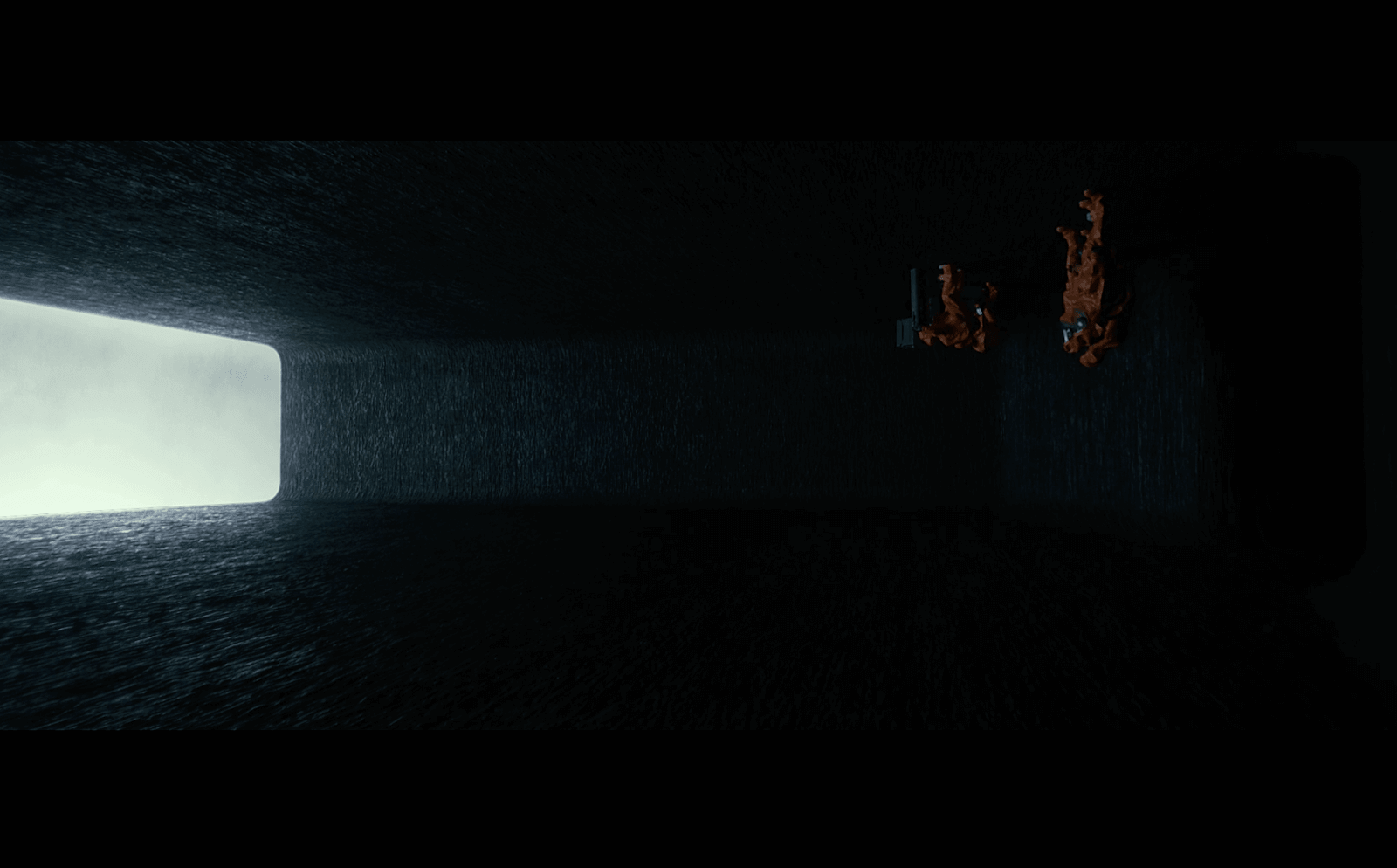

Something’s not right..
The team is upside down.
In an alien spaceship.
The dread of this scene is loud and clear.
Denis Villeneuve films have become just as sonically interesting as the visuals. Even though cinema is a visual medium, your sound and music choices are opportunities to suggest what we can’t see.
Don’t let these opportunities pass you by.
5.2 Alien Vocalization in Arrival
Speaking in tongues
When we finally hear the aliens "speak," our suspicions are confirmed. We wondered earlier if the moaning melody in the music might be alien vocalization.
Their bellowing and buzzing speech fit right into the territory established by the music. When the "heptapods" present themselves, their speech is mixed with the music. There is no separation between the two.
Abbott and Costello, the nicknames given to the heptapods, "speak" with sounds that are alien yet familiar. Their clicks, honks and guttural grunts could be a mix of animals found on Earth. But even those associations are complicated by distortion and reverb.
The heptapods move through their environment as if they were underwater, which makes their “whale-song-esque” speech even more familiar. No matter how alien their speech, it seems to be grounded in sounds we've heard before.
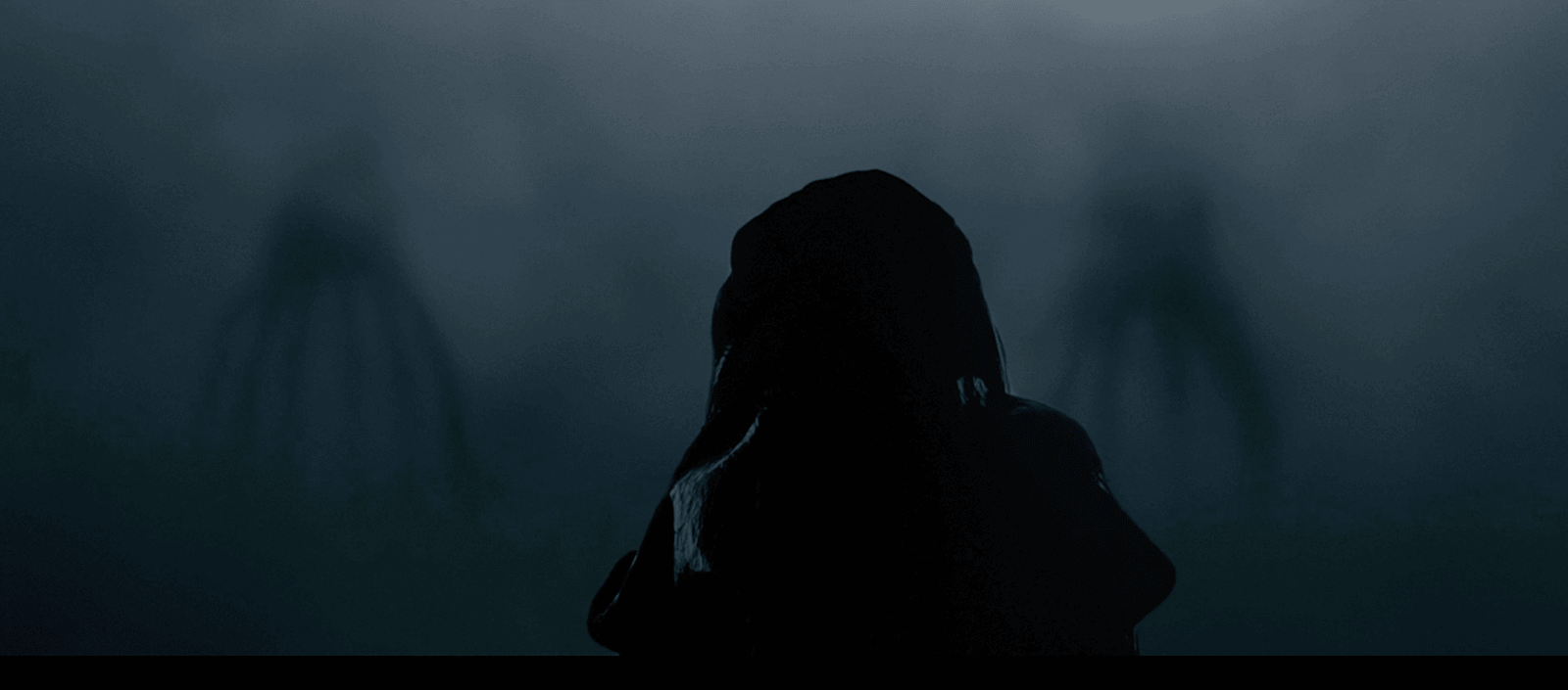

Meet Abbott and Costello
This gives the heptapods a legitimacy, a "realness" that makes them even more frightening.
The humans are powerless in this scene, and there is one other sound that makes this clear. The chirping of the tiny bird in its cage compared to the massive vocalizations of Abbott and Costello is symbolic.
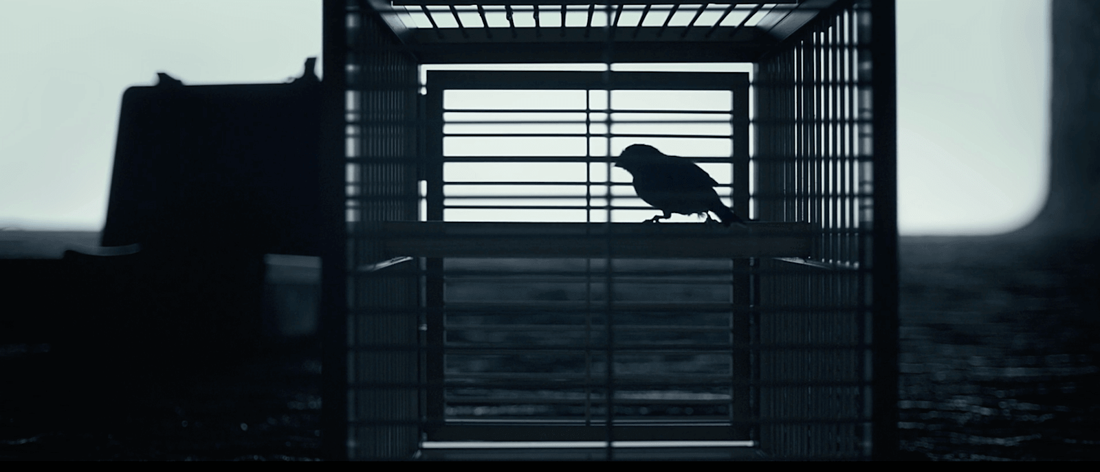

A metaphor for the situation
We are that bird. Small, trapped, and insignificant in the presence of these behemoths. Aliens are rarely presented as dreadful and dangerous as they are in Arrival. Most of this is due to the sound and music design. Aliens are still a mystery, which makes their presentation fair game.
What would aliens sound like in your movie?
Related Posts
Up Next
Aronofsky visual techniques
Denis Villeneuve films prove that he is an evocative filmmaker but, if you’re looking for a director with a more aggressive style, check out our article on Darren Aronofsky. Want to know the secrets to Aronofsky’s cinematic style?
We analyze his camera, editing, sound design, and music to illustrate what makes his filmmaking so exciting and how you can apply those same techniques to your next project.
Up Next: Aronofsky visual techniques →
Showcase your vision with elegant shot lists and storyboards.
Create robust and customizable shot lists. Upload images to make storyboards and slideshows.
