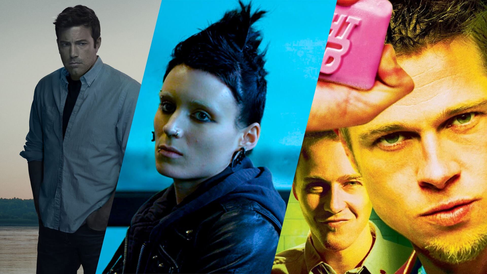
If you’re familiar with David Fincher movies, you know they focus on serial killers, robbers, brawlers, and murderers alike. You might also know that he has a reputation for being an exacting, obsessively technical director.
However, dark subjects and visual meticulousness belie Fincher’s overlooked secret weapon: his ability to connect with actors on a human level to draw out authentic and defining performances.
This humanity, this messy warmth, doesn’t simply transcend Fincher’s bleakness and robot-like technical rigor: it exists because of it.
That’s the genius of David Fincher films.
Table of Contents
The complete guide to David Fincher's visual style.
- Visual Style & Cinematography
- Production Design
- Editing
- Sound/Music
- David Fincher’s Filmography
David Fincher's Directing Style
1
David Fincher’s Visual Style
Frame, Lighting and Camera Movement
1.1 Staging, Blocking and Composition in Se7en
Staging Actors and Composing Frames
One cinematic technique favored by Fincher is the wide-angle shot. He uses wide shots (also known as full shots or long shots) to display a character’s environment and situation.
Wide shots literally shoot subjects from a distance, but when used in David Fincher movies, they tend to have the opposite effect: they give the audience a gut-level understanding of a character’s immediate predicament.
Look at this wide shot example from Zodiac: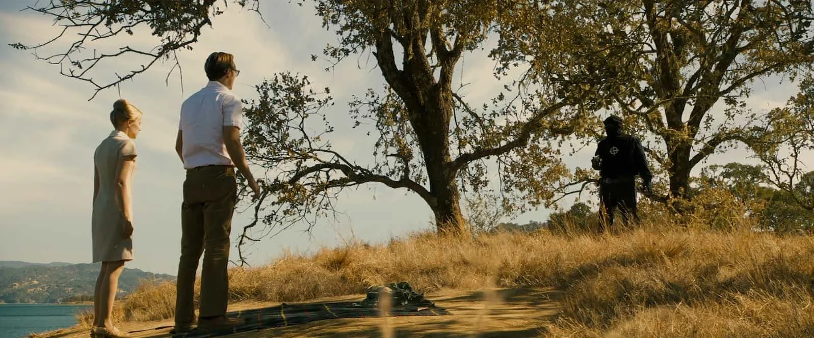
David Fincher movie employing the wide shot in Zodiac
Far less common for Fincher are his use of close-ups. He uses close-ups sparingly to highlight what’s really important.
This infrequency ramps up the intimate connection to character when he does choose to cut in.
So how come David Fincher movies use close-ups so sparsely?

Every time you go to a close-up, the audience knows, ‘Look at this, this is important.’ You have to be very, very cautious and careful about when you chose to do it.
— David Fincher
David Fincher’s style is characterized by purpose. For Fincher, a close-up has to be respected and used only when absolutely necessary. David Fincher films are also characterized by his meticulous shot selection.
On House of Cards, Fincher experimented with the rarely-used (up to that point) 2:1 aspect ratio. This would allow him to capture a middle ground between the intimacy of taller aspect ratios (1.85:1) and the breadth of wider aspect ratios (2.35:1). Let's take a look at the 2:1 aspect ratio and how Fincher brought it into House of Cards.
What is 2:1 Aspect Ratio? • Subscribe on YouTube
Let's examine another scene and see his purposeful precision at work.
The climax of Se7en is iconic for many reasons. The dark twist of an ending is one of the great shocks in cinema. Kevin Spacey as John Doe, Brad Pitt as Det. Mills, and Morgan Freeman as Det. Somerset all give masterclass performances.
But how is cinematography used to amplify the scene? What effect do shifts in lighting and frame sizes have?
Let's open the box and see what's inside...
Spoilers ahead, obviously.
Our analysis begins the moment Det. Somerset understands the gravity of the situation and runs back to Det. Mills and John.
This scene is all about the power that John Doe has over these men, even though he is their prisoner. One obvious way to suggest a powerful character is to shoot them from a low angle.
Our first shot is an extreme low angle on John Doe. He occupies the center of the frame and is backlit by the sun, giving him something like a halo. This is the moment the trap has been sprung, and he is at his most triumphant.
Most of John Doe's remaining shots are eye-level close-ups. His face looms in the frame as Det. Mills tries to understand what has happened. These close-ups also show us, as Det. Somerset says, "John Doe has the upper hand."
Det. Somerset has opened the box and understands the trap. His single shots are also in close-up. His understanding makes him visually equal to John Doe.
But Det. Mills is still unaware.
As the scene progresses, Det. Mills is shot in either medium or medium wide shots. That is, until he learns that his wife was pregnant when she died.
Finally, we cut to a large close-up of his broken and tortured face.
This close-up isn't meant to suggest Det. Mills has any power in the scene. It is necessary to register the shock and agony he is experiencing. We watch in great detail his emotional turmoil.
From here on, all three characters are shot in close-up.
But there is also a lot happening with how this scene is lit. The lighting, too, accents the scene in abstract but effective ways.
In short, the lighting on Det. Mills and Det. Somerset is 100% consistent and logical. The sun is always on Det. Mills back or left side. For Det. Mills, it is either in front or on his right side.
But the lighting on John Doe changes from shot to shot.
In some close-ups, John is backlit with the sun behind him. In other shots, he is lit from the left, others from the right. There are even shots of him facing the sun.
But the discrepancies don't end with the direction of the sunlight. The quality of the light also changes. In some shots, the sun hits John Doe with sharp brightness. And elsewhere it is diffused and glowing around him, especially in his last close-up right before his execution.
Why? This is a strange decision to make, especially for a perfectionist like Fincher. Is it really just a mistake?
For the sake of argument, let's assume this decision was made intentionally.
The lighting shifts are expressive, meant to suggest more than to represent. He switches from prisoner to mastermind. He is soft-spoken but deadly. He now admits that for all the righteous judgment of his victims, he, too, is a sinner.
There is a multitude of shades to John Doe's character. Det. Mills and Det. Somerset are much less complicated in their morality.
Fincher uses these oppositional lighting schemes to illustrate the divide between these characters. And we are reminded that we will never truly understand John Doe.
This is what creative decisions with cinematography and lighting can produce. Every shot, even within the same scene, is an opportunity to use light and shadow to your advantage.
For more on staging and blocking, check out StudioBinder's FREE masterclass, and the video below, offering some incredible insights on these visual storytelling techniques.
Related Posts
1.2 Camera Movement in Gone Girl
Moving the Camera for Character
David Fincher won’t move the camera unless he has a compelling, character-based reason to do so.
Fincher matches his camera moves to the movement and behavior of the actors in the frame. As characters move, so does the camera.
This is where the idea that Fincher “locks onto performance” gets technical. Sometimes actor and camera move together in big ways; sometimes a minute, blink-and-miss-it eyebrow raise motivates a granular camera tilt.
But there are also instances when the camera moves to suggest what the character is thinking rather than doing.
Let’s look at a moment from Gone Girl.
When Nick (Ben Affleck) and Amy (Rosamund Pike) first meet at a party, their playful banter finally wins Amy over. We recognize this moment instantly because the camera clues us in.
Amy leans against a pillar, and Nick stands in front of her. Nick impresses her with his witticisms, and she listens. The shot begins on Amy with Nick in semi-profile.
The camera then gently pans around into an over-the-shoulder on Amy's smile. The movement accomplishes two things.
1. We get a full, direct view of Amy's face to capture this moment.
2. It brings the two characters closer together in the frame without them moving.
They haven't moved physically closer, but they have moved emotionally closer. To get this idea across, nothing more than a simple pan is needed.
This is visual storytelling at its purest.
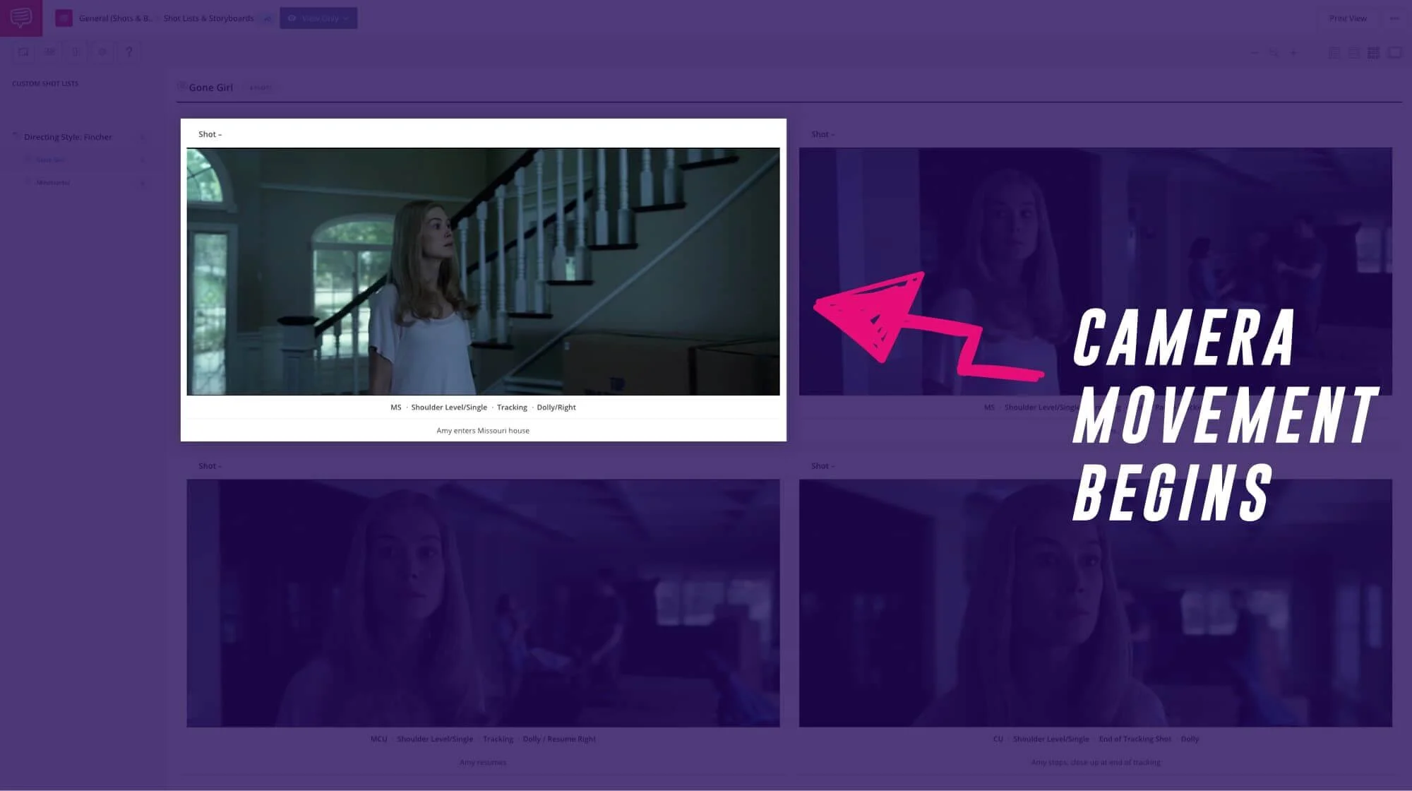
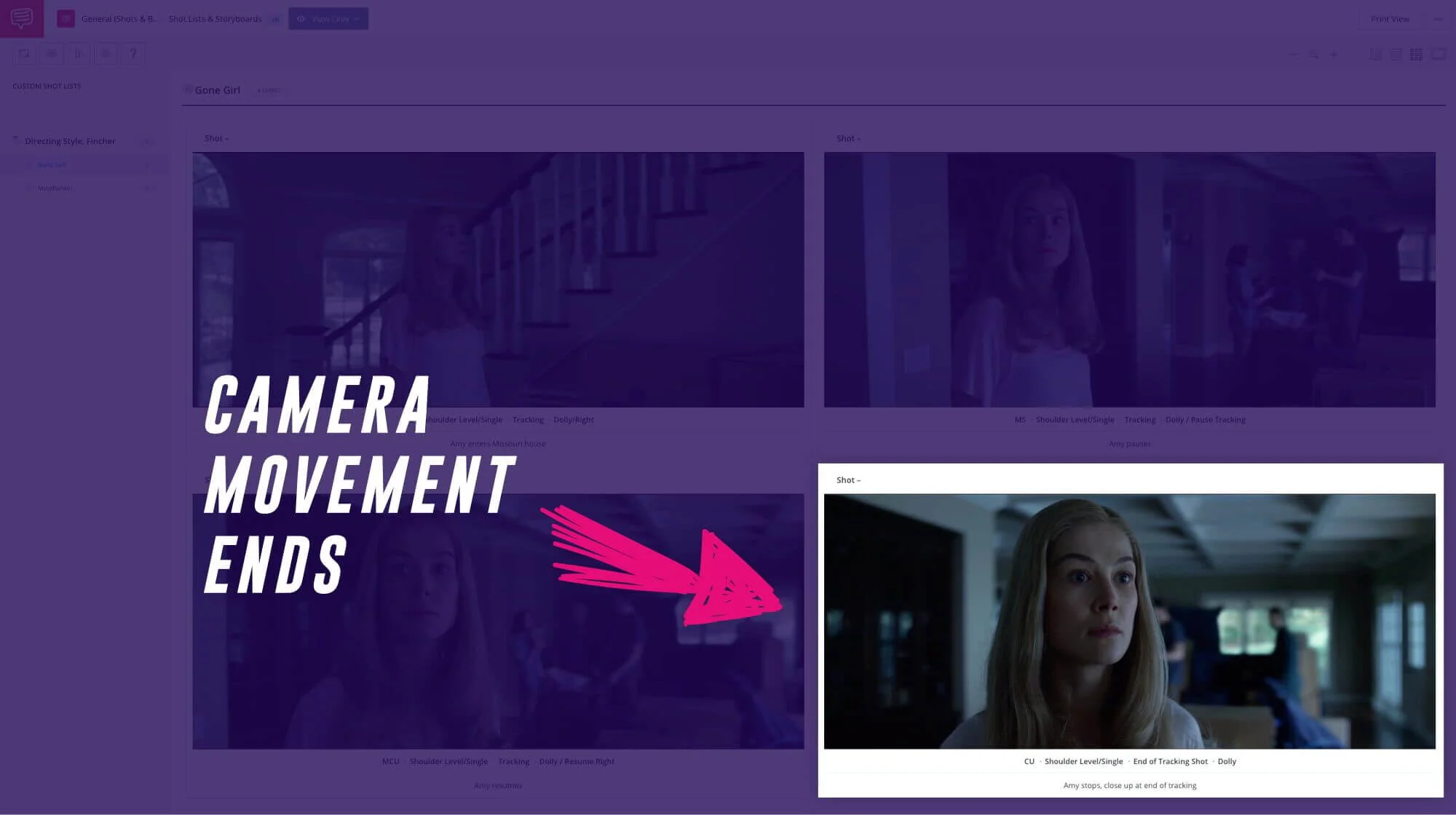
In the shot list below, check out how Fincher sets up the audience’s constant connection to Amy — a duplicitous murderer — in another scene from Gone Girl. Click below to find out how StudioBinder can help you plan your camera movements with its shot listing and storyboarding feature.
The camera moves when the character moves, and stops when she stops.
While it is unclear what David Fincher’s next movie will be, he is currently doing some exciting work in television. He directed the first and last two episodes for the first season of “Mindhunter.” With those first episodes, he established the visual language of the show using his distinct style.
Fincher’s fingerprints are so apparent in the series, it might as well be titled “David Fincher’s Mindhunter.”
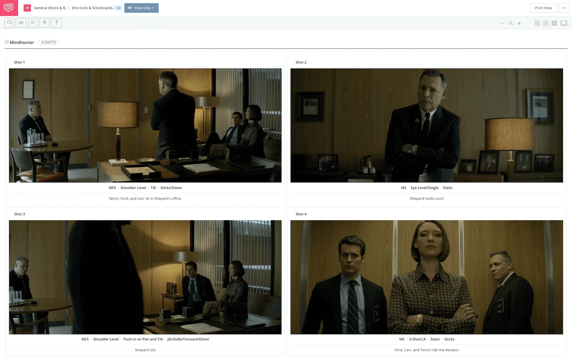
We used StudioBinder’s shot list feature to break down a scene from “Mindhunter” that Fincher did not direct so you can spot for yourself what makes the scene “Fincher-esque.”
All David Fincher films employ this movement-matching style. It results in a much tighter connection to the characters than the less-precise, looser framing styles of other directors.
By tying camera movement to human movement, Fincher fuses viewers to the humanity of his characters, inspiring the audience to empathize.
Auteur Theory Made Practical
Explore directing techniques used by the greats
Create works like these iconic auteur directors. Explore practical directing tips you can immediately put into action on your next project.
EXPLORE Auteur Directors
2
David Fincher’s Production Design
Color, Sets and Locations
2.1 Color in The Girl with the Dragon Tattoo
Fincher's Use of Color
David Fincher films and their use of color gives viewers a fast-track to fear, excitement, dread, joy, and the unexpected. Any emotion Fincher wants to evoke, color leads the way.
He uses monochromatic colors to communicate numbed characters in a stifling world, as with the Ikea furniture scene in Fight Club. He also draws the viewer’s eye to out-of-place elements and builds anticipation with discordant colors, like the orange weaponry on the torture chamber wall in The Girl with the Dragon Tattoo.
This video breaks down how David Fincher movies use color palettes with these examples, and more:
Color is often used as an indicator. It can represent a character's emotional state or as a visual motif to connect ideas.
David Fincher’s best movies use color grading quite liberally. Daytime scenes in his films will often be represented naturally. But nighttime scenes, especially interiors, are inevitably soaked in yellows and blues.
Color can also be employed as a filter for memory.
Consider this usage in The Girl with the Dragon Tattoo. Henrik Vanger (Christopher Plummer) recalls the day his grandniece disappeared. His voiceover narrates a flashback sequence of the day's events.
Flashbacks are often colored differently from the rest of the film. This is done not only to make the delineation between past and present clear.
This shift in the color palette can also suggest emotional resonance.
When the memories are positive, the colors might be over-saturated. When it is a sad flashback, a blue tint will work.
Vanger's flashback is not just sad. It is the worst day of his life.
The time is late September but otherwise a beautiful sunny day. The Vanger family has gathered at the house. Children play outside, and a festive parade bustles through town.
The irony of his grandniece's murder on such an idyllic day is visualized in the color grading. The flashback is tinted with a sickly and bitter yellow/green.
It is a sour color to represent a sour memory.
Is there a flashback in your script? What color would symbolize the emotional connection your character has with the memory?
The right color might hit the exact tonal note you're going for.
2.2 Sets and Locations in The Game
Maximize Your Locations
A character is defined by their environment. Where they live and how they live are directly related to the physical spaces they occupy.
Careful consideration of sets and locations is crucial to character development. As we know, Fincher is obsessed with the details. The color of a phone or the wallpaper in a room is always purposeful.
But let's look at how Fincher photographs these sets and locations for more than character. In The Game, Fincher frames these spaces for dramatic purposes.
Specifically, to visually represent the collapse of Nicholas Van Orton's world.
When we first meet Van Orton (Michael Douglas), his world is defined by large, open and opulent spaces.
The grand staircase with high ceilings and large windows. A living room so large, it extends beyond the frame. An exterior shot of his mansion that dwarves him.
His office is presented with a low angle and a slow push forward that marks the massive space. The conference room with panoramic views of San Francisco. And, again, ceilings so high that an extreme wide shot is still unable to contain.
The primary function of these spaces is to establish Van Orton's wealth and privilege. The wide frames give them a grandeur that would be missing if we covered the same rooms with many shots.
The secondary, and more interesting, function is to give Van Orton a starting point for the journey he is about to take. The Game will strip away everything he has, both his wealth and his privilege.
The excessive spaces like his home and office will be reduced dramatically. Throughout the film, he will be trapped into tighter and tighter spaces whether it's a stalled elevator, a back alley dumpster, or the back of a taxi cab sinking in the Bay.
Van Orton's world shrinks from a cavernous mansion to the inside of a coffin in an underground crypt.
The narrative is structured to break his character down systematically. And the way the sets and locations are designed and photographed aids this progression.
Without the wide frames of Van Orton's life of privilege, the tension and catharsis of his transformation would be minimized.
You've chosen the locations for your next film. The next step is to consider how to maximize the impact of those spaces. What would close-ups provide for character development? What would wide angles suggest about the theme?
Fincher doesn't let those questions go unanswered and neither should you.
Auteur Theory Made Practical
Explore directing techniques used by the greats
Create works like these iconic auteur directors. Explore practical directing tips you can immediately put into action on your next project.
EXPLORE Auteur Directors
3
David Fincher’s Editing
Editing for Character and Suspense
3.1 Editing for Character
Montage for Character Development
A montage is a great tool for compressing time and moving the narrative right along. It can also be used to make connections between seemingly disparate elements.
David Fincher films have many great montage sequences. In Zodiac, the amount of time and energy spent on the case needs to be shown in montage. In Se7en, we see Mills and Somerset working independently because of their inability to work together.
Related Posts
3.2 Editing for Suspense in Panic Room
Slow Motion and Suspense
Editing presents an opportunity to manipulate time. With film, time can be collapsed, expanded, reversed, or chopped up in a million ways.
A suspense scene is constructed to delay whatever the outcome may be. Will they live or die? Will the car crash or not? The longer these questions go unanswered, the higher the suspense.
Of David Fincher's thrillers, Panic Room is the purest. It is a simple conceit anchored by a home invasion. It lacks the nuanced commentary on the dark side of human behavior that his other films achieve but...
It's pure cinematic candy.
One scene stands out in particular for its editing. It is an epic presentation of a simple task: retrieving a cellphone.
Meg (Jodie Foster) and her daughter (Kristen Stewart) are safe in their panic room. While the intruders argue downstairs, Meg seizes this opportunity to get her cell phone outside in the bedroom.
You can imagine the consequences of this decision. So far, Meg and Sarah are mostly safe in the panic room...mostly.
Getting the cellphone might mean life or death. That's how vital this risky operation is.
And the presentation of the scene is explicitly designed to maximize this point. Using extreme slow motion and abstract sound design, the suspense reaches its tipping point.
Watch the scene here:
Watch the scene from Panic Room
The scene starts with Meg opening the panic room door. She races to her bedside, reaching behind the overturned mattress for the phone. It's not there.
The men continue their dispute on the stairs, completely unaware that their window of opportunity is wide open.
Meg then looks under the bed and sees the phone. She reaches but it is inches out of her reach. She stretches further and inadvertently knocks over a lamp. When it crashes to the floor and the bulb bursts, the intruders finally realize what's happening.
They begin to run back upstairs just as Meg grabs the phone and sprints back to the panic room. She gets in, and the door shuts behind her not two seconds before they would have reached her.
At normal speed, this action would have taken no more than 15-20 seconds. Instead, the slow motion stretches this out to one minute and forty-two seconds.
That's painfully slow. It's like a nightmare when you're being chased but can't seem to outrun your pursuer.
The slow motion might be enough to crank up the suspense by itself, but we're not done yet. The images move at a snail's pace, but the editing is insanely fast.
In the 102 seconds of the scene, there are 61 different shots. This means that the average shot length is 1.67 seconds.
The effect of super slow shots edited at this breakneck pace is pure suspense. It takes a simple action that could have been a minor moment in the film and expands it to epic dimensions.
With no dialogue, a subtle but brooding sound design, slow motion, and rapid cutting, we have an intense scene. This is David Fincher proving his mastery over the medium.
Here's a challenge for your next film: take a simple action with dire consequences and stretch it out as much as possible. But keep in mind that there is always a breaking point--that point in which you stretched too far.
After a certain point, you will lose the audience. Find that point and dial it back just a hair.
Auteur Theory Made Practical
Learn the directing techniques used by the greats
Create works like these iconic auteur directors. Explore practical directing tips you can immediately put into action on your next project.
Explore More Auteur Directors
4
David Fincher’s Sound & Music
Emphatic Sound Design and Ironic Music
4.1 Emphatic Sound Design in Fight Club
Storytelling with Sound
Fight Club is David Fincher's most stylized movie to date. Whether you enjoy this maximalist approach or not, the experience of Fight Club is one-of-a-kind.
Every element in the filmmaking process seems to be firing on all cylinders. Cinematography. Editing. Production Design. Music. Performance. Costume. Color. Writing. Special Effects.
Each of these elements is worthy of analysis, but let's take a closer look at just one.
Sound design.
How does David Fincher push his sound design, and what effect does it have on the audience?
In the very first scene, we are dropped into a moment that immediately raises many questions.
The Narrator (Edward Norton) has a gun in his mouth, held by a man we will later meet (Tyler Durden). The Narrator is strapped to a chair in an unfinished floor of a downtown skyscraper.
Before we see this setting, we hear it.
Watch the scene here:
Sound Design in Opening Scene of Fight Club
The sound design clues us in about our location. There are deep echoes and reverberation to everything. The dialogue, the click of the gun against the Narrator's teeth, the creak of the chair. There is also a room tone, a low hum that we associate with empty spaces.
The room they are in is under construction. It is bare bones, hollow and cavernous. So, the echoes we hear are exaggerated but also motivated by the location. It gives the quietness and the strangeness of the scene a reason to be.
As the camera leaves these characters, it takes on an omniscient and rapid tour of the situation. We descend into the parking structure below the building. The camera's motion is paired with a whooshing sound as it passes through the ground and concrete walls.
We also hear alarms and sirens outside the building, but we don't see their sources. These dramatic sound effects suggest the danger inherent in the situation. Finally, we hear the electronic buzz and beeps of the timers rigged to the explosives.
As we jump back to the Narrator, he sets us up for the flashback that will occupy the majority of the film. We hear a rapid ticking sound, like a watch at high speed.
This suggests the jump back in time, but also a reminder of the imminent disaster.
It is a short scene, lasting just over a minute — just enough time to meet our characters and understand that they end up in a terrible situation. The images tell us a lot about this scenario, but the emphatic sound design seals the deal.
The amount of storytelling you can achieve in a short amount of time is due to what we hear just as much as what we see. Consider this strategy for your next project.
4.2 Ironic and Thematic Music in Zodiac
Music for Irony and Theme
For his true crime epic, Zodiac, Fincher's initial plan was to forego an original score. He wanted the pop music of the time to ground the film. Along with the period-accurate production design, the music choices are about transporting us back in time.
And to remind us that the Zodiac killer was real. He lived in our world, and we listened to the same music.
Fincher is as deliberate with his music choices as he is with the imagery. He has a strong sense of when to use music to complement or contradict those images.
In The Girl with the Dragon Tattoo, he uses a smooth, easy-listening Enya track during a torture scene. And who can forget the iconic marriage of the Pixies' "Where is My Mind?" as the world crumbles in Fight Club?
In Zodiac, the strongest and most memorable pairing of theme, character, and music is "Hurdy Gurdy Man." The Donovan track is used as the killer's theme song, like the two-note piano melody from Jaws.
Before we see his first murder, we hear "Hurdy Gurdy Man" on the radio. When Zodiac arrives, the volume raises just enough to suggest their connection. As he shoots the teenagers in their car, the music goes full blast.
But there is another thematic yet ironic music choice in Zodiac. The very first scene of the film is soundtracked with Three Dog Night's cover of "Easy to Be Hard."
Watch both scenes here:
Music in the Opening Scene and First Murder
We begin with a god's eye view of San Francisco on the 4th of July. Fireworks are cracking over the city. We then cut to an eerily smooth tracking shot from the inside of a car, passing by suburban homes. Kids run around outside, waving sparklers.
This would be idyllic if it weren't for the lyrics to the song we're listening to.
"How can people be so heartless? How can people be so cruel? How can people have no feelings? How can they ignore their friends?"
With such pessimistic lyrics, you might think the music would be equally bitter. But it isn't. It is a slow and beautiful arrangement, more befitting of a love song.
The irony between the lyrics and music complicates this scene. We know what movie we're watching. We understand that a serial killer is somewhere in this world.
The music formally introduces us to a world where bad things are about to happy to innocent people. It is a subtle and ominous scene built around music in a way Fincher makes look easy. Perhaps this level of detail is why Zodiac is considered one of David Fincher’s best movies.
Music is an element that works more subconsciously on the audience. If done with subtlety, layers of meaning can be delivered without them even realizing.
Consider these opportunities as you decide on the music for your next project.
Auteur Theory Made Practical
Explore directing techniques used by the greats
Create works like these iconic auteur directors. Explore practical directing tips you can immediately put into action on your next project.
EXPLORE Auteur Directors
5
David Fincher’s Filmography
Tales from the Darkside
David Fincher Movies
David Fincher’s Filmography
This list represents the Top 10 David Fincher movies. Granted, he’s only made ten films but who’s counting? They’re all great in their own way. Even his debut feature, when he was a director for hire, has visible evidence of his stylistic trademarks. Here's a collection of interviews with Fincher as he lays out some of the core principles and aesthetics of his directing style.
How David Fincher Directs a Movie • Subscribe on YouTube
Alien 3 (1992)
After her last encounter, Ellen Ripley crash-lands on Fiorina 161, a maximum security prison. When a series of strange and deadly events occur shortly after her arrival, Ripley realizes that she has brought along an unwelcome visitor.
David Fincher Movies: Alien 3
Se7en (1995)
Two detectives, a rookie and a veteran, hunt a serial killer who uses the seven deadly sins as his motives.
David Fincher Movies: Se7en
The Game (1997)
After a wealthy banker is given an opportunity to participate in a mysterious game, his life is turned upside down when he becomes unable to distinguish between the game and reality.
David Fincher Movies: The Game
Fight Club (1999)
An insomniac office worker and a devil-may-care soapmaker form an underground fight club that evolves into something much, much more.
David Fincher Movies: Fight Club
Panic Room (2002)
A divorced woman and her diabetic daughter take refuge in their newly-purchased house's safe room, when three men break-in, searching for a missing fortune.
David Fincher Movies: Panic Room
Zodiac (2007)
In the late 1960s/early 1970s, a San Francisco cartoonist becomes an amateur detective obsessed with tracking down the Zodiac Killer, an unidentified individual who terrorizes Northern California with a killing spree.
David Fincher Movies: Zodiac
The Curious Case of Benjamin Button (2008)
Tells the story of Benjamin Button, a man who starts aging backwards with bizarre consequences.
David Fincher Movies: The Curious Case of Benjamin Button
The Girl with the Dragon Tattoo (2011)
Journalist Mikael Blomkvist is aided in his search for a woman who has been missing for forty years by Lisbeth Salander, a young computer hacker.
David Fincher Movies: The Girl with the Dragon Tattoo
Gone Girl (2014)
With his wife's disappearance having become the focus of an intense media circus, a man sees the spotlight turned on him when it's suspected that he may not be innocent.
David Fincher Movies: Gone Girl
Up Next
The Directing Style of Zack Snyder
In the past, Director, David Fincher has mocked the “spandex summer, superhero tentpole” nature of studio films, but one director who has mastered the comic book movie is Zack Snyder.
Gain insight into the Batman v Superman and Justice League helmer’s cinematic elements and directing style in the next post.
Up Next: Zack Snyder's Directing Style →
Showcase your vision with elegant shot lists and storyboards.
Create robust and customizable shot lists. Upload images to make storyboards and slideshows.
