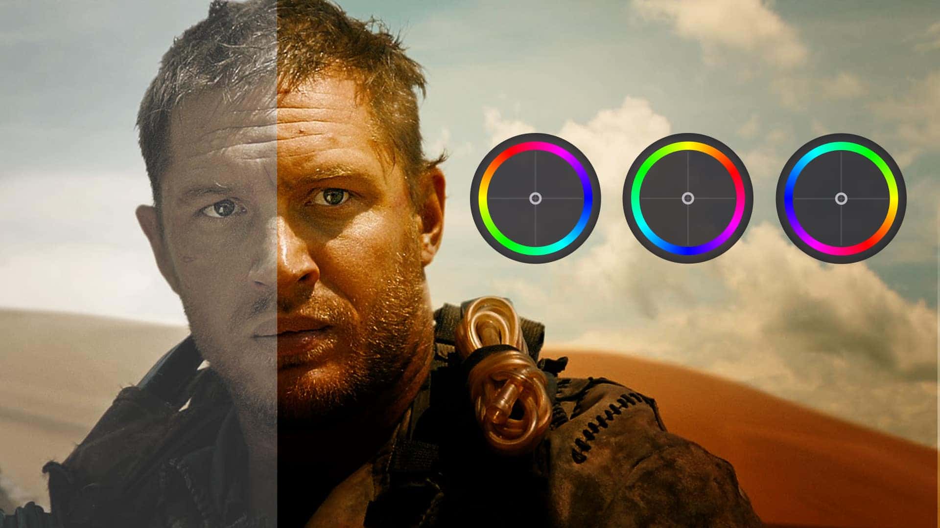
We’ve all seen films with an eerie green or chilly blue tint that drives home the tone of the project. These different atmospheres, and many more, stand as monuments to the film and video coloring process. It takes a good amount of research and practice to control images with advanced precision. What’s the difference between color grading vs. color correcting? And what other color processes can filmmakers use to tell their stories?
In this post, we’re going to take you through the process of coloring digital video so that you can control the mood of your project. You’ll be ready to establish your unique video style, or get footage that resembles your favorite films and shows.
1.1 VIDEO COLOR intro
The basics of digital video color
The process of properly coloring your footage is made up of three main interconnected tasks. Like any other recipe or formula, it is a general rule to do each of these tasks in their proper order, step by step.
Digital video coloring steps:
- Establish picture profile
- Color correct footage
- Color grade footage
These steps come with their own sets of micro-tasks, and with their own specific orders. Before we go on, let's quickly break down our two "title processes" of color grading and color correction to keep everyone on the same page.
COLOR GRADING VS. COLOR CORRECTION
Color correction is a technical process that fixes color issues and makes footage appear as naturalistic as possible. The idea is for colors to look clean and real, as human eyes would see them in the real world.
Color grading is also technical, but it's more of a creative concern. The color grading process adds atmosphere and emotion to shots by coloring footage in new, often unnatural ways.
The result of a finished video or film comes from a combination of both color grading and color correction — so it's not really a matter of one "versus" the other. Rather, it's all about the way they are combined to generate a desired look.
It’s the difference between “add two eggs” and “crack two eggs into a bowl, whisk them for thirty seconds, then chill in the fridge for an hour.”
We'll jump into the steps soon, but first we need to go over some basic color terms that will be used no matter which color grading software or camera you use.
1.2 VIDEO COLOR ESSENTIALS
What is color hue?
Hue refers to the color itself. In simplest terms, it’s the difference between red and blue. Your hue can then be altered by saturation and brightness, which we'll cover as soon as we give you a few paragraphs on hue.
Together, hue, saturation, and brightness are known as "HSB." This combination makes up the basic color concerns of any video image.
Hues don’t always have to be vivid, primary colors.
A skin tone, for instance, might be a brown hue that has very little saturation, and a lot of brightness — giving us a "fair" skin tone.
That same hue can be saturated and darkened to give us a different skin tone, all while still corresponding with the brown hue. Some skin tones will have different jumping off hues, so use your spot sampler to identify.
Here's a video that breaks down HSB color theory, and gives a good primer for our discussion of color grading and color correction.
Hue, saturation, and brightness (HSB) explained
Color schemes need to be your concern. Master filmmakers treat color as a creative component every bit as important as the script, the talent, and the camera shots.
In the video above, you can see how hue, saturation, and brightness color theory (HSB) can be applied to create mood in any film or video.
1.3 COLOR grading video
What is color saturation?
Saturation refers to the intensity of the color. This is determined by the amount of grey in the hue, from pure grey, to a vivid color.
Saturation is where you really get to make your colors "pop," or, at the other end of the spectrum, become "muddy." Believe it or not, this is all due to the amount of grey information in the color. Seems simple, right?
If you add pure white or pure black to your color, you’ll get a darker or lighter brightness value, which is our next category.
1.4 VIDEO COLOR correction
What is color brightness?
Brightness refers to the level of light in your color. This determines the difference between, say, burgundy and candy apple.
The hue for each is still red, and the saturation is at the max for each, but the amount of white and black in the color value is different. A color with intense saturation that has a high brightness value might make the viewer feel energetic and happy, whereas the same hue with a high saturation and low brightness value may evoke dread.
Is blood creepier when it is bright or when it is dark?
Those are fun questions that can come up during pre-production, and be emphasized and seized upon during the coloring process.
1.5 color grading software
Which coloring tools should I use?
There are a number of coloring tools and effects that can be applied, and altered, to help you both correct and grade your footage. Adobe Premiere is a good place to start:

Coloring tutorial with Adobe Premiere
Different programs do things better than others. Adobe Premiere, for example, is a non-linear editing (NLE) platform that include a robust menu of color tools.
DaVinci Resolve is an example of a more specialized, stand-alone color program, which also includes editing features.
We don't want to play favorites, so here's a good overview of DaVinci Resolve as well:

Coloring tutorial with DaVinci Resolve
Let’s break down these tools a bit further, but remember …
Don’t begin coloring your footage until you’ve read through the entire article because color is complex, and if you rush ahead you could destroy image quality and leave production value on the table.
1. White Balance
White balance is the same thing in your camera as it will be in coloring programs. It describes the color temperature of your image.
If you properly white balance your camera for the scene, you should have images that keep your colors around their intended values. Even if you do this in camera, you'll likely need to make a few necessary tweaks in post to get you home.
Your white balance should be one of the first things you do, because it will affect every single decision you make from there on out.
2. Scopes
You will want to use scopes (Waveform, Parade, Histogram, Vectroscope) to give you some extra value color info that you didn’t see initially.
Check out this video to see a demonstration of scopes.

How to understand scopes
As you can see, scopes are a simple but powerful tool that allow you to properly color correct your footage.
Scopes are a monitoring tool that show color and light information on a graph so that you can see the precise balance of these characteristics and how they compare to one another.
3. Curves
Curves are helpful for precise color correction and color grading, and you will want to pair these with your scopes.
With curves, you can add points to drag colors to new values, and change shadows, midtones, and highlights with much more precision.
When you make a curves adjustment, you control the entire color channel shift with any movement of the drag points. And that’s a good thing, because it means the change isn’t isolated, but interconnected.
This generates gradual changes rather than big extreme changes. You can always zoom in and add another drag point to make a small adjustment.
4. Color Match
Color match allows you to choose a reference image that will then be analyzed and applied to your target image.
This is an automatic calculation, so it is important to check your scopes and use your judgement as to the quality of the color match.
Some people even like to use popular film clips as their reference image, and their own personal footage as the target image.
This is fine for your color grade, but don’t do this to color correct. If you do, it will completely throw off the value of your colors and ultimately make your life a lot harder than it needs to be.
Color match, as demonstrated in Adobe Premiere
The best way to use color match is after you’ve color corrected some footage and now need to apply those same corrections to a target clip.
Often, you could just copy and paste the effects from your previous clip onto an adjustment layer, or through the use of bins, but if your footage has lighting and exposure discrepancies, it may not work very well.
5. Three-Way Corrector
Three-way color correctors are a useful tool for many colorists in professional entertainment, but they have their pros and cons.
The three-way color corrector lets you balance the shadows, midtones, and highlights of an image using color wheels. You can set numerical values, or use the control drag point to set your value based on hue.
7. Color Qualifiers
Color qualifiers give you the chance to change a particular color, or range of colors, without changing the rest of the picture.
You can also use color qualifiers to identify colors that you want to fix in place so that they won't change when you adjust other colors and elements in the picture.
8. Color Masks
In the DaVinci program, color masks are called Power Windows. These work a lot like masks in Adobe Photoshop. You can designate a shape to isolate its colors.
2.1 VIDEO COLOR PROCESS
How to pick your picture profile
First things first. Choose your picture profile.
If you are shooting in RAW format, you will have a large amount of control over the characteristics of your image. Beyond general quality, this is one of the attractive advantages of RAW, but it eats up a lot of storage (This is because RAW images, captured unprocessed by the camera with no set parameters, are uncompressed).
If you are not working in RAW, chances are that you will want to record in a flat picture profile, or Log profile, to give yourself more opportunities when it comes to coloring and enhancing your footage.
COLOR SPACE DEFINITION
What is a picture profile?
A picture profile refers to a set of parameters that determine the characteristics of your footage. Popular picture profiles for professional video are ‘C-Log’ (Canon) or ‘S-Log’ (Sony), but there are many others.
What does a picture profile do?
- Establishes baked-in parameters for your footage.
- Specific profiles give you a more obedient image.
- Maintains consistency across your footage.
See how important it is to establish color profile first?
You can’t go back on your picture profile because it is baked into your footage (unless you’re capturing images in RAW).
Your picture profile can be whatever you want it to be, but generally if it is more "flat" it will give you the best chance to pull out some extra steps of dynamic range, and keep your footage out of trouble.
This is where you hear the term “Log,” and more specifically “C-Log” (Canon) or “S-Log” (Sony). These are essentially neutral picture profiles (but not RAW!), giving you the best chance for controllable images.
2.2 color correction guide
How to color correct video
Now we can begin to color correct.
Color correction methods have changed since entertainment production switched to digital footage, but it is still just as important for professional images. You’ve established your picture profile, so now let's talk about one of the most important steps in any post production workflow.
COLOR CORRECTION DEFINITION
What is color correction?
Color correction refers to adjusting white and black levels, exposure, contrast, and white balance to give you an image with accurate, unprocessed-seeming colors. The point of color correction is to ensure that subsequent color adjustments have more precision, and don’t yield unintended results.
The other purpose of color correction is to create visual consistency for your footage and scenes. You want them to match for better flow.
What does color correction do?
- Establishes true levels and colors.
- Allows for accurate and effective adjustments.
- Creates visual consistency throughout scenes.
If your white isn’t really true white, but rather more of a beige, any adjustment you make to your image will be incorrect. If you go rogue, something that looks good to you may look odd to someone else.
It’s like trying to write a great song with an out-of-tune guitar.
Color correction eliminates visual inconsistencies. You’ll need to go through this process if you hope to cut together footage that may not look exactly the same, but needs to be in the used in the same scene.
Check out this Adobe Premiere color correction tutorial:
Color Correction in Adobe Premiere Pro
If your color profile is flat, desaturated, and has less contrast, it will allow these additions to have a more positive outcome, and give you a bit more control when coloring your footage.
It also helps you to squeeze out some extra information in between your maximum and minimum values.
Think how easy it would be to color the art at the museum if it was flat, desaturated, and had less contrast. They’d be more like coloring books.
Let’s get into the micro-steps of color correction.
1. Apply your input LUT
The LUT (which stands for look up table) that you apply in this case will shift the colors in your footage to the standard values of HD broadcast television, and we referred to it as an "Input LUT."This means that we intend to send our footage through this predetermined adjustment so that we may accurately adjust colors during our correction and grade phase, but …
You output LUT (if you choose to apply one) is intended to achieve a cinematic look, or sometimes a "film" look.
The Rec. 709 LUT will make your color correction sliders, curves, and scopes all work the way they should so that you can get the most out of your creative LUTs later on.
What's the difference between a Log LUT and a Rec. 709 LUT? Check out this video for a quick primer.

Log vs. Rec. 709 explained
Here’s a fun (and odd) metaphor.
When you make coffee in the morning, you pour hot water over ground up beans to get … coffee!
You don’t, however, pour coffee over ground up beans to get coffee.
Log footage is your hot water, and the coffee beans are your input LUT.
Don’t put already "brewed" footage with harsh characteristics through an input LUT because you’ll end up pushing values to extreme levels.
Rec. 709 allows you to work from a place of accuracy, but it is not necessarily going to give you the look you hope to achieve, and that’s where additional LUTs and color grades come into play.
Watch this quick study in color grading with a variety of footage types:

Color grading a variety of footage in Adobe Premiere: RAW, Log, and Rec. 709
Applying a LUT is also an opportunity to white balance your footage, either via the Auto White Balance or manual temperature adjustments.
Your camera should have been white balanced before hand, but there are some picture profiles that slightly push the color temperature one way or another, so you’ll want to rebalance regardless.
Don’t apply any tint at this point. Not yet. You just want to get as close to true white as you can so that each step works correctly. Unless your footage was shot in a way that the tint helps, chances are you should avoid it altogether.
2. Choose a "home base" clip
The best way to attain visual consistency across a bunch of footage is to look at your clips and to find one that has average exposure and levels when compared to the rest of your footage.
That way, you can try to match everything to a place that is, at the very least, able to be achieved with all of your footage.
If you pick a clip that has an extreme exposure when compared to the other footage you got on the day, you may not be able to adjust those clips to match one another, thus eliminating options from your cut.
3. Adjusts white and black
You’ll want to use your scopes here, and you need to do each one at a time. Adjust the colors and levels to find true black or true white. Make your video look properly adjusted for white and black using any number of tools. Here's how to do it with Adobe Premiere's Lumetri Color tool:

How to get a cinematic look
Your scopes will let you know if you’ve gone too high or too low with your levels, and you may need to adjust your RGB curves as well.
Use the scopes for precision.
4. Adjust overall gamma
This is where you adjust each section of your image, which includes the highlights, shadows, and midtones. Again, at this point we are still in the color correction phase and not stylizing or grading phase.
Remenber with gamma adjustments and color correction in general, you are NOT trying to make your image look “cool” or “how you want it to look” but rather "correct" in terms of color fidelity and the relationship between each level’s light intensity in the image.
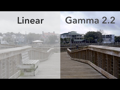
Video gamma explained
Later, when we get to color grading, you can crush your blacks and blow out the whites, but during this phase you just want to make them coordinate with one another.
5. Basic secondary correction
In primary color correction, you adjust and correct the entire image. Secondary color correction involves isolating specific parts of the image, or objects within the video frame, and correcting only those.
The same way we’ve created archetypes for characters, so it goes for color schemes and color identification of objects and imagery.
We all know that the sky is blue, or that a stop sign is red.
These are colors that everyone knows, and will expect to register if say … you have a stop sign in your footage.
If the color of your stop sign looks weird, that means two things:
- Your color correction is probably off by a bit.
- Viewers will subconsciously question your story.
This means that skin tones need to look like real skin tones, blades of grass need to look like blades of grass, and the world has to appear real.
This video explains it well:

Secondary color correction in Adobe Premiere PRO CC
That way, when you do adjust something later you can be sure that it works correctly so that you achieve your intended look.
Your imagery also feeds the willing suspension of disbelief so crucial in narrative filmmaking, all because you followed the "rules."
6. Advanced secondary correction
This is where you begin to adjust specific colors toward your desire, while still keeping in mind that they still need to be "correct."
You might want to boost the yellow of a bright-yellow sports car. You’re not altering the overall yellow in the total image, but rather boosting a very narrow hue to make specific imagery — the yellow car — pop.

Advanced secondary color correction
We still want things to look the way they should, but you can begin to use your taste a little more during this section.
Just know that you may bump values later in your color grade, so do so accordingly to avoid backtrack.
Looking good? Everything's correct? Great. Now let's make the grade.
2.3 digital color grading
How to color grade video
When you begin color grading, you will of course need to start with some software. This can be an NLE (non-linear editor) like Adobe Premiere or it can be a program created specifically for color control like DaVinci Resolve.
It's also likely you'll be using the same platform to color grade as you used for your color correcting — but many video color correction and color grading pros like to use different software for each process.
COLOR GRADING DEFINITION
What is color grading?
Color grading refers to the stylized color scheme of your footage. This can be super extreme like you see with many popular films, or it can be rather subtle so as to achieve color fidelity like with nature documentaries.
What does a color grade do?
- Stylizes the color scheme of your footage.
- Evokes specific emotions from your viewer.
- Transforms footage for the final look.
Every piece of footage that has ever been recorded has a color grade, regardless of any adjustments that might be applied.
This is different from color correction, because clips that aren’t adjusted to the correct levels are NOT color corrected, but any footage you capture has a color grade — and it is your job to adjust that grade to display your desired look.
It's what turns film and video makers into artists.
Take a look at director Denis Villeneuve's color schemes in this video:

How to use color like director Denis Villeneuve
Your color grade is where your footage begins to look stylized, but it won’t look the way you want unless you follow the first 2 steps correctly.
This is where you get to make your own creative decisions.
Using the same tools you've used to color correct, now you can add another layer, and paint your masterpiece.
This is the moment where we have to explain that the process of coloring video is additive.
That means we are adding color information to something that already has baked in color values. We are not changing the digital values of color, but rather adding values on top of the existing values.
It is similar to going to a museum with some paint, and adding more color to art on the walls.
You can also enable a creative LUT to your color corrected footage, which will apply your entire color grade literally with a single click.
In our post on LUTs, we go over different kinds of LUTs and give you a free pack of Ridley Scott LUTs.
Check out how Ridley Scott uses color here:

Mastering the movie color palette of Ridley Scott
You can see right away how these creative output LUTs make your life much easier, and if you create your own custom color grade you can export it as an export LUT, and apply it to the rest of your scene.
Color grading is something professionals consider before they step on set. While there is a bit of creative latitude in post-production, you'll want to determine a starting point for your color grade during pre-pro.
3.1 VIDEO COLOR Profiles
Color Profile Examples
Below is a clip of some footage shot in "C-Log." You’ll be able to see exactly what footage should look like coming out of the camera.

Video color in test footage
If you’re working with a camera that doesn’t have a Log setting, you can find your "Neutral" profile and decrease the contrast and saturation levels thus creating a custom picture profile that resembles Log.
3.2 color correction post production
Color Correction Examples
Showing you properly color corrected images will give you a clear idea how footage is transformed before setting out to color grade.
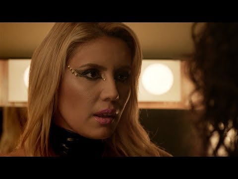
Color management is the key to matching colors from multiple cameras
The color correction examples in the video above were shot in a flat picture profile, run through the Rec. 709, and then corrected based on those values.
3.3 VIDEO and film color grading
Color Grade Examples
Here are some great examples of professional color grades.
In the first example, from Black Hawk Down, the blue is much more saturated and the brightness is definitely turned down, with the highlights lowered as well. This is a great look for sci-fi footage, or even a nice David Fincher noir vibe.
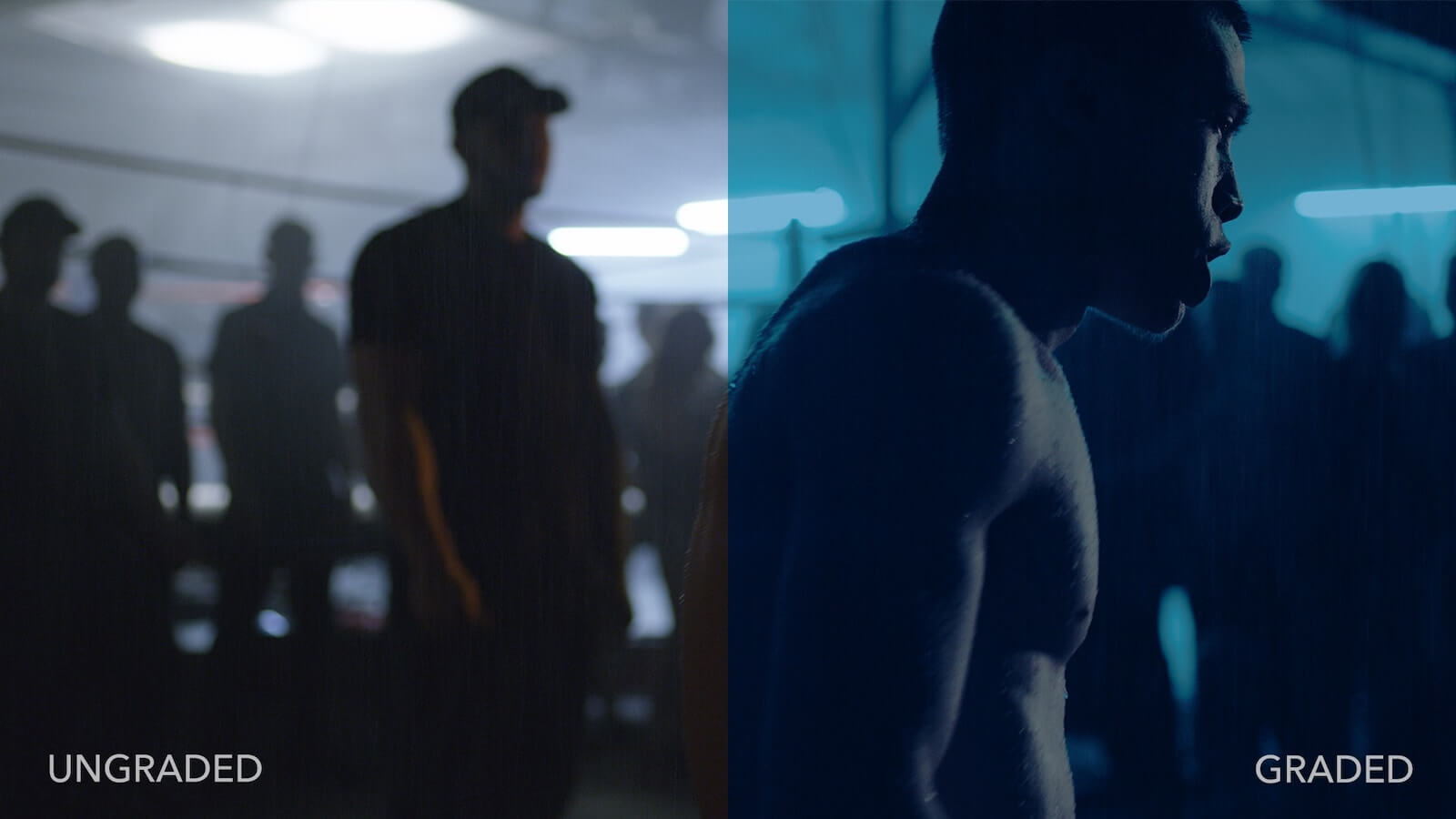
Black Hawk Down LUT in full effect
In the next example, below, we get a landscape shot. This also comes from a Ridley Scott film, The Martian.
You’ll notice immediately how much darker the sand in the ungraded clip looks, and obviously the amount of saturation in the sky. It looks like, well, Mars.
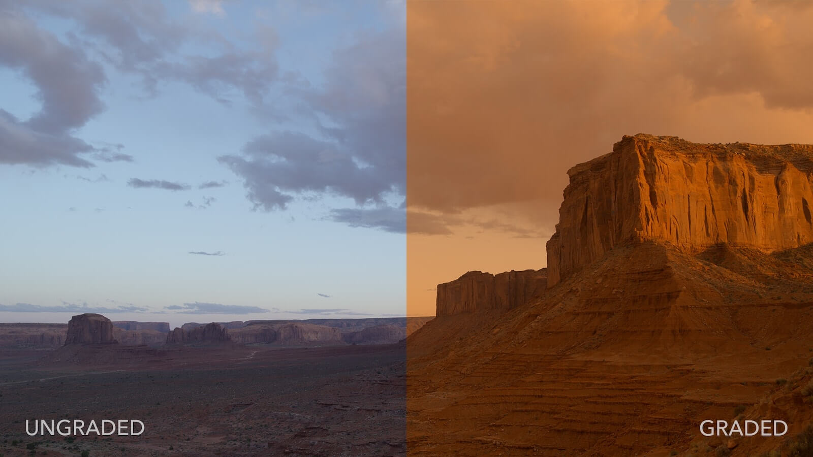
Color grading examples from The Martian
The sky in this clip has completely lost its blue, and become brown, but man do those reds and oranges come out. You’d almost think the lack of color contrast would hurt, but it doesn’t.
For these two examples, we used the free Ridley Scott LUT pack.
Keep in mind: if these clips had not been properly color corrected first, the LUTs wouldn’t have worked this way.
3.4 VIDEO COLOR EXAMPLES
Color Palette Examples
Here are some examples of color palettes from popular films and television. Keep an eye out for colors that have the same hues but different saturation and brightness. Check out Kukrosawa:
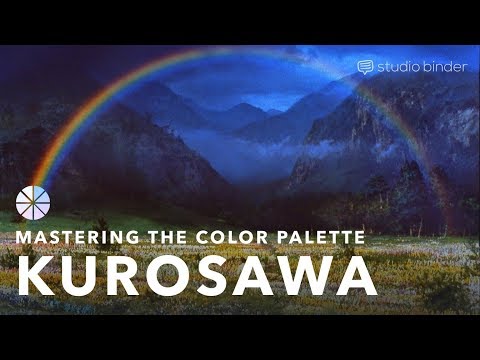
Create a color palette like Akira Kurosawa
Color is one of the more complicated portions of film and video because it requires a coherent plan from the start.
Performances can be hashed out by the director and actors.
Lighting can be figured out by the DP and gaffer.
Sound can be taken care of by the sound team.
But for color to be done correctly, you need good lighting, good production design, thoughtful input from the director, and obviously a skilled colorist.
And now you know a skilled colorist who has done their research: you!
UP NEXT
Color in Film: 50+ Examples
Now that you’re ready to color and edit your footage, make sure to check out our post on how to use color in film where we provide you with a free e-book to help you color your footage during every phase of production. If you’re about to color correct and grade some footage, why not use this guide to inspire some big decisions that will make your clients and viewers understand why they come to you - great imagery.
