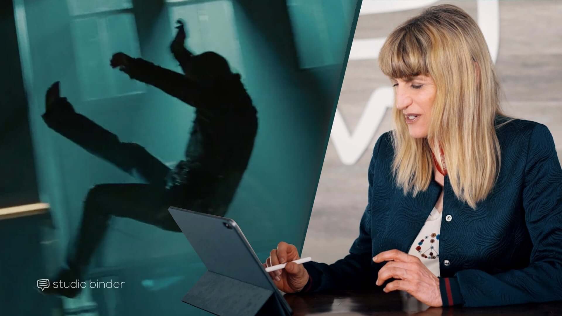
Catherine Hardwicke is a director best known for her work on Lords of Dogtown, Miss Bala, and Twilight. In a joint project with Co//ab, StudioBinder recently sat down with the talented director about her work on Twilight and how she was able to bring emotion to the climactic final battle. A lot of directorial decisions went into this one scene, so see what inspiration can be gleaned from her years of experience in the film industry.
Directed by Catherine Hardwicke
Twilight (2008)
Bella Swan moves to a rural area of Washington where she meets Edward Cullen. A romance soon develops as well as the realization that Edward is a vampire. It’s up to Edward and his family to protect Bella from a coven of evil vampires set to transform her into one of them.
We’ll run through some of the directorial choices Catherine Hardwicke decides to utilize for the climactic battle in the ballet studio and how she never lost track of the scene’s emotional core amidst all the fighting.

I’m Strong Enough to Kill You | Twilight
Self-Reflection
Utilize mirrors
Mirrors symbolize the duality of a character. They also come up in scenes pertaining to revelations and secrets. Mirrors can create a more dynamic aesthetic and give your scene a cooler look than what you would’ve been able to get otherwise.
Want to make a location come alive and even disorient the viewer, use a mirror. With the scene in Twilight, Bella thought she was about to see her mother only to be fooled and trapped by James. She’s disoriented, and the effect that Catherine Hardwicke creates by portraying James in a mirror helps aid in that effect.
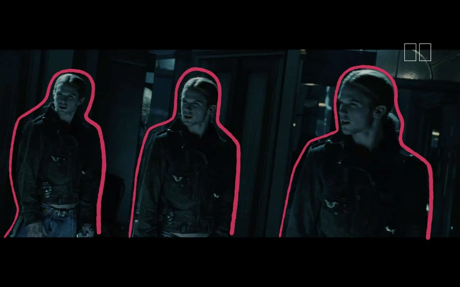
Mirrors make the threat larger
For another example in a fight scene, you can look at the hall of mirrors fight scene in John Wick: Chapter 2. Mirrors make the scene come alive, but we’re also placed in John Wick’s shoes where we have no idea where the adversary is, and we’re frantically searching around trying to find a clue.

Hall of Mirrors | John Wick: Chapter 2
Think Outside of the Box
Frame scenes unconventionally
The next thing Hardwicke does in putting the audience in Bella’s shoes involves setting up an unconventional shot. When James pushes Bella against the wall, getting uncomfortably close to her neck, they are to the far-right side of the frame. The left side of the frame brings depth as it goes all the way back to the farther wall of the ballet studio.
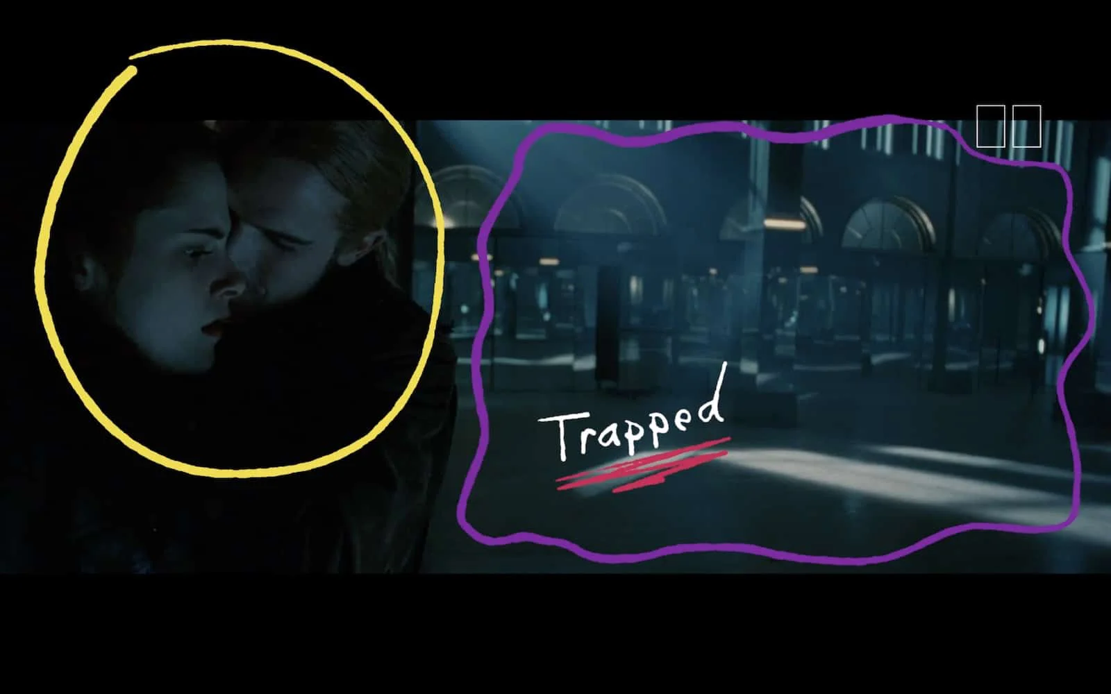
Trapped using composition
Although we see space on the left side of the frame, it’s empty space. There’s nothing and no one else in the studio. Bella is all alone with James, and if he wanted to, he could very easily bite her neck right at this moment.
We feel how Bella feels. We’re all alone.
Get Creative
Use Dutch angles wisely
After James knocks Bella into a column, Hardwicke utilizes a Dutch angle. This type of shot is commonly used to signify something is unsettling or disorienting. Bella just got knocked on her head, and she’s still trapped with the evil vampire. The Dutch angle is an appropriate choice because it makes us feel as unsettled as Bella is.
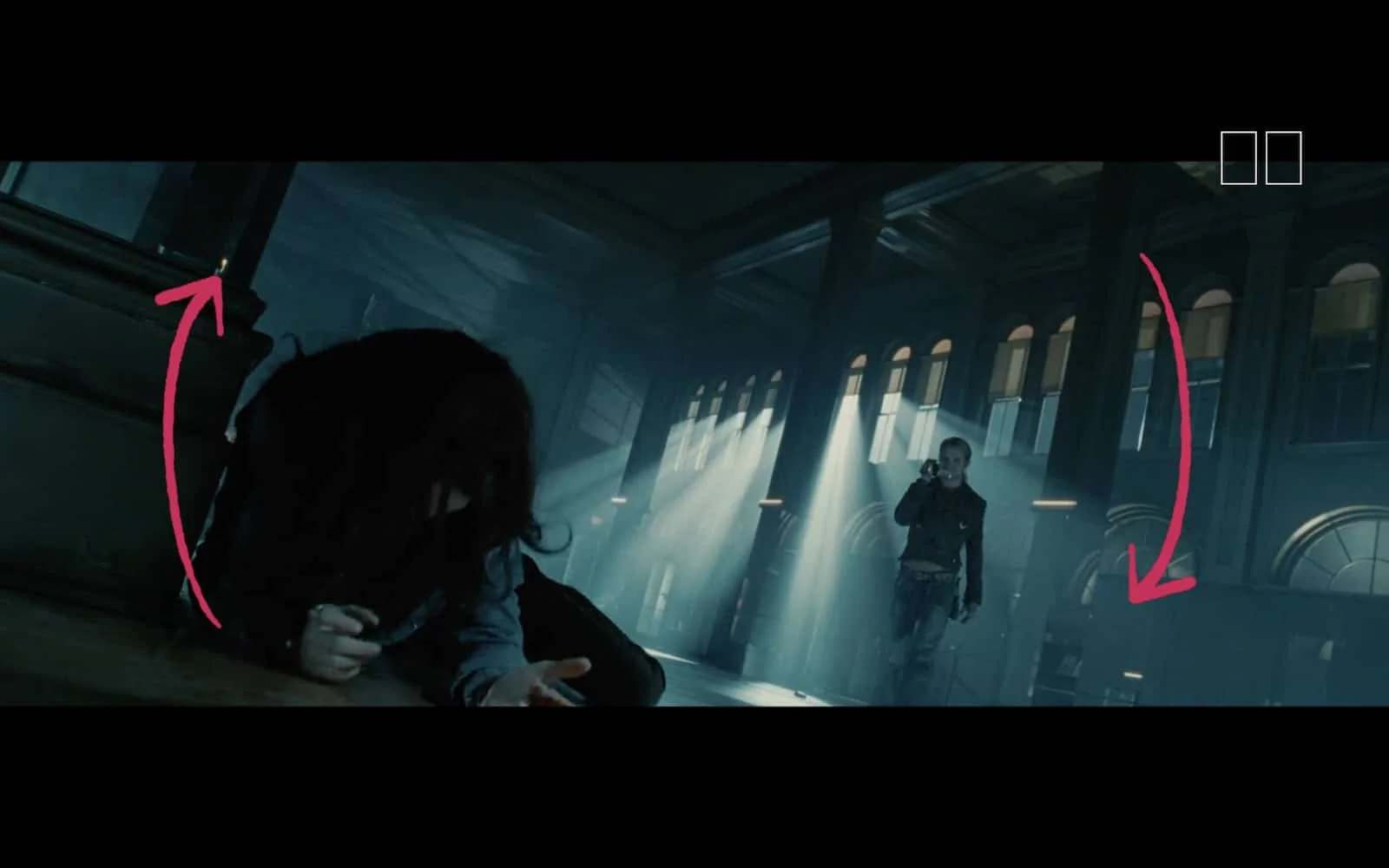
The world on a tilt
While many directors have come to overuse the Dutch angle, Hardwicke uses it sparingly. As you have seen in films like Battlefield Earth or Thor, using the Dutch angle too often will strip it of meaning. The use here makes the audience feel how Bella feels. It’s impressive to see how Hardwicke manages to make the viewer feel anxious using various different camera techniques over the course of just a few minutes.
If you’re interested in Dutch angles further, here’s a quick rundown to help you understand when they are appropriate.
![How to Use The Dutch Angle Shot [Cinematic Techniques in Film] #dutchangle](https://i.ytimg.com/vi/R9FUEScjB1U/hqdefault.jpg)
How to Use the Dutch Angle Shot • Subscribe on YouTube
Develop Intimacy
Give characters close ups
Once Edward arrives to save Bella, each character receives a close up. The scene is about to become more chaotic as the fight intensifies. Before we get into the action, Hardwicke wants to put us in the emotional state of our protagonists, so they each get their close up.
In Bella’s shot, we see that she’s still scared. It makes sense. She’s still in a room with two vampires. She’s underpowered and at their mercy.
When we cut back to Edward, he looks at Bella longingly. We understand why he’s here and why he’s about to fight. Before the main battle even begins, we’ve gone through an emotional rollercoaster with our main characters, so when the fight occurs, we know what’s at stake.
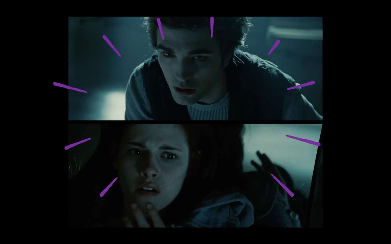
Characters connected with close-ups
It won’t just be a fight scene for the sake of having a fight scene. It will have a true arc.
Close ups are a common filmmaking technique. Check out StudioBinder’s video on close ups and when they work best.

Close Up Shots That POP • Subscribe on YouTube
Talk Through the Lens
Camera speaks for the character
The fight begins, and over the course of the scene, James manages to bite Bella, infecting her with the vampire venom. Hardwicke could’ve merely chosen to include a simple close up shot of the bite mark, but instead, she does something a bit differently.
When we do get the shot of the bite, the camera goes blurry. When we get a shot of Bella’s face, the camera tilts. All of this works toward one goal of putting us in Bella’s mindset.
The venom is setting in. She’s feeling woozy and disoriented. Another Dutch angle would have captured the same effect, but we’ve already seen that. Instead, we get unique frames that indicate this is something different. The bite is not a fake-out. Bella is genuinely hurt, and she could transform into a vampire if Edward does not act quickly.
Related Posts
Build a Sequence
Organically form new set pieces
Edward’s family shows up to finish off the bad vampire. It would’ve been a bit of a deus ex machina to have his family come in with some secret weapon that would kill James right away. Instead, the family has to think on their feet. They notice the destroyed floorboards from the earlier fight and use that to create the fire that will kill James.
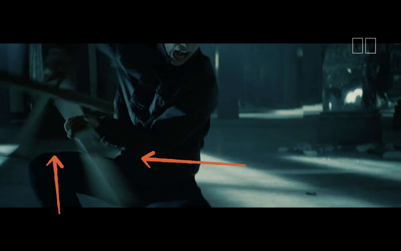
When the set becomes part of the story
Another example of this is in the fight scene from Mad Max: Fury Road. In this instance, Max is still chained to Nux from earlier. This chain plays an integral role in the fight. Sometimes it holds Max back while other times, the two use it to trip Furiosa.

Max vs. Furiosa | Mad Max: Fury Road
By building upon what you’ve already done in the scene, you can make a more engaging fight sequence that feels like a natural buildup.
Raise the Stakes
Create multiple conflicts
Another important feature of this fight scene is that defeating James is not the endgame. Even after he’s defeated, there’s still tension on screen because Bella was bitten by James earlier. Edward now has to save Bella’s life, but he’s not sure if he can resist draining her blood entirely.
You see this in a lot of fight scenes. You have an external and internal struggle. The external battle in this scene involves defeating James, which is done relatively quickly. But even after that’s finished, you still have Edward in need to control himself so that he can be with Bella.
This is a good rule of thumb for the screenwriters out there to follow. Don’t let the battle end just because the bad guy is defeated. Create another conflict to keep the tension going just a little bit longer.
Related Posts
Use Spatial Depth
Add layers to your shots
Catherine Hardwicke creates a brilliant shot when she has Edward, Bella, and Carlisle in the foreground while Edward’s other family members are in the background burning James. Not only does it create a more compelling shot, but it also gives the audience multiple pieces of information at the same time.
The emotional core of the scene is that Edward needs to save Bella without killing her. He’s not sure if he can do it. It would be distracting if the scene cut back and forth from Edward to the burning floorboards. We need to keep that emotional throughline going strong, so Hardwicke chooses to give us both scenes at once.
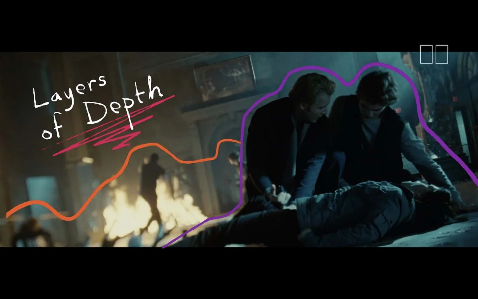
Dynamic and dimensional frames
We stick with Edward to go on his emotional journey, but we also see that James has been defeated. Economical storytelling at its finest.
Incorporate Music
Add depth with your score
Films are both a visual and audial medium. When you need to add a further layer of depth to your scene, you want to consider how a change in the score can create that effect.
Before Edward sucks the venom out of Bella, there’s no music, but as soon as his mouth touches her skin, we get a subtle score shift. You can hear the sad, gentle twang of a guitar as well as a man singing, and that singer is actually Robert Pattinson.

“Let Me Sign” | Twilight
Even if you don’t know it’s Pattinson singing, it feels like a man trying to comfort Bella in this moment. It’s sad but romantic at the same time. It tells us they will be together, but their romance will not be easy. This is just the beginning of what is sure to be a romance for the ages.
Up Next
67 Best Female Film Directors
Catherine Hardwicke is a talented director who works on everything from independent films to big blockbusters. She’s just one of the many female directors out there changing the game, and you can see who else’s filmography you should check out in our list of 67 fantastic female film directors
Up Next: The Best Female Directors →
Share your vision with elegant shot lists and storyboards.
Create robust and customizable shot lists. Upload images to make storyboards and slideshows.
