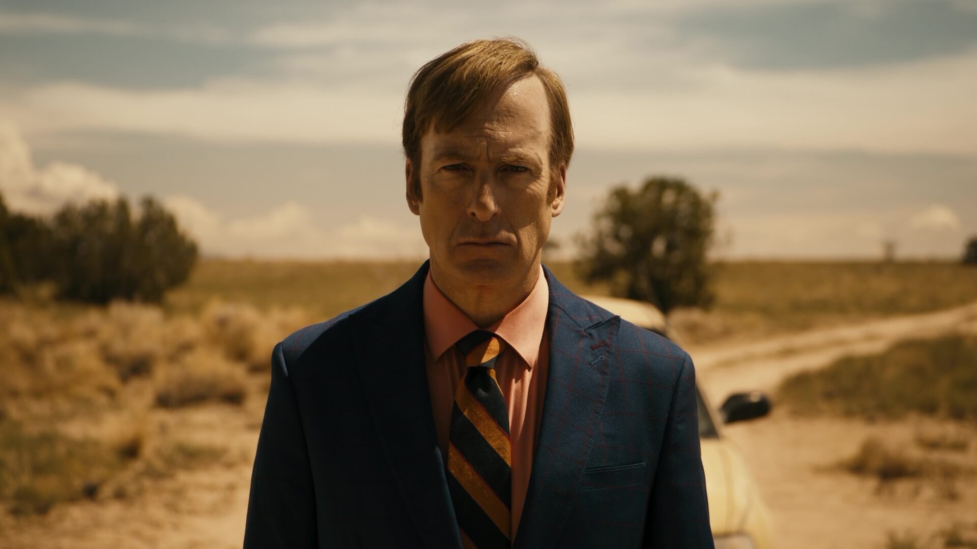
Better Call Saul is one of the most critically lauded shows on TV — and its cinematography is a big reason why. The Better Call Saul cinematography excels in just about every area: lighting, framing, focus, camera movement. You name it, BCS knocks it out of the park. We’re going to break down the Better Call Saul cinematography by looking at some key technical/creative strategies. By the end, you’ll know why the show’s cinematography is considered masterclass.
Cinematography Better Call Saul
Mix and match camera shots
Mixing and matching camera shots is essential to successful cinematography. This is particularly true when using opposite ends of the spectrum. That may sound trite to say — but you’d be surprised just how few shows do it.
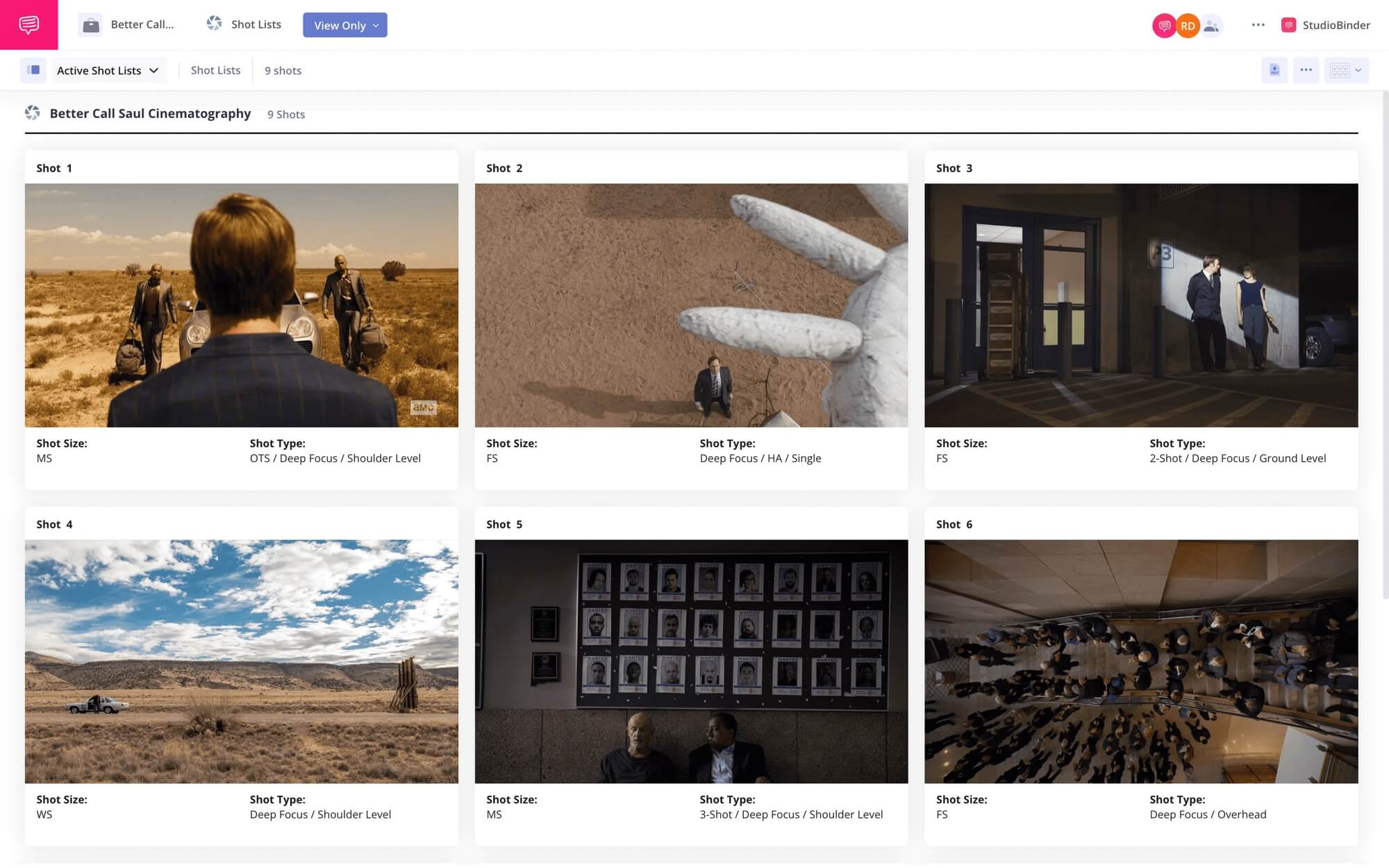
Better Call Saul effortlessly mixes and matches camera shots, from extreme close-ups to extreme wide shots. For example, cutting from a “world’s second greatest lawyer mug” to a wide shot of the sweeping vistas of New Mexico’s deserts. And BCS doesn’t just do it on rare occasions; it’s made a style of matching close-ups.
We imported a series of stills from Better Call Saul into StudioBinder’s shot listing software to show the breadth of camera shots used in the show. Click the image below to explore the entire collection.
Better Call Saul Cinematography • Mixing and Matching Camera Shots
Marshall Adams, who’s served as the show’s director of photography since season 3, comments on the benefits of shooting on location in New Mexico's deserts. “It’s hard to point the camera at something you don’t love,” Adams said in conversation with Gold Derby,
It’s true that deserts may be more sparse than jungles or metropolises, but they’re debatably more intoxicating to look at. Sparsity connotes simplicity; which brings focus to the objects/subjects of value. Consequently, it allows the viewer to focus on complex themes without missing minute visual details.
That doesn’t mean Better Call Saul is shot entirely in the desert. Quite the contrary, much of BCS is shot in interiors, from courtrooms to houses to underground meth labs.
Better Call Saul Cinematography
Build mood with stylized lighting
Cinematographers and lighting specialists often talk about “motivated lighting” when describing the desired look and feel of their work. We describe motivated lighting as “the technique used to imitate or accentuate existing light sources.” And Better Call Saul uses motivated lighting all the time.
Here’s an example:

Better Call Saul Cinematography • Motivated Lighting in Better Call Saul
Here, the light from the window shines a spotlight on Chuck (Michael McKean). Consequently, Howard (Patrick Fabian) is shrouded in darkness. The motivated lighting accentuates what we presume would be “natural light” coming through the window.
The dynamic contrast between light and shadow, known as chiaroscuro, is so obvious we could compare it to a Renaissance painting.
The production design in Better Call Saul is often used to support and juxtapose the mood. We see this in set dressing, costuming, and props. But we also see it in lighting. Take this still for example:

Better Call Saul Cinematography • Mood Building in Better Call Saul
Here, the artificial lighting supports a carnivalesque tone. Saul (Bob Odenkirk) is presented in fluorescent lighting like a circus performer.
Fun fact: did you know Breaking Bad was shot on film and Better Call Saul was shot on digital? However, the flash-forward scene from Season Four, Episode Five of Better Call Saul was shot on film to match the visual aesthetic of the original series.
Check out the clip below, and think about the style of the scene. Are the shots and lighting what you’d expect from Better Call Saul?
Or more reminiscent of Breaking Bad?
Cinematography Better Call Saul • Interior Lighting Better Call Saul
I think there are definitely elements of both Breaking Bad and Better Call Saul cinematography styles in this clip. The scene definitely has a sharp filmic look — but it also relies heavily on the dynamic contrast we’ve come to associate with Better Call Saul.
“We shot Breaking Bad on film. We shoot Better Call Saul on digital. But that whole scene in Saul Goodman’s office was shot on film. That made [co-showrunner] Peter [Gould] and I misty as anything — as much as seeing Saul Goodman’s office again was the fact that it was captured on film.”
Breaking Bad creator and Better Call Saul co-creator Vince Gilligan, in conversation with AMC.
Cinematography Better Call Saul
Master the montage
Montages have more to do with editing than cinematography — but that doesn’t mean that cinematography isn’t an important component. In fact, cinematography plays a crucial role in effective montages.
For example, Better Call Saul uses montages liberally, for both style and pacing. Check out this “Jimmy and Kim montage," and consider how the subject matter and visual composition supports and juxtaposes the characters.
Better Call Saul Cinematography • Master the Montage
On one hand, Jimmy and Kim (Rhea Seehorn) have never been closer. We see them share a bathroom, a bed, and a life together. But on the other hand, they’ve never been farther apart. We see a compositional line divide them.
This unique visual style gives the imagery a lot of emphasis. Every matching, or mismatching shot can’t help but be viewed through a contrasting lens.
The “Cinnabon montage” may be more benign in theme. But it’s arguably more impressive in terms of visual composition. Check out the montage below, and think about how the framing builds continuity.
Better Call Saul Cinematography • Master the Montage
This results in an electric pacing in the scene created by rapid camera cuts to the forceful camera movement. Director of photography Paul Donachie employed just about every trick in the game to give this montage a frenetic feel. Contributing to this effect are the uses of the rack focus to dutch angles.
And I’d be remiss if I didn’t give credit to Joey Liew and Chris McCaleb for editing it as well.
The black and white cinematography also gives the film a diametric filter. Interestingly, the cinematography is fairly low-contrast, with a silver tone reminiscent of the works of Ingmar Bergman.
Up Next
Guide to Breaking Bad Symbolism
Better Call Saul is one of the most visually striking shows ever made. Vince Gilligan’s previous outing, Breaking Bad, is arguably just as impressive. Up next, we break down symbolism in Breaking Bad, from motifs to color in props. By the end, you’ll know how Gilligan and the team created a world with meaning beyond its literal representation.
Up Next: The Right Way to Use Symbols →
Share your vision with elegant shot lists and storyboards.
Create robust and customizable shot lists. Upload images to make storyboards and slideshows.

