U
sing lower thirds in Premiere can add crucial context to your videos. But there’s a plethora of creative lower thirds to choose from out there. It’s all too easy to get overwhelmed. Don’t worry. As with any part of video producing, just focus on what’s right for your project. And keep in mind some tried-and-true principles of creating lower thirds in Premiere to stay on track.
Prepare to be inspired by the great examples we found. And, because we’re so darn nice, we also designed a free lower thirds template just for you. So download and get started on those titles right away.
using premiere
1. Using lower thirds in Premiere
A lower third graphic is a text graphic that adds additional context to a video. They can relay just about anything. Names, roles, locations, and even Twitter handles are fair game in lower third design.
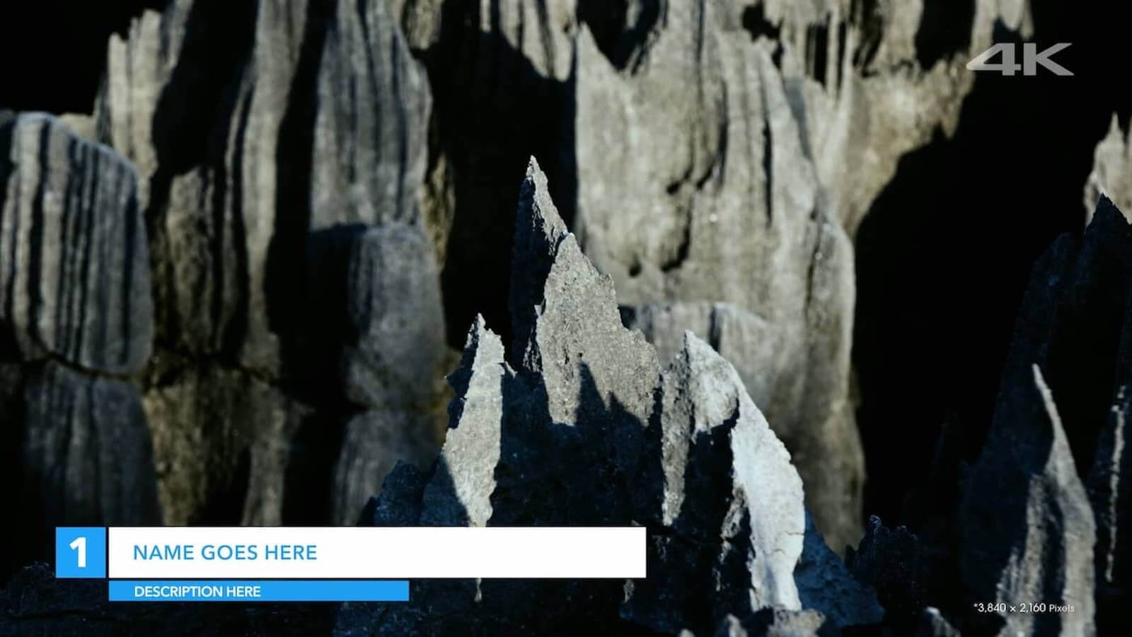
The Best Lower Thirds In Premiere - Lower Third Template
But be strict on usage. Use them only to fill in the gaps where visuals and sound bites don’t tell the story well enough.
Usually lower thirds are on the bottom third of your frame (on either left or right). But this isn’t set in stone. It all depends on where your subject is in the frame. Make your titles highly readable and out of your subject’s way. Try put them on the side with less important visuals in your frame.
Lower third templates are quicker to use, obviously, but for more creative options, here's a step-by-step video tutorial on how to create your own lower thirds in Premiere.
Lower thirds in Premiere tutorial
One last tip about placement, make sure your lower thirds in Premiere are in the “safe area” of the frame.
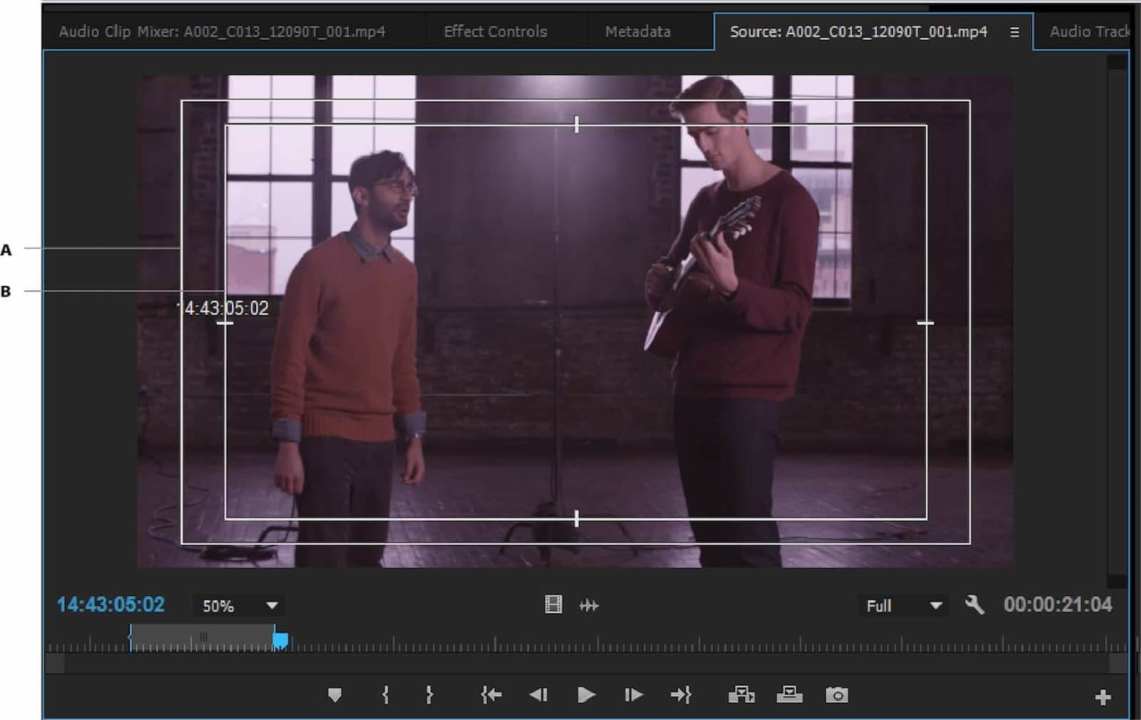
Keep your lower thirds the “safe area” margins in your source viewer
Premiere lower thirds template
2. Designing lower third graphics
The best lower thirds examples are both useful and brief. Your lower thirds After Effects or Premiere components (shapes, motion design and typography) should all be lightweight. And the information should be just enough to add context to the visuals.
Keep the themes and tone of your project in mind. Think about how your lower third graphics can evoke the project at large.
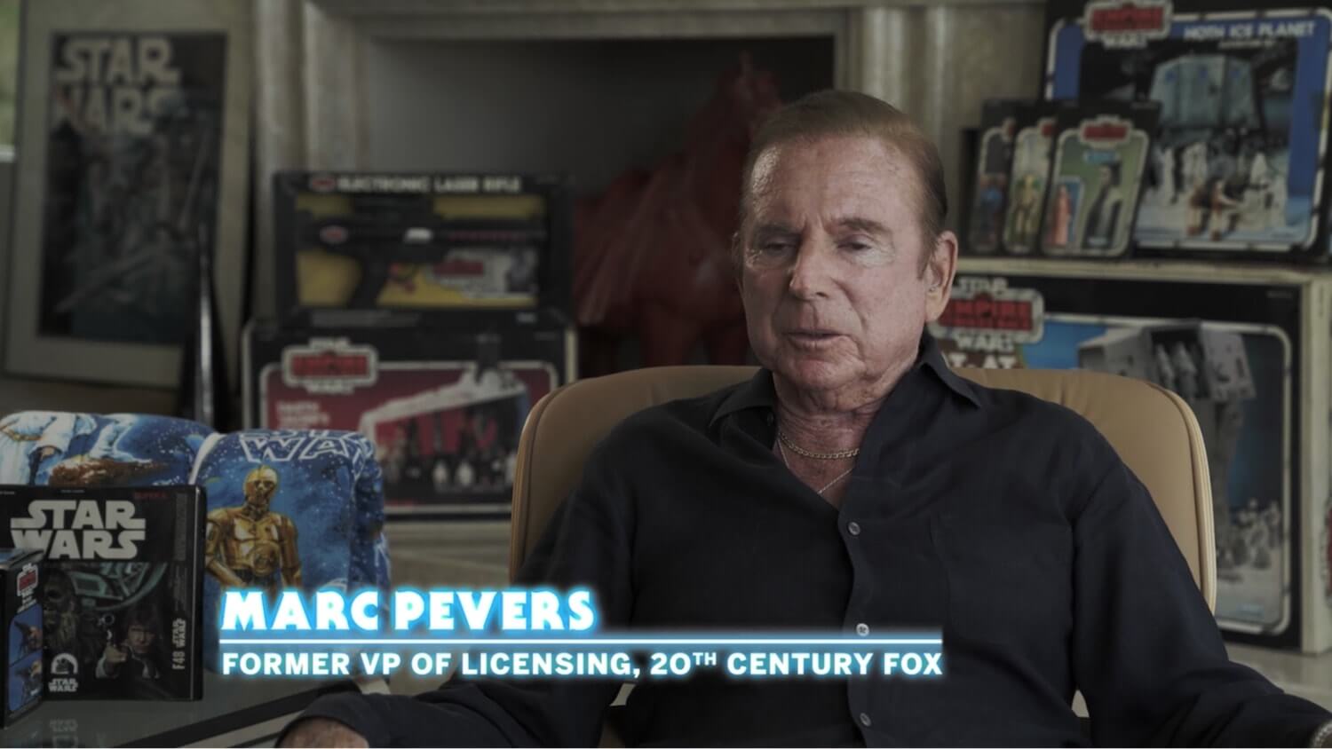
This lower third evokes the subject — vintage Kenner Toys
If you’re working with a brand, ask for feedback to better match their style. If not, think about choices that complement your subject.
Or just make them minimal to stay out of the way.
As a general rule of thumb, your lower thirds should be on screen long enough for viewers to read each word twice.
LOWER THIRD TEMPLATES
3. Choosing colors
As with all elements of title graphics, color should attract your viewer to the information — but it should never distract.
Make simplicity your guiding principle. Stay away from too many colors. Solid, intentional colors usually sell the information best.
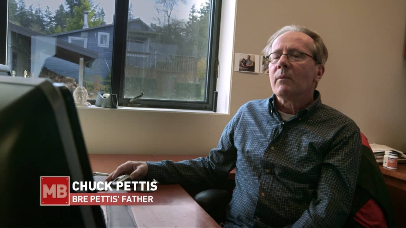
White and red colors in a title graphic
Keep titles black or white and limit to one solid color accent — if you use color at all. Sometimes, it's not necessary.
Related Posts
Templates for Premiere
4. Finding the right typography
Selecting the typography for your lower third graphics should be a delicate process. Again, it should evoke the video's tone and content.

Lower thirds in this Steve Jobs documentary evoke early Apple computers
If you’re making a documentary, choose a good sans serif font. This will give you many standard yet striking options.
If your content tone isn’t super specific, there are some universal fonts that work well, including: Bebas Neue, LatoCode, Futura, and LT.
THE BEST LOWER THIRD TEMPLATES
5. Choosing a font size
Your font size depends on the information you need to present. In news lower thirds, the headline graphics are often large, colorful, and attention-grabbing.

News lower thirds employ big, bold font sizes
Usually, documentaries are more subtle. But they can use different font sizes to differentiate the information presented. For example, different font sizes can separate a person’s name and title.
But try to gauge what the audience needs to know. If you’ve got a celebrity who is a household name, you might not need any more context than name. A one-line layout might suffice here.
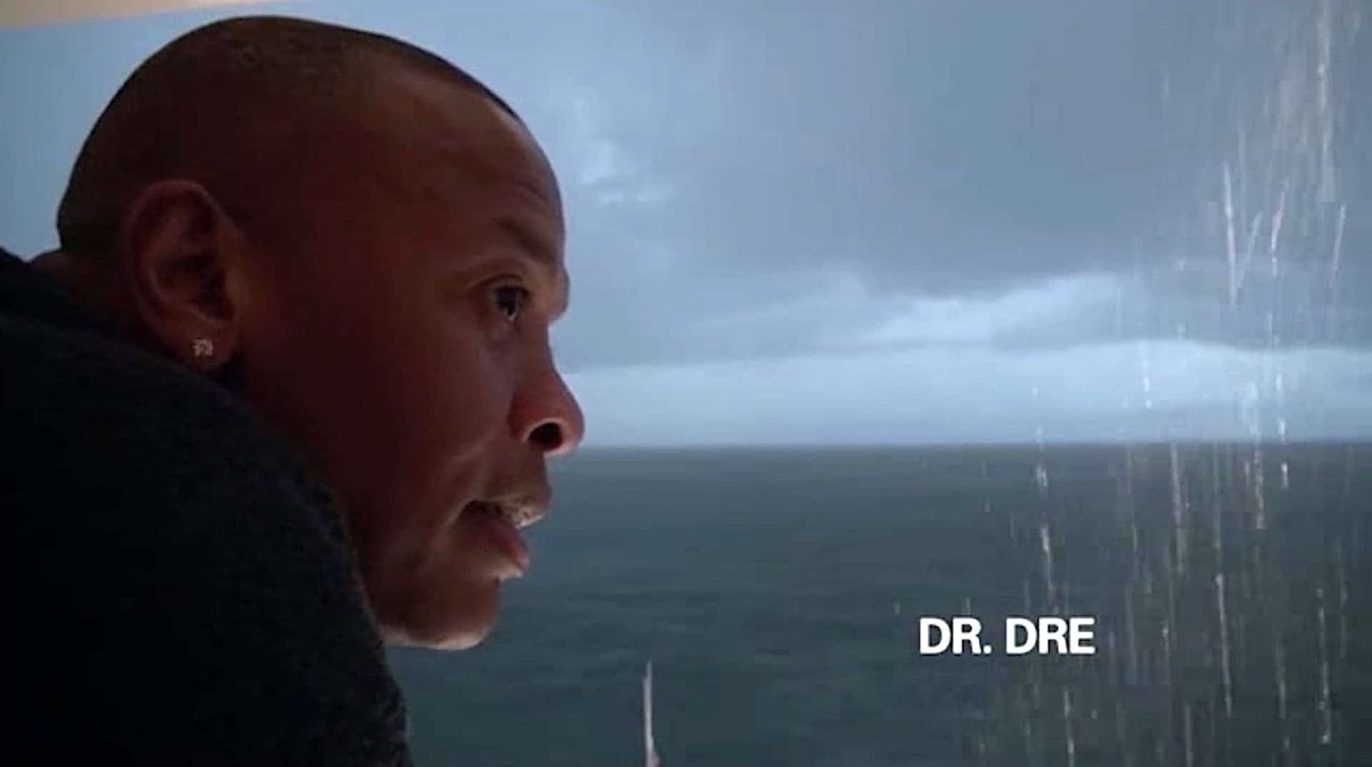
Dr. Dre needs no introduction in “The Defiant Ones”
Consider the intended medium too. Smaller font sizes might work for TVs and web, but if your project is intended for mobile applications, remember the smaller screen will make it difficult to read small text.
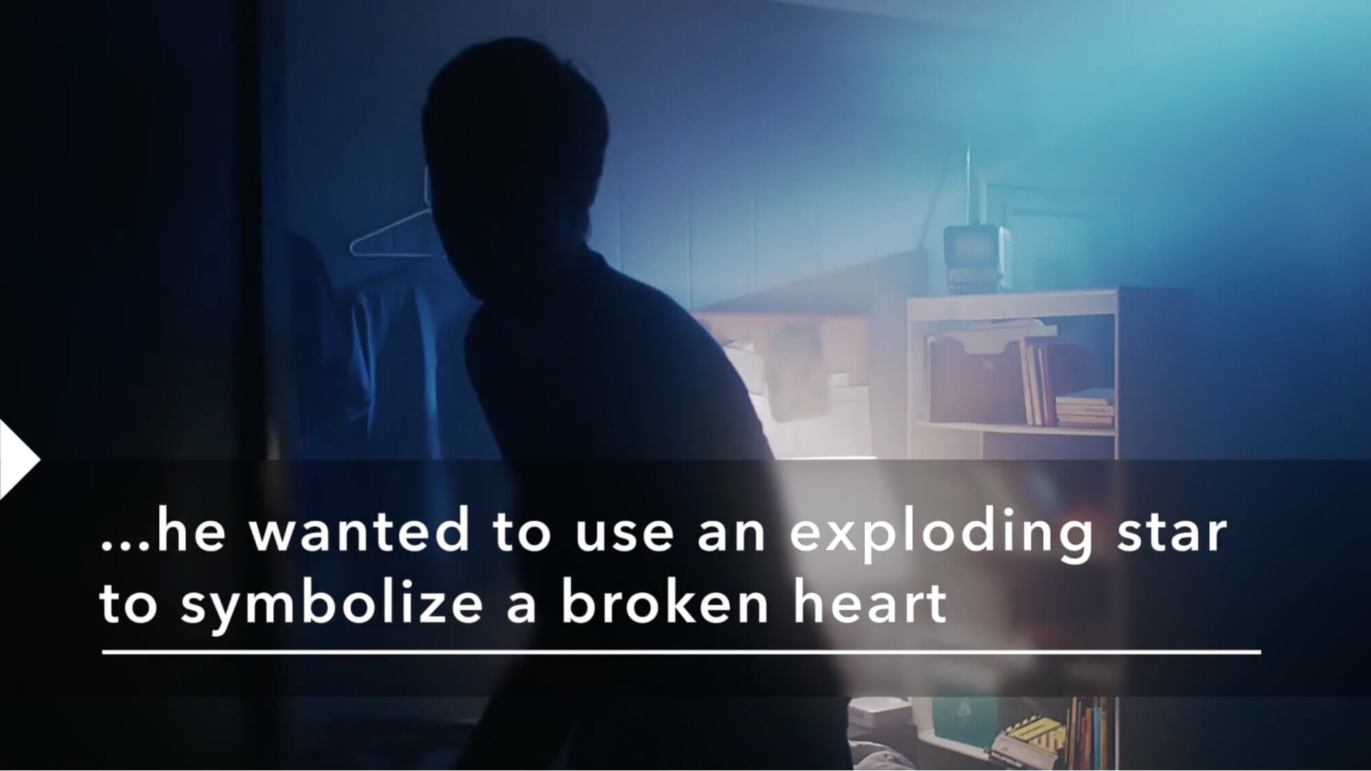
Vevo Footnotes videos employ a large caption format
The Best Lower Third Templates for Premiere
6. Using shapes in lower third graphics
Use shapes in your lower third graphics to separate your text from the background. Squares are the most effective choice here, especially in news graphics.
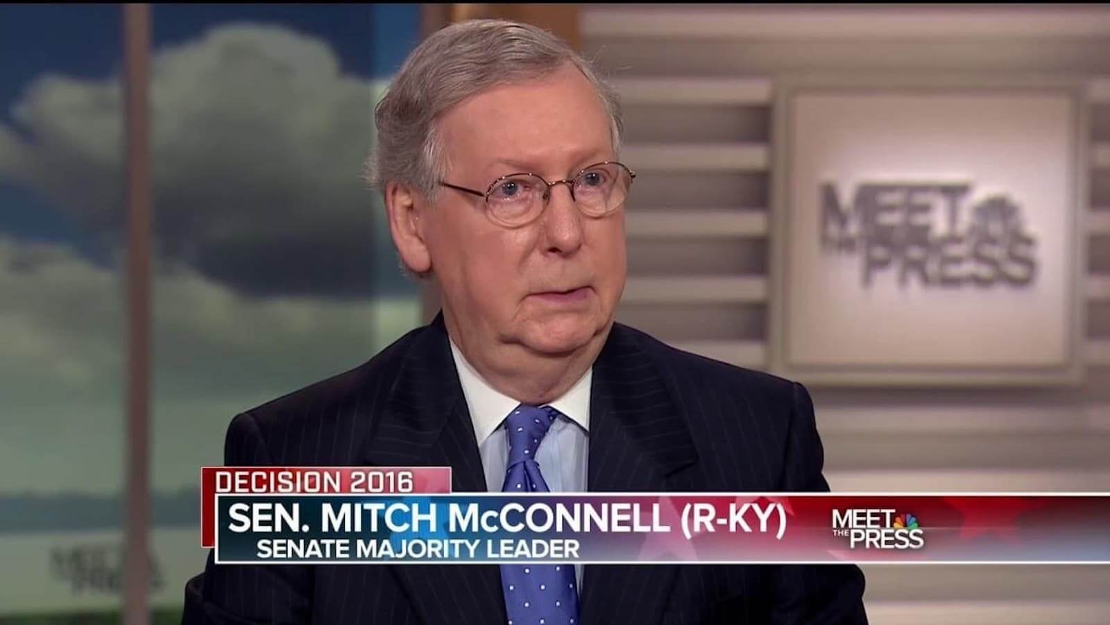
News graphics often use blocks in their lower third graphics
But in the news, lower thirds aren’t too subtle — they don't really have to be. However, lower thirds should be used in understated ways to sustain the audience's focus on storytelling in documentary filmmaking or feature film production.
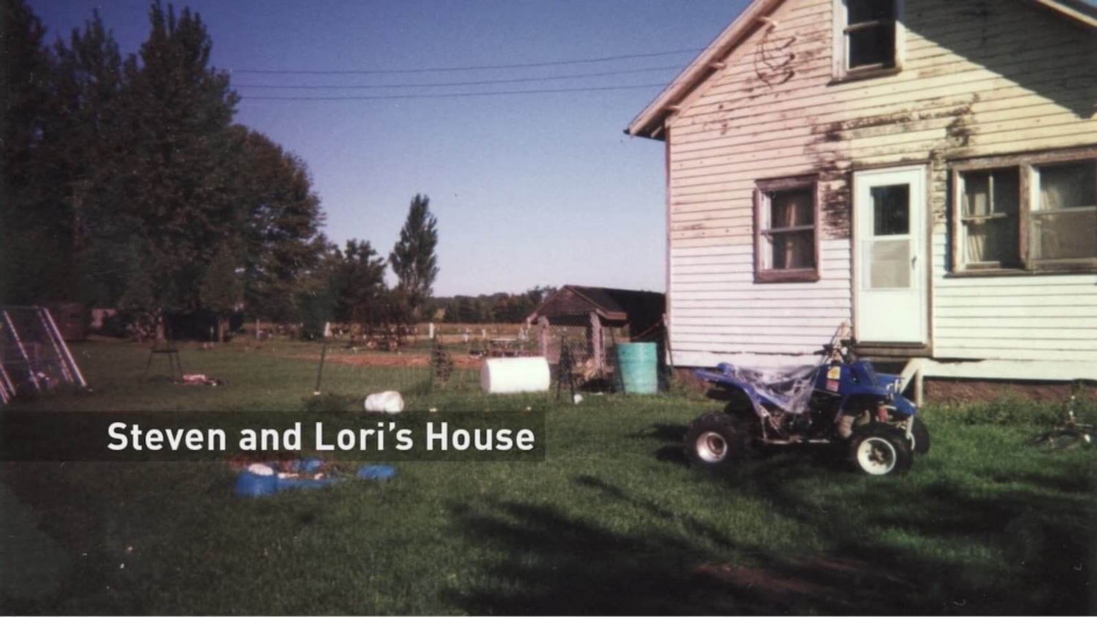
Of course, shapes aren't always necessary. Sometimes all you need is the text if the typography and size are good. But if you add shapes, consider a template to save time.
LOWER THIRD TEMPLATES
7. Animating your lower third graphics
Smooth, clean animations draw your viewer’s eye to your lower third graphics in a natural way. Find them in documentaries, web videos and even news graphics.
A program like After Effect might be better suited for animating text on screen, but you can animate your lower thirds in Premiere itself.
How to animate lower thirds in Premiere
In line with good motion design principles, keep your animation as simple as possible. Keep your keyframes smooth and brief. Generally one or two seconds tops.
Related Posts
Lower Thirds Template for Premiere
8. Using free lower third templates
There are plenty of Premiere Pro lower third templates out there. You can find lower thirds in Premiere too, in the Essential Graphics Panel. Open the Essential Graphics panel, click “Browse,” and search away.
Take advantage of templates and save tons of time. Even if you can’t find free lower third templates, the paid downloads are pretty affordable.
Premiere lower third templates come as different file types. Remember that lower third PSD files are Adobe-specific. Lower thirds in PNG or other non-vector formats will not have animation built in and might lose quality when scaling.
After you find and download your lower thirds in Premiere, simply import them into the project file. Customize as you need and you’re ready to rock! Don't forget our free lower thirds template below.
Free downloadable bonus
Download FREE Lower Thirds Template
Download your FREE lower thirds pack for Premiere Pro (.mogrt) below. Prepare to be inspired by the great examples we found. And, because we’re so darn nice, we also designed a free lower thirds template just for you. So download and get started on those titles right away.
up next
Motion graphic trends
As it goes with all creative choices in video, let your project dictate your visual elements. Your choice of lower thirds should evoke your project’s look and feel. After you create lower thirds in Premiere that you love, remember to save them as Motion Graphics Templates. Learn more about motion graphic trends in our next post.
Up Next: Mo-graph trends →
Project management for video creatives. Tasks, file sharing, calendars and more.
Manage video production timelines, tasks, storyboards, shot lists, breakdowns, call sheets. Made for video creatives, new media and film.
